


Micro-Surveys: One Question, One Decision
Useful  Mike Taylor Updated: Aug 26, 2026 Reading time ≈ 26 min

A micro-survey is one question, occasionally two, small enough to answer without breaking stride. The size is not a shortcut around real research, it is the whole design, and every constraint on the format buys something specific in exchange for something it costs.
Two articles on this blog already cover how a question like this gets put in front of someone: popup survey forms covers the on-site mechanic, the trigger, the card, the dismissal, and in-app feedback covers the moment inside a product where a prompt belongs. This piece is about the format itself, not the delivery: what makes three questions a different instrument from ten, how to choose the one question that actually matters, how to read the answers without fooling yourself, and how to run more than one of these things without them piling up into a stack of forgotten widgets nobody remembers switching on.
What makes a survey "micro", and what each limit buys
A micro-survey fits five constraints, and none of them are arbitrary. One screen, no scrolling and no pagination. At most two or three questions. Answerable in well under fifteen seconds by someone who is already doing something else. No account and no login. And the first question has to be answerable in a single tap, a click on one of a handful of options rather than typing.
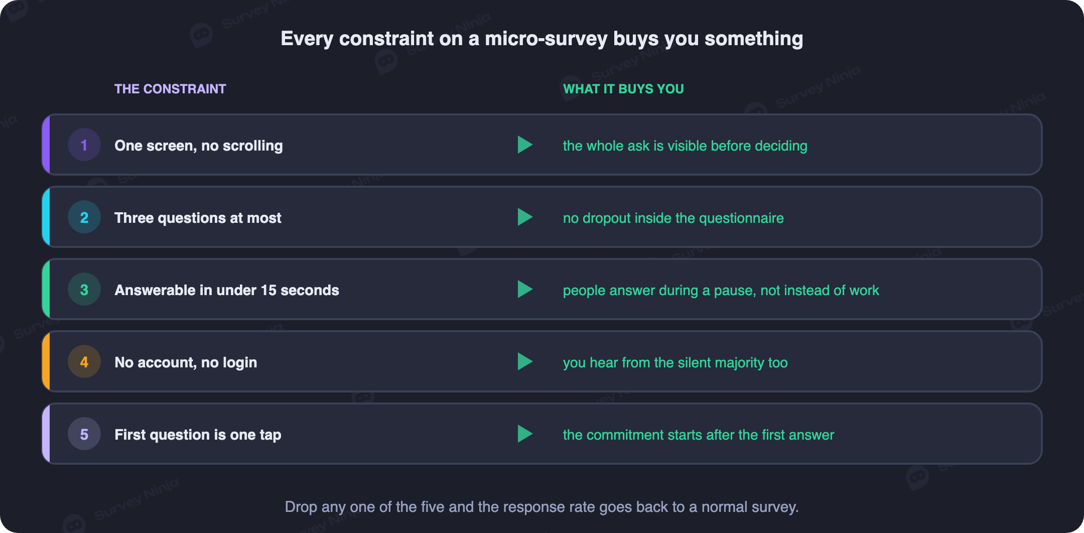
Each constraint is a trade you are choosing on purpose. One screen means nobody loses interest crossing a page boundary, because that is where a normal online survey sheds most of its respondents; there is nothing to abandon partway through if there is no partway. Capping the question count at two or three does not just save time, it forces you to decide in advance what you actually need to know, which is a discipline a ten-question form lets you skip. Under fifteen seconds keeps the ask inside idle time, the gap between one task and the next, rather than requiring someone to set aside a moment for it. No account removes the single biggest reason people close a form without answering: nobody wants to create a login for a two-question ask, and requiring one cuts your addressable audience down to people already signed in. A single tap on the first question means the highest-friction step, typing, comes last if it comes at all, so the drop-off that would normally hit your first question hits your last one instead, after most people have already answered something useful.
Put together, those five rules describe a different instrument, not a shrunken one. A twelve-question customer satisfaction survey and a two-question micro-survey are not the same tool at different sizes any more than a thermometer and an MRI are the same tool at different sizes. Treating a micro-survey as "the short version" of your usual questionnaire is how teams end up cramming five required fields into something that only works because it asked for one.
The trade you are making: response rate for depth
Every constraint above buys reach, and reach is the entire point of the format. A two-question prompt that fits in a thumb's worth of screen and needs no account will, in practice, be answered by several times as many people as the same audience would give to a ten-question form sent by email. That gap is not marginal. It is the difference between a sample you can act on within a day and one you spend weeks chasing.
The other side of that trade is real and worth stating plainly rather than glossing over. You lose the ability to explore. There is no room for "tell us more about that" unless it is the single follow-up you budgeted for. You lose context: you know what someone answered, not the three factors that led them there, not their history with your product, not whether today was a bad day for reasons that have nothing to do with you. And you lose the safety net a longer instrument gives you when one question is worded badly, because there is no second question to catch what the first one missed.
Neither side of that trade is the "right" one in general. A team that needs to understand why enterprise buyers churn should not run a micro-survey and call it research; a team that needs to know whether a redesigned settings page is easier to use than the old one does not need eight questions to find out. The honest version of this section is a warning: a micro-survey answers a much narrower question than it feels like it does, and the volume of responses can make a shallow finding feel more solid than it is.
Work backward from the decision: the one question that matters
With ten questions you can afford to explore a topic from a few angles and let the analysis find the interesting cut. With three questions you cannot, so the first question has to already be the decision you are actually facing, not a general-purpose read on how things are going.
Work backward. Name the decision on the table: keep the new checkout flow or roll it back, renew the onboarding email sequence or rewrite it, staff up support for a product line or leave it as is. Then ask yourself which answer to which question would change what you do next. If a five-point rating of "how easy was that" coming in low would trigger a rollback and coming in high would confirm the launch, that is your first question. If you cannot say what you would do differently depending on the answer, you have not found the question yet, you have found a mood check, and a mood check does not justify interrupting anyone.
This is why "are you happy with our product" is close to useless as a micro-survey question even though it is one of the most common ones teams reach for. It is not attached to a decision. Nothing you do next depends on whether the average comes back 7.8 or 8.1. Compare it with "how easy was it to complete your order today", asked on the confirmation screen the week you changed the checkout flow: every possible answer points at a specific next action, keep it, tweak it, revert it.
If you get a second question, spend it on context rather than more exploration: a single-select for plan tier, device type or how long they have used the product, something that lets you read the first answer with a bit more precision later. If you get a third, make it the one open-text field, placed last, and treat it as optional colour on a decision the first question already made, not as the place the real finding lives.
Question types that survive three taps, and the ones that do not
The format punishes the wrong question type harder than the wrong wording. A few shapes survive being squeezed into one screen and a few reliably do not.
What survives: a single rating, five points or a row of faces, answered with one tap and requiring no scale explanation. A short pick-one with four to six options, phrased so the choices are genuinely mutually exclusive. And exactly one open-text field, always last, always optional, used to catch the reason behind whatever the rating or pick-one already established. An eleven-point NPS question can work as a micro-survey's first question if your layout gives it a full row without shrinking the tap targets; where the trade-off between a relationship metric like NPS and a transactional one sits is covered in CSAT vs NPS.
What does not survive: a matrix, because a grid of rows and columns needs either a wide screen or a scroll, and a micro-survey has neither. Ranking, because dragging items into order is a small, fiddly motion that takes real attention, the opposite of what the format is for. Any multi-select with more than a handful of options, because scanning a long list defeats the fifteen-second budget on its own. Date pickers, file uploads, and anything that needs its own instructions. And an open-text field as the first question, which asks for the highest-effort answer type before you have earned it; the general case for where open and closed questions each belong is in open vs closed questions, and it applies here with the volume turned up, because a micro-survey has no second chance to recover a respondent who bounced off a blank text box.
One more rule worth stating on its own: if you cannot picture the whole question, every answer option and the submit control fitting inside a thumb's reach on a phone without scrolling, it is not a micro-survey question yet, however good the idea behind it is. Cut it down or move it to a longer instrument.
Reading a small sample without fooling yourself
This is the part most guides to short surveys skip, and it is where most of the damage from misreading a micro-survey happens, quietly, months after the launch.
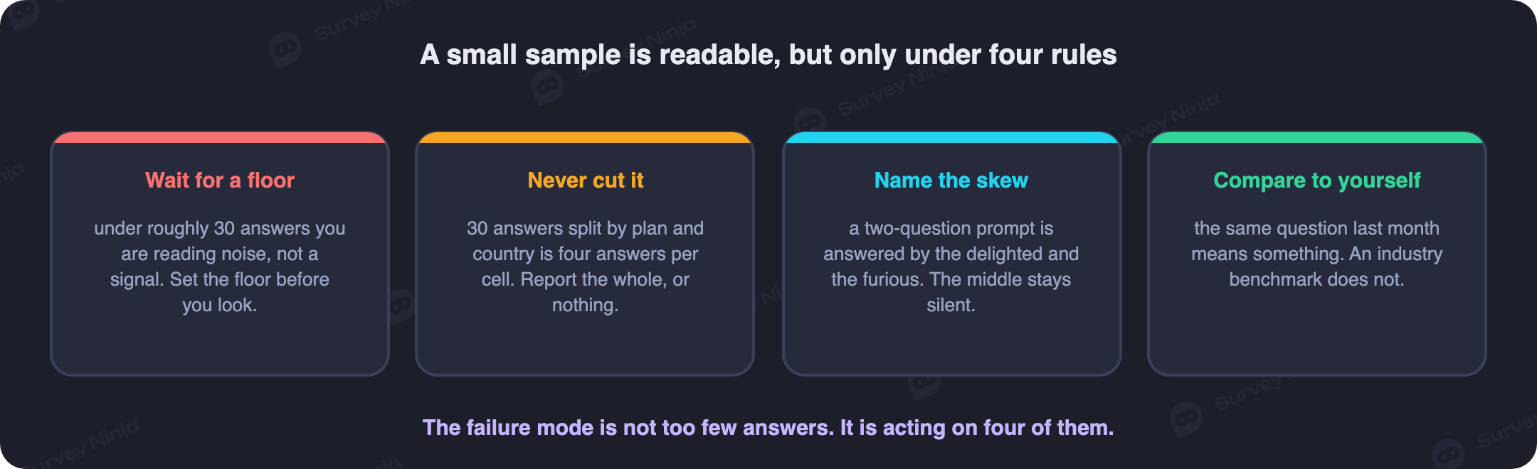
Set a minimum response count before you act on a result, and treat anything under that line as a hypothesis rather than a finding. Thirty to fifty responses is a reasonable floor for a single-question rating; below that, ordinary day-to-day noise can move a headline number by ten points or more with nothing real behind it. A score that shifts from 72 to 61 on forty responses might mean the last release broke something, or it might mean six different people answered on a Monday instead of a Thursday. You cannot tell the two apart without more data, and acting on the first explanation without checking is how teams chase phantom problems.
Resist cutting a small sample by segment. Forty responses split by plan tier, device and region leaves you with cells of three or four people each, and a rule you draw from three or four responses is a story, not a result, no matter how confidently the dashboard renders a percentage next to it. If a cut genuinely matters, run the ask long enough or wide enough to have thirty-plus responses inside the cut itself, not thirty-plus in the total that then gets sliced.
Account for who answers a two-question prompt and who never does. The people who respond to something this short tend to be either genuinely delighted, genuinely annoyed, or simply the type who answers things; the large quiet middle, people in a hurry, people who already gave up on your product and stopped opening it, are underrepresented by construction. That skews scores toward the extremes and, on anything measuring satisfaction, often skews the sample toward the people who feel strongly enough to bother, which is not the same population as your average user. Read every micro-survey result with that skew in mind rather than treating it as a clean cross-section.
Finally, compare a micro-survey question against itself over time rather than against an outside number. Your wording, your audience, your trigger and your timing are all specific to your instrument, so a benchmark built from someone else's ten-question CSAT survey measures something different even when the topic sounds the same. The useful comparison is this month's answer to the same question against last month's, on the same trigger, to a similarly composed audience. A trend line built from your own history is honest in a way a borrowed benchmark cannot be; the mechanics of picking a sample large enough to trust in the first place are covered in our note on sample size, and the general shape of the error a small count introduces is covered under margin of error.
Running micro-surveys as a programme, not a pile of widgets
The failure mode nobody plans for is not a bad first micro-survey, it is a good one that never gets turned off. A team ships a two-question ask on the pricing page, gets a useful early read, moves on to the next project, and the prompt keeps firing to visitors eighteen months later because switching it off was nobody's job.
Run a small, deliberate set of live asks instead of an accumulating pile. Cap the number that can be live at once, somewhere around three to five for most products, so adding a new one means retiring an old one rather than stacking indefinitely. Give every live ask three things on a shared list: an owner, a named person or team who is accountable for the question and the answers it produces, not "the product team" in the abstract; a review date, a point a few months out where someone actually looks at the trend and decides whether the ask is still earning its place; and a retirement date, a default expiry that requires an active decision to renew rather than an active decision to kill. Defaulting to expiry is what actually prevents the pile, because inertia favours whichever choice requires no action, and a retirement date makes "do nothing" mean "turn off" instead of "keep running forever".
Keep that list somewhere visible, even a simple spreadsheet: the question text, the trigger, the owner, last reviewed, next review, retirement date. When someone proposes a sixth live ask, the list is what makes "which of the current five are we replacing" the obvious next question instead of an afterthought.
Frequency capping across every ask, not per ask
A programme of several small asks has a fatigue problem a single survey does not, and it is easy to miss because each individual prompt looks harmless on its own. Two questions feels like nothing to the team that built it. It feels like something quite different to the user who has now seen four different two-question prompts from four different teams inside the same product this month, each one capped sensibly on its own and none of them aware the other three exist.
Survey fatigue in a micro-survey programme is a budgeting problem, not a wording problem, and the fix has to live above any single ask. Set one global cap per user across every micro-survey running in your product, not a separate cap per widget: something like one prompt every two to four weeks in total, regardless of which team's question it is. Track it centrally, ideally server-side rather than in each widget's own local storage, so a user who resets an app or switches devices does not silently reset their own cap. Treat a dismissal the same way you would treat it in a single survey, as a signal that pushes the next eligible date out further, and if the same person dismisses prompts from your programme repeatedly, suppress them for a longer stretch rather than letting five different asks each independently decide they are entitled to a shot. The specific display-level rules, timing on the page or in the app, dismissal design, are covered in popup survey forms and in-app feedback; the point here is that those rules need to be enforced once, centrally, for the whole programme, or every team's individually reasonable cap adds up to something a real person experiences as being nagged constantly.
Where micro-surveys win, and where they lose outright
The format is excellent at a specific kind of question and genuinely wrong for another kind, and mixing the two up is the most expensive mistake on this list because it costs weeks before anyone notices the data cannot answer what they needed.
Micro-surveys win at checking a specific, recent, well-defined moment: did an onboarding step work, what did people think of a feature the week it shipped, how did a support interaction feel right after it closed. In each case the population answering the question was just there, the topic is narrow enough to fit one screen, and speed matters more than nuance because you want the read before the moment fades.
Micro-surveys lose outright at anything needing a representative sample or a wide net of questions in one sitting: segmentation studies, where you need enough attributes on each respondent to group them meaningfully, which cannot happen in two questions; pricing research, which needs multiple scenarios and trade-off questions that do not survive a single screen; and any study where the self-selection bias described earlier would quietly wreck the conclusion, such as measuring overall satisfaction across your entire user base rather than reaction to one specific moment. For those, a longer, more deliberately sampled instrument is the right tool, and starting from a full survey template rather than trying to stretch a micro-survey to cover the gap saves you from redoing the work later.
| Situation | Best fit | Why |
|---|---|---|
| Did the new onboarding step land | Micro-survey | One clear moment, one decision, needs a fast read |
| Reaction to a feature shipped this week | Micro-survey | Narrow topic, respondents just used it, timing matters more than depth |
| Pulse right after a support ticket closes | Micro-survey | Clean boundary, single effort question, no exploration needed |
| Segmenting your audience into groups | Long-form survey | Needs many attributes per respondent to build groups |
| Pricing and willingness to pay | Long-form survey | Needs scenarios and trade-off questions, not one tap |
| Overall satisfaction across the whole base | Long-form survey | Self-selection in a micro prompt skews too far from a representative read |
Getting the answer to someone who can act on it
A micro-survey's whole advantage is speed, and that advantage evaporates if the answer sits in a dashboard for three weeks before a human sees it. Instrumentation is not an afterthought here, it is half of what makes the format worth running at all.
Attach the context you already have rather than asking for it: which page or screen the prompt fired on, the plan tier, the app version, how long the person has used the product. Every one of those is a fact you can pass automatically that would otherwise cost you a question you do not have room for, and it is what makes it possible to read a rating alongside the situation it came from rather than in a vacuum.
Route by content, not just by volume. A low rating with an open-text comment naming a specific problem should reach a person, not a spreadsheet, ideally the named owner from your programme list, within a day. A run of low scores on the same page should trigger an alert rather than wait to be discovered at the next quarterly review. High scores and short, positive comments can go straight into a weekly digest, because nobody needs to be paged for good news. The goal is a short, boring pipeline: response comes in, gets tagged, reaches the right inbox or channel, and someone can say what changed because of it. If you cannot name who reads a given micro-survey's answers today, that ask has drifted from useful signal to background noise and belongs on the retirement list from the earlier section.
A practical build: one micro-survey, live this week
Start with the decision, not the question. Write down, in one sentence, what you would do differently depending on the answer. If you cannot finish that sentence, you are not ready to write the question yet.
Write the first question so it is answerable with one tap: a five-point rating or a short pick-one, worded around the specific moment rather than the product in general. Add a second question only if it buys you a useful cut, plan tier, role, device, and keep it a single tap as well. Add a third question only as open text, mark it optional, and place it last so it never blocks anyone who would rather just answer the rating and move on.
Pick a trigger tied to the actual moment the decision depends on, a success screen, a milestone, a closed ticket, following the timing guidance in in-app feedback or popup survey forms depending on where the moment lives. Set a frequency cap against your programme-wide budget before launch, not after the first complaint about being asked too often. Assign an owner, a review date roughly a quarter out, and a retirement date if nobody renews it, and add the ask to your shared list alongside whatever else is currently live.
Launch to a fraction of eligible traffic first rather than everyone at once, watch the response count climb, and hold off on any conclusion until you cross your minimum sample line. Read the trend against your own history, not an outside number, and route the first batch of comments to the owner directly so the loop from answer to action is proven before you scale the ask up.
SurveyNinja supports this end to end: single-question logic that only shows a follow-up when the first answer warrants it, hidden fields for the context you already have, filtered reports that let you read a score by version or page without hand-slicing a spreadsheet, and a free plan with no cap on responses, which matters once a well-placed micro-survey starts returning volume you were not expecting. See pricing for the plan details, or start from a ready survey template instead of a blank page.
Common mistakes
- Treating it as a shrunken version of a real survey. A micro-survey is a different instrument with its own rules, not the same questionnaire with items deleted.
- Asking a mood question instead of a decision question. If no answer would change what you do next, the question does not belong in three taps of anyone's time.
- Putting the open-text field first. It asks for the highest-effort answer before you have earned it, and costs you respondents who would have answered a tap-based question happily.
- Acting on a result under your minimum sample line. A score that moves ten points on thirty responses is often noise, not news.
- Slicing a small sample into segments. Cells of three or four people produce a story that reads like data.
- Comparing your score to an outside benchmark. Different wording, audience and trigger make the comparison meaningless; compare your own trend instead.
- Capping frequency per widget instead of per user. Five individually reasonable caps add up to a user who feels nagged constantly.
- Never retiring anything. A useful micro-survey that nobody reads six months later is functionally the same as a bad one, plus the fatigue it costs you.
- Collecting answers nobody routes anywhere. A fast instrument with a slow or missing feedback loop wastes the one advantage it has.
Frequently asked questions
What counts as a micro-survey?
A survey that fits one screen, holds at most two or three questions, can be answered in well under fifteen seconds, needs no account, and starts with a question answerable in a single tap. Each of those limits is deliberate, not a shortcut around a longer instrument.
How many questions should a micro-survey have?
One is enough on its own. Two lets you add a context field like plan tier or device. Three is the practical ceiling, and the third slot should be an optional open-text field placed last, never the first question someone sees.
How is a micro-survey different from a pop-up survey or in-app feedback?
Pop-up surveys and in-app feedback describe how and where a question is shown, the trigger, the card, the timing. Micro-survey describes the format of the question itself, the constraints that make it answerable in seconds regardless of whether it appears as a pop-up, inside an app, or somewhere else entirely.
How many responses do I need before I trust a micro-survey result?
Treat anything under roughly thirty to fifty responses as a hypothesis rather than a finding. Below that line, ordinary day-to-day variation can move a headline number by ten points or more with nothing real behind it.
Can I break a micro-survey result down by segment?
Only if each segment itself clears your minimum sample line. Splitting forty total responses by plan, device and region leaves cells of three or four people, which is a story, not a result, even though the dashboard will render a clean percentage next to it.
Why do micro-survey scores skew toward strong opinions?
The people who bother answering a two-question prompt tend to feel strongly, delighted or annoyed, or simply be the type who answers things. The quiet middle and people who already disengaged are underrepresented by construction, so a micro-survey result should be read as skewed toward extremes rather than as a clean cross-section of everyone.
How often can the same person be shown a micro-survey?
Set one cap across every micro-survey running in your product, not a separate cap per widget, roughly once every two to four weeks in total. Track it centrally rather than per widget, and push a dismissal's next eligible date out further so five reasonable individual caps do not add up to constant nagging.
When should I use a long-form survey instead of a micro-survey?
Whenever you need a representative sample, several related questions in one sitting, or attributes to segment respondents meaningfully, such as segmentation studies or pricing research. A micro-survey answers one narrow, timely question well; it is the wrong tool for anything that needs breadth.
Updated: Aug 26, 2026 Published: Aug 21, 2026