


How to Reduce Survey Dropout
Useful  Mike Taylor Updated: Aug 26, 2026 Reading time ≈ 17 min

Survey dropout is the share of people who begin answering your survey and leave before the final question. It is one of the quietest ways a study goes wrong, because the answers you do collect still look complete, and it is easy to forget how many people slipped away in the middle.
A typical email study makes the problem concrete. Send an invitation to a thousand people and, on a decent day, a few hundred open it, a fraction of those click through and start answering, and only a slice of those reach the last screen. The most painful loss is not the people who ignored the email, since that is a distribution problem, but the ones who opened the survey, spent thirty seconds on it and then quit. They were interested enough to begin, and something inside the survey pushed them out. This article is about that something: why people abandon surveys, where they leave most often, and what you can change to keep them.
What survey dropout rate is, and what counts as normal
The dropout rate is the proportion of respondents who started the survey but never reached the end. Its mirror image is the completion rate, the share of people who did finish, and together the two add up to one hundred percent. The math is not complicated: take the people who started, subtract the people who finished, and divide by the people who started. If 180 people begin and 47 reach the last screen, 133 dropped out, which is a dropout rate of about 74% and a completion rate of 26%.
There is no single number that counts as good, because what is normal depends heavily on length and context. As a rough set of benchmarks:
- Short surveys (up to five questions) tend to sit around 10% to 20% dropout. Lower is excellent, and much higher is worth investigating.
- Medium surveys (six to fifteen questions) commonly land between 20% and 40%.
- Long surveys (sixteen questions or more) routinely reach 40% to 60%, and that is simply the reality you work with.
On top of length, context shifts the baseline. An exit survey that pops up as someone leaves your site almost always loses more people than an email to a loyal list. An anonymous HR survey usually finishes better than a marketing survey offered with nothing in return. And mobile traffic is nearly always weaker than desktop. So before you judge your own numbers, compare them against a survey of a similar length and setting rather than against an abstract ideal.
Where respondents actually drop off
Dropout is not one figure, it is a funnel, and if you only look at the final completion rate you miss the stage where people are really leaving. That means you end up guessing at what to fix. It helps to lay the whole path out, from the invitation to the last answer, and see how many people survive each step.
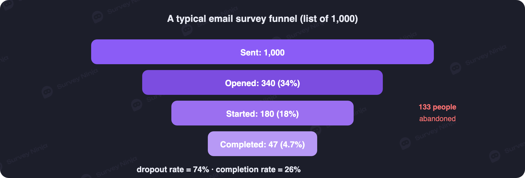
Each stage has its own reasons for loss and its own levers. People who never open the invitation are a subject line, sender and send-time problem, which is pure email marketing rather than survey design. People who open but never click through were not persuaded that answering is worth their time, usually because the message has no clear call to action and no sense of what they get out of it. People who click but never start were scared off by the first screen: it looks too long, there is no progress indicator, or the layout feels careless. And people who start but quit partway are the group this article is mostly about, because that is exactly where the design of the survey itself can cut your losses roughly in half. Watching the drop between "clicked" and "started" also keeps your response rate honest, since a strong open rate means little if almost nobody begins.
Length is the biggest driver of dropout
If you had to pick a single factor that moves dropout more than any other, it would not be the question type, the visuals or the wording. It would be length. Everything else is a modifier layered on top of that basic effect, which is why the first thing to look at is almost always how many questions you are actually asking. The mechanism has a name, survey fatigue: attention and goodwill run down as the survey drags on, and past a certain point each extra question costs you people.
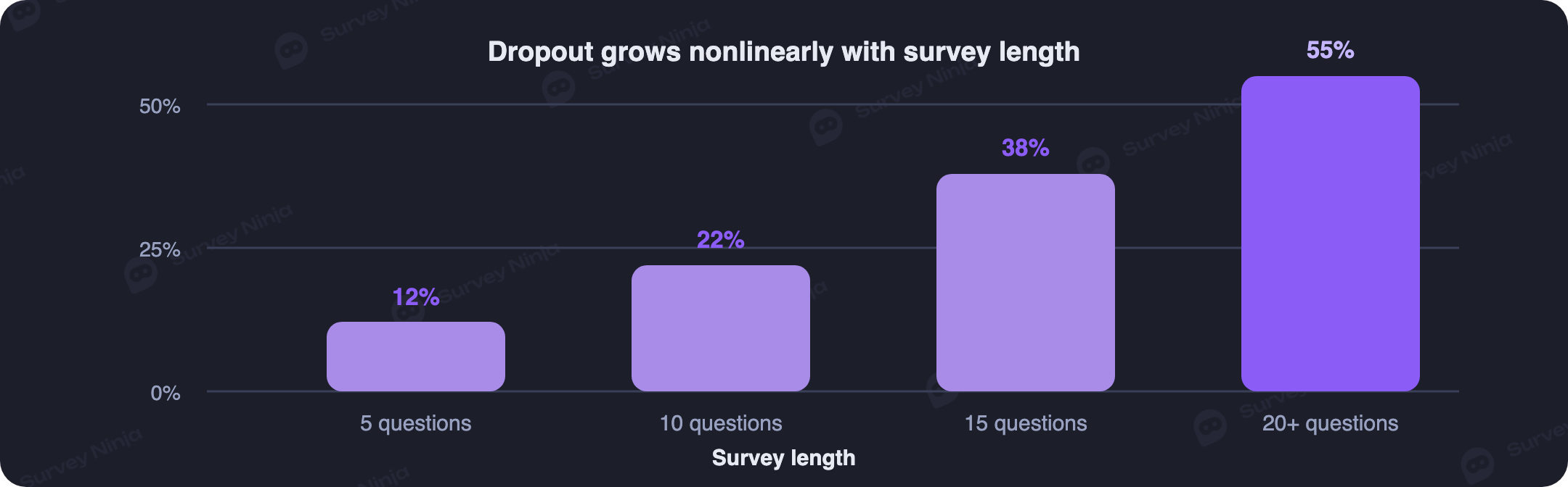
The important detail is that the curve is not a straight line. The first handful of questions are cheap, and then the cost of each additional block rises steeply, so a survey of twenty questions loses far more than twice as many people as a survey of ten. That is why the single most powerful move you can make is to cut questions before you touch anything else. A useful test for every question is to ask what decision the answer will change. If the honest reply is "I am not sure" or "just in case," the question is dead weight, and the survey is better off without it.
20+ ways to reduce dropout
Beyond trimming the survey, most of what keeps people to the end falls into six groups, each pulling on a different lever. You do not need to apply all of them at once; pick the ones that fit your situation and your audience.
Length and structure
Start by earning every question, applying the decision test above so nothing survives "just in case." Then state the length up front: a plain line like "about two minutes, six questions" on the first screen tends to reduce dropout noticeably, because people will tolerate a known length far better than an unknown one. A progress indicator such as "question three of eight" holds people through the middle, with one caveat: if your survey branches, show a step counter rather than a percentage, since a percentage that jumps around as the path changes quietly erodes trust. It also helps to group similar questions together, keeping all the demographics on one screen and all the feature ratings in one block, because switching context tires people more than length alone. Save the demanding questions, the open text and the matrices, for the last third, when respondents have already invested effort and are more likely to push through. And for anything genuinely optional, give people a clear "skip" control rather than burying a "not sure" option inside the answers, since the first keeps the respondent while the second quietly corrupts your data.
Wording
Keep questions short, ideally a single line, and if one will not fit on a line, that is usually a sign there is a word to cut. Ask one thing at a time: "how satisfied are you with the speed and the design?" is two questions wearing one coat, and it strands anyone who feels differently about each half. Drop the internal jargon, because a term that only you and your team understand will stall a respondent who does not, and the same care that separates open and closed questions cleanly also keeps your wording plain. Finally, label your scales: "rate this from 1 to 7" with no legend is guesswork, while "1 means strongly disagree, 7 means strongly agree" gives people something concrete to answer.
Visual presentation
How a survey looks changes how heavy it feels. In longer surveys, showing one question per screen lowers the psychological weight of the wall of text, though for short surveys the opposite is true and it is better to show everything on a single screen. Prefer simple, generous controls, stars, faces and large buttons, over tiny radio dots that people have to aim at, and leave real breathing room around each question. A cramped layout reads like a school exam, while a bit of white space makes the same survey feel lighter and quicker.
Mobile layout
Most surveys are now answered on a phone, so treat mobile as the default rather than an afterthought. Avoid matrices on small screens entirely: a grid of six statements against a seven-point scale on a five-inch display is a near-guaranteed exit, and it is far better to break it into a short series of single questions. Make tap targets large, at least around 44 pixels tall, so people do not miss and grow irritated, a bar that mobile design guidelines have held to for well over a decade. And minimize typing, because every field that summons the keyboard on a phone is a chance to lose someone, so wherever a person could tap a choice instead of typing, give them the choice.
Motivation and feedback
People finish surveys they understand the point of. Say why you are asking in concrete terms: "this helps us improve the checkout for people like you" lands better than "your opinion matters to us," because a specific benefit is legible and an abstract one is not. Where it fits, a small incentive such as a discount, a checklist, early access to the results or a modest gift is not required, but on marketing surveys it can lift completion meaningfully. And do not leave the closing screen empty: at a minimum confirm that the answer was recorded, and better still show a small preview of the results so the effort pays off with a little curiosity satisfied.
The technical basics
None of the above matters if the survey is slow or broken. Check the load speed first, since a survey that takes five seconds to appear loses people before the first question. Test on real devices and browsers, especially Safari on iOS and the in-app browsers inside social apps, rather than trusting a desktop emulator. And for longer surveys, allow people to resume where they left off: if a session drops and they return to the same link, reopening at the same question is the one technique that directly rescues losses on long surveys.
A pre-launch checklist
Fifteen minutes before you send the invitation, walk through the points below. These are the most common causes of "sudden" dropout, and nearly all of them are things you can catch before launch rather than after:
- Does the survey open with a clear intro that states its length and its point?
- Is the number of questions the minimum that still answers your real question?
- Is every question a single line with a single meaning?
- Do the scales carry a legend, so people know what the lowest and highest points mean?
- Does it look right on a phone, checked on a real device rather than in an emulator?
- Are the demanding questions placed nearer the end?
- Is there a progress indicator or a "question X of Y" counter?
- Does the first screen load in under two seconds?
- Is the thank-you screen more than a blank page, telling people what happens next?
- Have you taken the survey yourself, from the first question to the last?
If every point is a yes, the survey is ready to go. If even one is a no, fix it before you send, because editing after launch is expensive: your first hundred respondents will have answered a different version, and comparing the two sets of results becomes a headache you do not need.
What to do when dropout is already high
Say you launched, collected the first hundred or two hundred responses, and the completion rate came back at eighteen percent. The instinct is to rebuild the survey from scratch, but that is usually the wrong move. First find the single point where you are losing the most people, because one bad screen often accounts for the bulk of the damage, and fixing it is far cheaper than starting over.
Look screen by screen, not question by question
Most platforms report how many people reached each screen and how many moved on from it, and that is the view you want. Scan for the screen after which the numbers fall off a cliff. That step is your problem, and it tells you where to spend your attention rather than spreading effort evenly across a survey that is mostly fine.
The usual trouble screens
A few screens cause most of the damage. If you lose thirty percent or more right on the first question, the issue is the intro screen or that opening question, which is probably too hard, too dull or too intimidating to start with. A matrix screen is a classic loss zone, and breaking it into single questions usually helps immediately. A screen with a required open-text question pushes people out, because when they cannot skip it, closing the tab is easier than composing an answer. And a screen asking for personal details, an email address, an age or an income placed in the middle of the survey, reliably makes dropout jump; move it to the end or make it optional.
If you have collected open-text answers from the people who did reach the end, read them for clues, or run them through an AI survey improver. Comments like "this was too long," "I did not understand the question about X" or "you asked about Y, which I never use" are direct instructions for the next iteration, and they often point at the same screen your funnel already flagged.
Reducing dropout in SurveyNinja
A good deal of this is easier when the tool defaults to keeping people in. SurveyNinja shows an automatic progress indicator in every survey, whether it branches or not, so respondents always know how far they have to go. On small screens the mobile layout adapts on its own, unfolding matrices into a series of single questions rather than shrinking a grid no one can tap. Session recovery means that if someone closes the tab and comes back to the same link, the survey reopens at the question they left, which is the difference between losing a long survey and finishing it.
For diagnosis, the report shows screen-level analytics, so the screen where people are dropping off is visible without exporting anything by hand, and the response rate and completion rate are calculated for you. Before you launch, you can run the draft through the AI survey improver, which flags double-barreled, leading and overloaded questions, the wording problems that quietly cost you respondents.
Building a survey that people actually finish does not have to be complicated, and you can start for free. SurveyNinja has ready-made templates and a free plan with no limit on the number of responses, so you can create a low-dropout survey and gather answers without paying by the response.
Frequently asked questions
What is survey dropout rate?
The dropout rate is the share of respondents who start a survey but do not reach the end. Its mirror is the completion rate, the share who finish, and the two add up to one hundred percent.
What is a normal dropout rate?
It depends mostly on length and context. Short surveys of up to five questions tend to sit around 10% to 20%, medium surveys of six to fifteen questions around 20% to 40%, and long surveys of sixteen or more questions often reach 40% to 60%. Exit pop-ups and mobile traffic usually run higher.
Why do people abandon surveys partway through?
The biggest reason is length, since attention drains as the survey drags on. Beyond that, people quit at confusing or double-barreled questions, matrices on mobile, required open-text or personal-detail questions, and any screen that is slow to load or hard to tap.
How can I reduce dropout in my survey?
Start by cutting every question that will not change a decision. Then state the length up front, add a progress indicator, keep questions to one line and one idea, label your scales, design mobile first, and let people resume an interrupted session.
Does survey length really affect completion rate?
Yes, more than any other single factor. Dropout rises steeply rather than evenly with length, so the first few questions are cheap while later ones cost you many more respondents. Trimming questions is usually the most effective fix.
How do I find where respondents are dropping off?
Use screen-level analytics rather than looking only at the final completion rate. Find the screen after which the numbers fall sharply, since that step is where you are losing people, and reading the open-text answers of those who finished often points at the same screen.
Updated: Aug 26, 2026 Published: Aug 4, 2026