


Pop-Up Surveys That Get Answered Instead of Closed
Useful  Mike Taylor Updated: Sep 29, 2026 Reading time ≈ 31 min

A pop-up survey is one question shown to somebody who is still on the page, which makes it the only way to hear the reason behind a behaviour while the behaviour is happening. It is also the easiest widget on a website to get wrong, because the same mechanism that collects answers can quietly cost you sales.
Analytics can tell you that four out of five visitors leave the pricing page without choosing a plan. It cannot tell you why, and no amount of session replay will produce the sentence "I could not work out whether support was included". A question on the page can. That is the case for the format, and it is a strong one, but it comes with a bill attached: an interruption that lands badly costs attention, patience and sometimes a sale. This guide takes both sides seriously, because the usual fate of an on-site survey is to keep running long after the person who set it up has moved on.
What a pop-up survey actually is
A pop-up survey is a small overlay that appears on a page under defined conditions, asks one or two questions and records the answer without sending the visitor anywhere else. Vendors call it an on-site survey, a website intercept, a feedback widget or a microsurvey, and the mechanics are identical in every case. Behaviour crosses a threshold, a card appears, the visitor answers or dismisses it, and the answer lands in your reporting with whatever context you captured automatically.
The comparison that matters is not with other survey tools but with the marketing pop-up loaded from the same tag manager. They look alike and they are opposites. A marketing pop-up interrupts in order to take something: an email address, a signup, a sale. A survey pop-up interrupts in order to give something back, in the form of a change to the page or the product. Because the first one is measured in captured leads, its incentives push toward maximum coverage, maximum size and minimum escape, and every dark pattern in the genre exists because it moves that number in the short run. A survey has no such incentive. It needs a sample rather than a census, so it can show to a fraction of traffic. It needs honest answers, so it cannot afford to annoy anyone into a random click. If your survey pop-up covers the screen and demands an email address before the first question, you have built a lead capture form wearing a lab coat.
The other useful contrast is with channels that arrive after the fact. An email survey reaches a known customer days later and returns considered, retrospective answers. A pop-up reaches an anonymous visitor mid-task and returns immediate, situational ones. Neither is better, and the mistake is asking a pop-up to do relationship research or asking an email to explain why a checkout step confuses people.
Triggers: when the card appears
The trigger is the most consequential setting in the whole widget, more than the wording and far more than the colour. It decides who gets asked, how the interruption feels and whether the answers mean anything. A good question shown one second too early is dismissed by people who would have answered it gladly later.
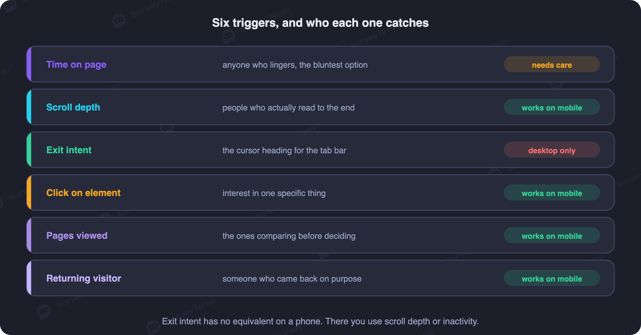
Time on page is the default everywhere and the one most often set carelessly. Five seconds is not engagement, it is the time it takes to realise you are on the wrong site, so a five second timer mostly interviews people who are already leaving. Set the delay against the median time on that page in your own analytics and fire somewhere past it. A pure timer also cannot tell reading from an abandoned tab, so it works best with a second condition attached.
Scroll depth is the better engagement proxy in almost every case, because scrolling requires a hand. Firing at half to two thirds of the page catches somebody who has consumed enough to have an opinion, and on a long article or a detailed product page it is the first trigger to reach for. Two cautions: a short page can be scrolled to the end in a second, which turns depth back into a timer, and lazy loaded content keeps moving the percentage under you.
Exit intent fires when the cursor accelerates toward the top of the viewport, which on a desktop browser usually means the person is heading for the close button, the address bar or the back arrow. The visit was ending anyway, so the interruption costs little, and this is the one place a centred modal is defensible. It suits a cart, a pricing page or a checkout step, where the question is some version of "what stopped you". The catch is a steady rate of false positives, since people also move upward to reach a bookmark or another tab, and it does not exist on touch devices.
A click on an element is the least intrusive trigger available and the most underused: a permanent feedback tab on the edge of the screen, a small control at the foot of a help article, a link in the footer. Nobody is interrupted, and the people who click have chosen to talk to you, so answer quality is the highest of any trigger. Volume is the lowest, and the sample skews toward the delighted and the furious, so treat it as a source of hypotheses rather than a measurement.
Number of pages viewed targets session depth rather than page depth, and it isolates an expensive kind of visitor: the one clearly looking for something and clearly not finding it. Three or four pages without reaching a conversion step is a good threshold for "did you find what you were looking for", and it surfaces problems that live in the navigation rather than on any one screen.
Returning visitor uses visit count or days since the first visit, and it unlocks questions you cannot ask a stranger, about the range, the delivery terms or the thing they keep coming back to compare. It is also the polite setting for newcomers: exclude anyone on the first page of a first visit and you avoid the worst version of this format, which is being questioned by a business that has not yet done anything for you.
Two more conditions deserve a mention. Inactivity, meaning no scroll or click after real engagement, catches hesitation on a form or a comparison table. Triggering after a completed action, such as a successful checkout, gives you the moment an email survey aims at with none of the delay. Whichever you choose, have the widget record the page, the referrer, the device and anything you already know about the visitor as hidden context, so that segmentation does not have to be bought with extra questions.
Why exit intent does not work on mobile
Exit intent is a mouse technique. It watches cursor velocity and the moment the pointer crosses into browser chrome, and a touchscreen has neither a pointer nor a hover state. There is also no gesture to detect, because leaving a page on a phone means swiping home, switching apps, using the system back gesture or closing the tab, and the operating system gives the page no warning before any of them. By the time your script could react, the tab is already in the background.
Vendors sell mobile exit intent anyway, and it is worth knowing what sits under the label. The common implementation pushes a fake entry into the browser history so the back gesture triggers your pop-up instead of leaving. That hijacks a system control the visitor never agreed to hand over, breaks the most used navigation affordance on mobile, and produces the kind of angry dismissal that poisons your data. The workable answer is to stop imitating exit intent and use signals a phone actually provides: scroll depth with a dwell threshold, inactivity after engagement, a trigger after a completed action, or a small feedback control the visitor taps when they want to. For cart abandonment specifically, the honest fix is not an interruption at all but a message after the fact, which reaches the same person with the same question and costs nothing in the moment.
The anatomy of a pop-up that gets answered
Once the trigger is right, the card decides the response rate. The pattern that works is boring and consistent: one question, one screen, an obvious way out.
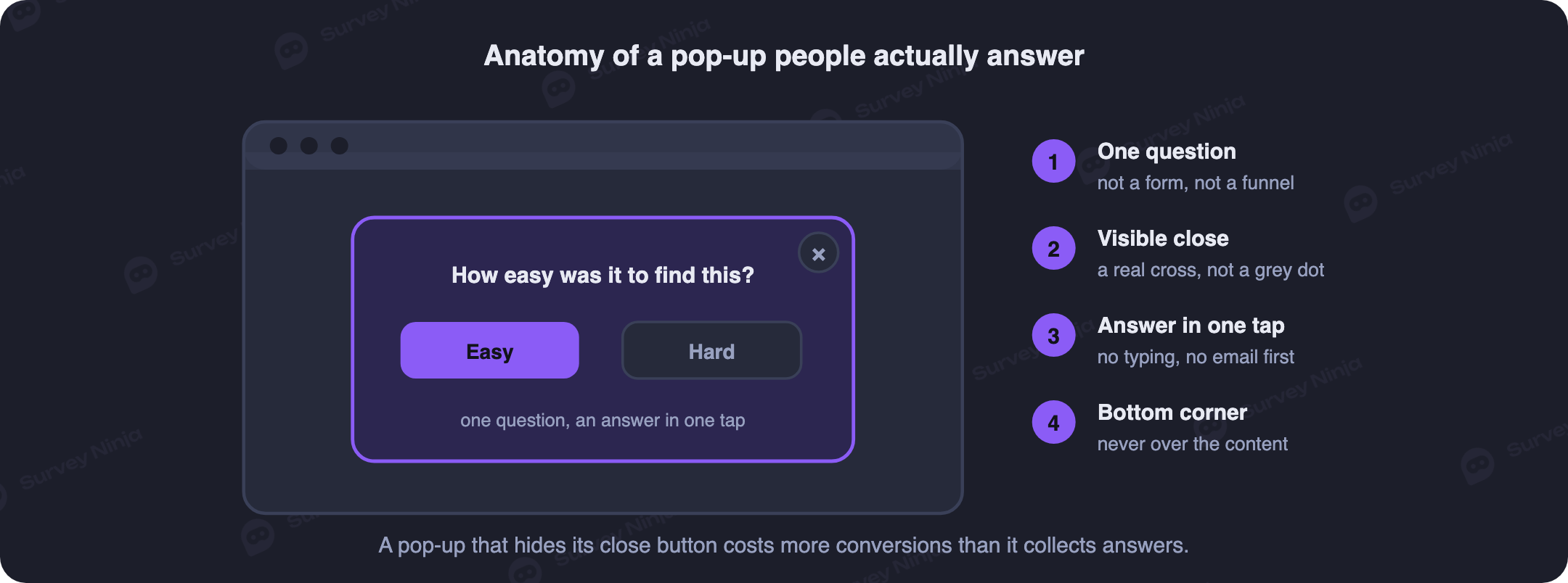
One question is the rule, and the exception is one follow-up. The moment a visitor sees a second question they did not agree to, they are doing a survey rather than answering a question, and that shift is the difference between a few percent and a fraction of one. If you need depth, ask the closed question first and let the answer open a single follow-up through branching logic, so the person who rated you badly is asked what went wrong and everyone else is thanked and released. On a pop-up the closed question always goes first, because a tap is a smaller commitment than a sentence; the wider trade is set out in open vs closed questions.
The wording has to survive being read in one second by somebody thinking about something else. That means concrete phrasing tied to the page, no internal vocabulary, no two questions welded into one, and nothing that hints at the answer you want. A leading question does more damage here than in a long questionnaire, because there is no context to correct it. If you are starting from scratch, our list of feedback form questions beats a blank field.
The close control is not a detail, it is the deal. A visible X in the top right corner, in a contrast a person can see without hunting, with a hit area big enough for a thumb, available the instant the card appears. Escape should close it, a click outside should close it, and the dismissal should be remembered so the card does not return on the next page view. That rules out the whole family of patterns the marketing pop-up has normalised: an X that appears after five seconds, an X in light grey at ten pixels, confirmshaming that makes declining mean clicking "No thanks, I do not care about better service", fake countdowns, second modals asking whether you are sure. Those techniques are built to convert people who wanted to leave, which is coherent for a discount offer and incoherent for research, since a coerced respondent gives you a random click and a random click is worse than silence.
Size and position carry more weight than teams expect. The desktop default that works is a card roughly 320 to 400 pixels wide, anchored bottom right, with no dimming overlay, sliding in rather than appearing. It reads as an invitation instead of a barrier, it leaves the page usable, and it leaves visible the very thing you are asking about. A centred modal buys a higher response rate at the cost of goodwill, and exit intent is the one place that trade is justified.
The remaining parts are quickly stated. Answer options should be visible without scrolling, which argues for a five point scale over an eleven point row on narrow screens, and any numeric scale needs both ends labelled. A single optional comment field is worth having, because open-ended answers carry the reasoning a rating cannot, but it must never be the first thing asked on a phone, where the keyboard covers half the screen. One line saying what happens to the answer builds more trust than a paragraph of reassurance. A thank you state that confirms receipt and closes itself finishes the interaction properly. And accessibility is not decoration: a true modal needs focus moved into it and returned afterwards with the right ARIA role, a corner card must not steal focus at all, both must be closable by keyboard, and contrast standards apply to the close control too.
Frequency capping, and never asking the same person twice
The fastest way to ruin a good pop-up survey is to show it again. Frequency rules get skipped because nothing visibly breaks without them, and the damage appears months later as an audience trained to dismiss anything that moves in the corner of your site.
The working set of rules is short. Show at most one pop-up per session, of any kind, from any team. If somebody dismisses without answering, suppress that survey for a week or two, because a dismissal is an answer of sorts. If somebody answers, suppress it for the whole measurement cycle, or permanently for a one-off study. Enforce a cool-off between different surveys, so the visitor who answered your pricing question on Tuesday is not intercepted about the help centre on Wednesday. This is survey fatigue in its on-site form, and unlike email it accumulates invisibly because nobody unsubscribes from a website. Technically it lives in a cookie or local storage, so anyone who clears storage or switches device looks new and will be asked again; for logged-in users, store the answered flag against the account instead.
The setting almost nobody configures is sampling. There is no reason to show a survey to every eligible visitor. Work out how many responses the decision needs, which for directional feedback is usually a few hundred rather than a few thousand, then set the display rate to deliver that within a couple of weeks. Ten percent of traffic is often plenty: the other ninety percent is never interrupted, your exposure to the downside shrinks by an order of magnitude, and the data is no worse, because a random sample is a random sample. Our note on sample size covers the arithmetic. Pair it with a quota that switches the campaign off once the target is reached.
Targeting by page so the question fits the context
A site-wide pop-up asking "how are we doing?" produces answers nobody can act on, because the response averages reactions to a dozen different experiences and belongs to none of them. Page targeting is what turns the widget into a diagnostic instrument, and the rule is simply that the question should be about the thing on the screen.
That gives a natural map. On a pricing page, ask what is unclear or missing from the plan they were considering. On a category page, ask what they were looking for and could not find. At a checkout step reached by exit intent, ask what stopped them, offering price, delivery terms, payment method and "still comparing", plus a free text catch-all. On a help centre article, ask whether it solved the problem, which is a genuine customer effort signal and tells your documentation team which pages to rewrite. On an empty search results page, ask what they were searching for in their own words, which is the cheapest product research on the internet. After a completed purchase, ask what nearly stopped them while the memory is intact.
Exclusions matter as much as inclusions. Do not fire during payment entry, in the middle of a form, on legal or account security pages, or on top of an existing dialog including the consent banner. Beyond the page itself, the useful dimensions are traffic source, new against returning, and for logged-in products the plan or tenure. Anything you can target on you can also capture silently as a hidden field, and every field captured that way is a question you no longer have to ask. Relationship metrics are the exception to all of this: an NPS question is about the company rather than the page, so it belongs on a fixed cycle and a stable audience, a distinction unpacked in CSAT vs NPS.
Mobile rules and what Google says about interstitials
Most sites now serve most of their traffic to phones, so mobile is the default case rather than an adaptation, and the physical constraints are unforgiving. A bottom sheet works because it sits where thumbs live. Tap targets need around 44 pixels, including the close control, which is where cramped designs fail first. Any text input needs a font size of at least 16 pixels or the browser zooms on focus and the layout jumps. The page underneath must keep scrolling.
The other reason to keep the card small is Google's guidance on intrusive interstitials, part of the page experience picture since 2017 and still worth designing around. It singles out three behaviours: a pop-up covering the main content immediately after a visitor arrives from search, a standalone interstitial that must be dismissed before the content can be reached, and a layout where the area above the fold looks like an interstitial while the real content sits below it. The exemptions are equally explicit and cover dialogs required by law such as cookie consent and age verification, login dialogs on genuinely gated content, and banners that use a reasonable amount of screen space and are easily dismissible.
Translated into settings, that is the advice this article already gives for other reasons: do not fire on arrival, keep the card to a modest portion of the viewport, and make dismissal obvious and immediate. There is a technical dimension too. A widget injected into the document flow shifts the layout and damages Cumulative Layout Shift, so render it as an overlay in its own layer and load the script lazily after the main content. A feedback tool that slows the page it is measuring will eventually be blamed for the numbers it reports.
Measuring it honestly, including the cost
Pop-up surveys are usually reported with one flattering number, the count of responses. That number cannot tell you whether the widget is worth having, because it says nothing about how many people were interrupted to produce it or what the interruption did to everything else on the page.
| Metric | What it answers | Warning sign |
|---|---|---|
| Impressions | How many people the trigger actually interrupted | Far higher than the sample you needed |
| Response rate | Whether the question and the moment were right | Below one percent on an engagement trigger |
| Completion rate | Whether the follow-up was worth asking | A steep drop between question one and two |
| Time to dismiss | Whether the card reads as an ad | A median under about two seconds |
| Exit and bounce rate on the page | Whether the interruption pushes people out | Any rise against the holdout group |
| Conversion and revenue per session | Whether the feedback costs more than it is worth | Any measurable drop, however small |
Start with the denominators. Count eligible sessions, impressions and answers separately, because response rate against impressions and against sessions are different numbers and only one of them is honest. Keep completion rate separate again, since a good first question with a bad follow-up looks identical to a bad first question once you merge them. As a rough shape, a well targeted single question on an engagement trigger tends to land in the low single digits to low teens as a percentage, exit intent lower, a deliberate feedback tab much higher on a much smaller base. Compare your own campaigns rather than a published benchmark, because the number moves by an order of magnitude with the trigger.
Then measure the cost, which almost nobody does. The only reliable method is a holdout: run the widget for most of your traffic, keep a slice that never sees it, and compare bounce rate, pages per session, conversion rate and revenue per session between the groups as a proper A/B test over a fixed period. The arithmetic that follows is the part that makes this format defensible or not. If a checkout pop-up brings in three hundred useful answers a month and costs half a percent of checkout conversions, work out what half a percent of that funnel is worth in money and put the two numbers side by side. On a content page with no transaction to damage the trade is usually good. On a payment step it often is not, and the right response is to move the survey, cut the sample rate or switch to email. What you must not do is take the benefit and never look at the bill.
Finally, be honest about who answered. Pop-up respondents are self-selected, and self-selection on a website skews hard toward the annoyed and the enthusiastic, with the mildly satisfied majority absent. That response bias cannot be engineered away, which makes on-site data excellent for diagnosis and unreliable for measurement. Use it to find problems worth investigating, not to claim that sixty percent of your customers want a feature. When you read the free text, code it into themes with counts attached rather than quoting the most memorable line, a discipline covered in thematic analysis.
Consent, privacy and where the UX line sits
Two legal threads run through this format. The first is storage: frequency capping needs a cookie or a local storage entry, and in jurisdictions covered by EU ePrivacy rules and their equivalents, non-essential storage generally requires consent before it is set. In practice the widget must respect your consent management state rather than firing independently of it, which also solves the experience problem of a survey card landing on top of a cookie banner. Confirm the specifics with whoever handles compliance for your site, since the answer varies by market.
The second thread is the answers. A rating is harmless. A free text field is not, because people paste order numbers, account details, names of staff and sometimes their own contact details into it unprompted. That makes an open comment box a place where personal data arrives unpredictably, so it needs a retention rule, restricted access and a line in your privacy notice. Say in one short sentence on the card what the answer is used for and link to the full notice. If you call the survey anonymous, be anonymous: attaching a user or session identifier makes the response identifiable whatever the label says, and our note on anonymous surveys sets out what the word commits you to.
The UX line is easier to state than to hold. It sits where the visitor's ability to ignore you is taken away. A card closed in one tap is a request; a card that resists closing, punishes declining or reappears after dismissal is a demand, and demands get answered with noise. One more temptation is worth naming: offering a discount for completing the survey reliably lifts the response rate and reliably changes who responds and why, because you have recruited a sample motivated by a coupon and turned the research instrument back into a marketing pop-up. If you want to thank respondents, do it after the answer and without announcing it in advance.
Common mistakes
- Firing after five seconds. The visitor has not experienced anything yet, so the answer is about nothing and the interruption lands at the worst moment.
- Asking a generic question site-wide. "How are we doing?" averages a dozen unrelated experiences and points at no specific fix.
- Hiding or delaying the close control. It raises the response rate on paper and fills the dataset with clicks from people who only wanted the card gone.
- Faking exit intent on mobile by hijacking the back gesture. It breaks a system control, and the answers come from irritated people.
- Showing it to one hundred percent of traffic. You needed a sample, so you took on ten times the conversion risk for no extra insight.
- Re-asking people who already answered. The quickest way to lose your best respondents, and it happens whenever suppression is keyed to impressions rather than responses.
- Never measuring the cost. Without a holdout you have no idea whether the feedback is being paid for out of revenue.
- Leaving it running forever. Set a quota or an end date, or you will interrupt visitors for a year to feed a report nobody opens.
Building one without writing code
The technical requirements are modest and no development work is needed for the common cases. On the survey side you want a widget you can embed with one snippet, trigger conditions covering time, scroll, exit intent, element clicks and visit counts, per-visitor frequency rules, hidden fields for the context you already hold, logic that opens a follow-up only when the first answer warrants it, mobile layouts that behave without hand-fixing, and reporting you can filter by those hidden fields.
SurveyNinja covers that ground. You build the question in the same drag-and-drop editor you would use for a full questionnaire, style it to match the site, choose the trigger and the display frequency, and embed it. Logic routes different answers to different follow-ups, hidden variables carry page, plan or cart value into the response, and the dashboard filters and charts the results without an export step. The free plan has no cap on responses, which matters here because a pop-up on a busy page can collect in a day what an email campaign collects in a month; details are on the pricing page and the full list under features. If the wording is the part you would rather not start cold, the template library gives you tested questions to edit, and the craft behind the questionnaire itself is covered in how to create an online survey and how to reduce survey dropout. Build your first one, point it at a single page with a single question, and keep a holdout group so you can see both sides of the ledger from the start.
Frequently asked questions
What is a pop-up survey?
A small overlay that appears on a web page under defined conditions, asks one or two questions and records the answer without navigating the visitor away. It is also called an on-site survey, a website intercept or a microsurvey. Its purpose is to explain a behaviour while the behaviour is happening, which is something analytics can describe but not account for.
How is a pop-up survey different from a marketing pop-up?
A marketing pop-up interrupts in order to take something, usually an email address or a sale, and it is measured in captured leads. A survey pop-up interrupts in order to learn something and give a change back. That difference removes any incentive to cover the screen, hide the close button or shame people into staying, and it means the survey only needs a sample of traffic rather than all of it.
Which trigger should I use?
Scroll depth combined with a minimum dwell time is the safest default for content and product pages, exit intent suits carts and pricing pages on desktop, a click on a feedback tab gives the highest quality answers at the lowest volume, and pages-viewed catches people who cannot find what they came for. Avoid a bare five second timer, which mostly interviews people who are already leaving.
Does exit intent work on mobile?
No. Exit intent watches cursor velocity toward the top of the viewport, and a touchscreen has no cursor and no advance warning of a swipe home or a back gesture. Implementations that claim otherwise usually hijack the browser back button, which breaks navigation and irritates the people whose answers you wanted. Use scroll depth, inactivity after engagement, a post-purchase trigger or a tappable feedback tab instead.
How often should the same visitor see a pop-up survey?
At most one pop-up per session from any team. Suppress a dismissed survey for one to two weeks, suppress an answered survey for the whole measurement cycle or permanently for a one-off study, and enforce a cool-off between different surveys. For logged-in users store the answered flag against the account rather than in a cookie, so it survives a device change.
Do pop-up surveys hurt SEO?
Only if they behave like intrusive interstitials. Google's guidance targets pop-ups that cover the main content immediately after arrival from search, standalone interstitials that must be dismissed to reach the content, and layouts where the fold looks like an interstitial. A card that fires after real engagement, uses a modest slice of the screen and closes in one tap sits in the exempt category. Render it as an overlay so it does not shift the layout.
What is a good response rate for a pop-up survey?
It varies by an order of magnitude with the trigger, so compare your own campaigns rather than a published benchmark. As a shape, a well targeted single question on an engagement trigger often lands in the low single digits to low teens as a percentage, exit intent lower, and a feedback tab that people click deliberately much higher on a much smaller base. Report answers against impressions, not against sessions.
Do pop-up surveys hurt conversion?
A badly configured one certainly can, and the only way to know is a holdout group that never sees the widget. Compare bounce rate, pages per session, conversion rate and revenue per session between the two groups over a fixed period, then put the cost in money next to the value of the answers. Firing late, sampling a fraction of traffic and keeping the card small and closable reduce the risk before you measure it.
Updated: Sep 29, 2026 Published: Aug 13, 2026