


In-App Feedback Users Actually Answer
Useful  Mike Taylor Updated: Sep 29, 2026 Reading time ≈ 23 min

In-app feedback is a question asked inside your own product, at a moment you choose, to a user you can already identify. That control is the entire advantage over every other feedback channel, and it is also why a badly timed prompt does more damage than no prompt at all.
A mobile app knows something no email survey ever will: exactly what the person was doing one second before the question appeared. Using that well is the difference between a prompt that returns product signal and one that returns a one-star review. Question design in general is covered in how to create an online survey; this guide is about the small screen and the public rating you can damage.
Feedback is not the store rating prompt
If you take one thing from this article, take this. The in-app feedback survey and the app store review prompt are two different mechanisms with two different jobs, and confusing them is the single most common mistake mobile teams make.
The store review prompt is the operating system's dialog, requested through StoreKit on iOS or the In-App Review API on Android. The platform, not your app, decides whether it appears at all, and both vendors cap how often a user sees it. The result is a public star rating you cannot read in advance, answer privately or follow up. The in-app survey is yours: it appears when you say so, asks whatever you wrote, and the answer arrives privately with the context you attached, so you can branch on it, route it and reply.
The failure mode is teams wiring the store prompt into a place where they meant to collect information. An engineer adds the review dialog because it is four lines of code, and the product now has a rating generator pointed at a random sample of users, including the ones who just failed to complete a payment. The quota makes it worse, because every prompt spent on an annoyed user is a promoter you cannot reach later. Never trigger the store review prompt from a negative or unknown signal. Qualify with your own question first, and offer the store path only to people who have just said they are happy.
When to ask
Timing does more for in-app response rates than wording, design or incentives combined. The principle behind every good moment is the same: ask when the user has just finished something and has nothing else in their hands.
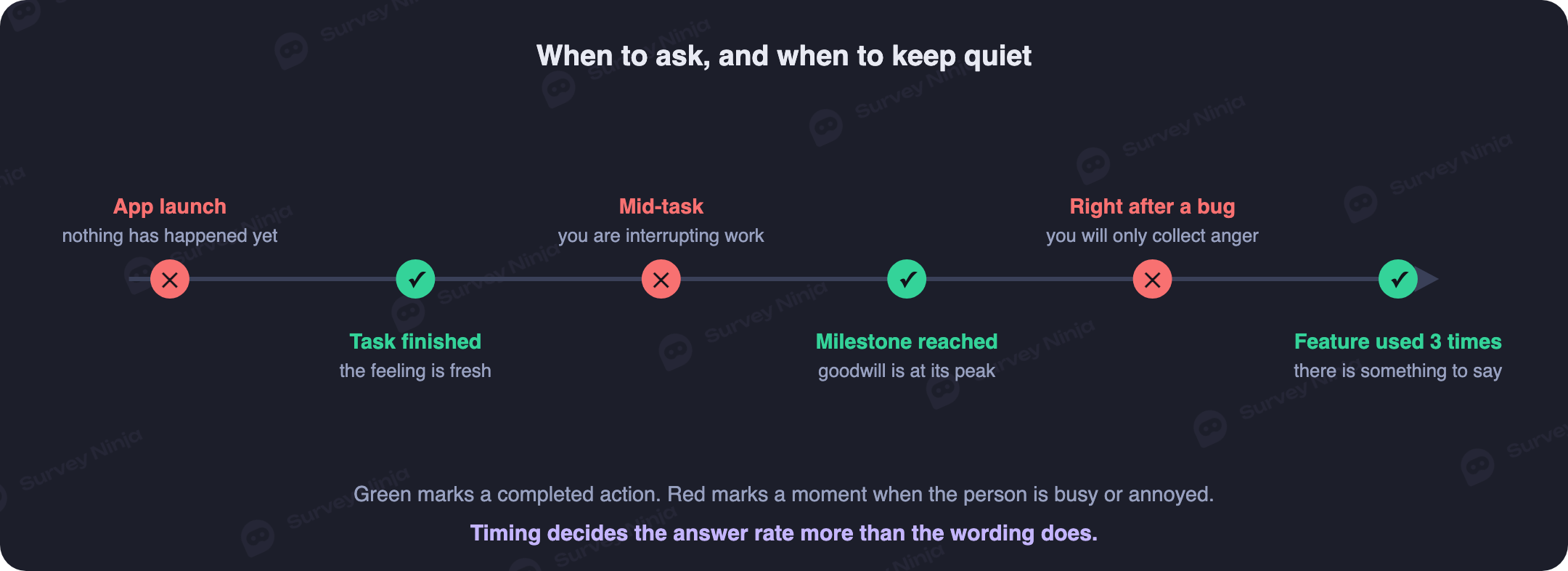
The strongest moment is the success screen: the payment went through, the file exported, the ride ended, the level finished. Attention is free because the task is done, and the memory of the flow is intact. Ask within a second or two of that screen appearing, not three screens later.
The second is a milestone rather than an action: the seventh session, the end of the first week, the first renewal. Milestones suit questions about the product as a whole, are the natural home for a periodic pulse survey, and guarantee the person has enough experience to have an opinion. The third is a resolved support thread, the cleanest trigger there is because the experience being rated has an obvious boundary, and where an effort question in the family of customer effort score beats a satisfaction score.
The bad moments are more instructive. Never ask on launch. A prompt on cold start interrupts someone who arrived with an intention and has not yet done anything, so there is nothing to give feedback about. It produces low answer rates, bad sentiment and sometimes the uninstall you were trying to prevent. A session opened from a push notification is the same case: the notification already spent your interruption budget.
Never ask mid-task. Not during checkout, not on a half-filled form, not during gameplay or video playback. Interrupting an unfinished task costs you twice: a dismissal instead of an answer, and higher odds the task is abandoned.
Two red zones are less obvious. The first is immediately after a crash. It is tempting, since you have a user with a strong opinion, but a rating there measures your error handling and invites a public complaint; what belongs after a failure is a narrow diagnostic question about what they were trying to do. The second is the paywall, because feedback collected next to a price is contaminated by the price. Users on a brand new build are a third case: they react to novelty rather than judging the product, so let a version settle before prompts resume.
The prompt patterns and where each fits
There are five common ways to surface a question in an app, each with its own level of interruption. Matching the pattern to the moment is what stops a feedback programme from feeling like a nag.
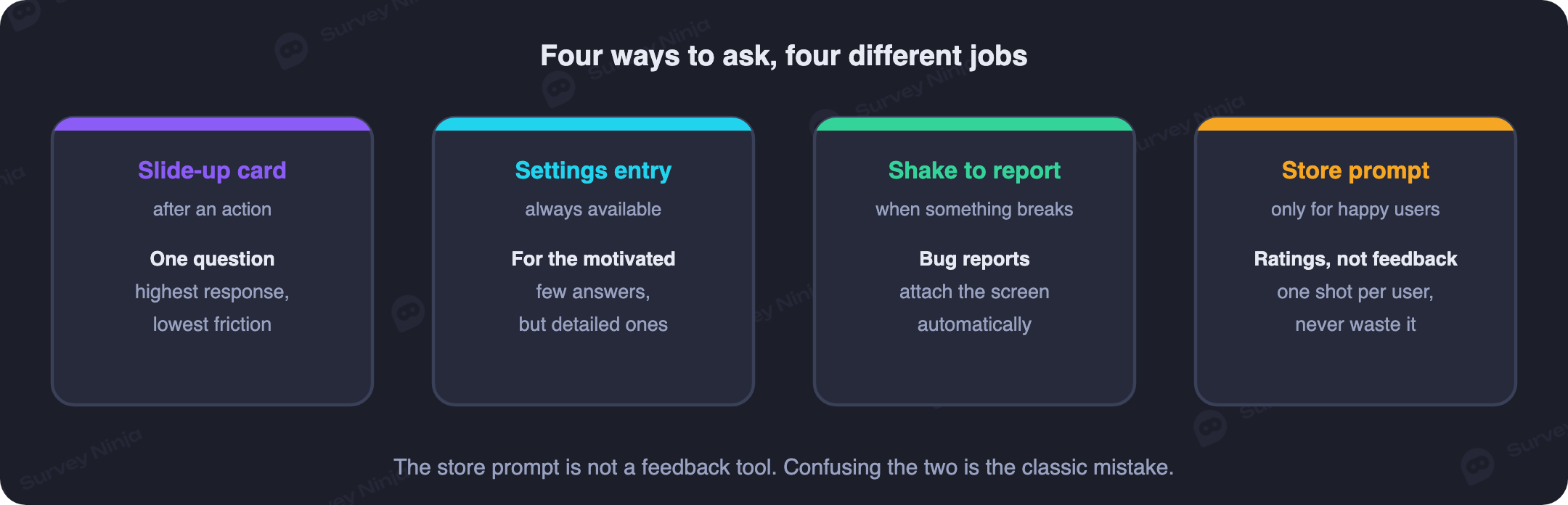
The slide-up card, or bottom sheet, is the workhorse: one question, no blocking of the content behind it, dismissed with a swipe. It is the right default after a completed action, because it respects the fact that the user might not want to talk today, and it has the best ratio of answers to annoyance here. That is why the microsurvey became the mobile standard.
The full-screen prompt takes the whole display. It earns higher completion once opened and costs far more when it lands wrong, so reserve it for terminal moments: a milestone, an onboarding wrap-up, a cancellation flow. Make it your default and users will close it reflexively within two weeks. The inline block is the opposite, a card between items in a scrolling feed. It never interrupts, and while volume is lower the answers are voluntary in a way that makes them useful.
The persistent entry point is a "Send feedback" item in settings or the help menu. It is passive, so the motivated minority dominates and the sample skews toward strong complaints and strong enthusiasm alike. It is still mandatory: every app needs a place a frustrated user can reach without leaving for the store, and the absence of one is a direct cause of one-star reviews that should have been a ticket. The shake gesture opens a report form when the device is shaken, which is excellent in beta builds and internal testing, especially with an automatic screenshot. In production it is niche: it has to be announced to be discoverable and needs a switch in settings, because accidental triggers annoy people.
| Pattern | Interruption | Best for | Questions it carries |
|---|---|---|---|
| Slide-up card | Low | Satisfaction right after a completed action | One, plus a conditional follow-up |
| Full-screen prompt | High | Milestones, onboarding wrap-up, cancellation | Two or three, with a visible end |
| Inline block in a feed | None | Slow-burning questions in content apps | One, self-contained |
| Settings entry point | None, user-initiated | Complaints, bug reports, feature requests | Free text plus a category |
| Shake to report | None, user-initiated | Beta builds, internal testing, power users | Free text plus a screenshot |
| Store review prompt | High, and quota limited | Users who already said they are happy | None, it collects a public rating |
Whichever pattern you pick, dismissal has to be trivially easy. A prompt with no visible close control converts a mild irritation into the exact public review you were trying to avoid.
Wording a question that fits a phone screen
The constraint nobody plans for is physical. A slide-up card gives you one short question and one row of answers before the fold or the keyboard eats the rest.
Keep the question under roughly sixty characters, and name the thing you are asking about. A bare "How are we doing?" returns an answer about something you cannot identify, while "How easy was it to send that transfer?" sets the scope and produces something comparable across thousands of responses. If the prompt fires on a specific screen, refer to that screen; at a milestone, refer to the app as a whole. Never mix the two.
Answer options have to fit one row with tap targets of at least 44 points, which caps you at five or six choices. A five-point scale, a row of faces or a thumbs pair all work. An eleven-point NPS row does not fit a narrow screen without shrinking cells below thumb size, so split it across two lines or move it to a roomier milestone prompt; the choice between relationship and transactional metrics is unpacked in CSAT vs NPS. Label both ends, because a bare row of numbers leaves people guessing.
Avoid writing the answer into the question. "Does the background music bother you?" plants the idea that it should; "How do you feel about the sound in the app?" does not. This leading question problem is worse in-app, because with a single question nothing else corrects for the bias. The checklist is in feedback form questions. Wordings that survive the space you have:
- How easy was it to finish that? A one-tap effort question, the best default after a completed flow.
- How would you rate this screen? Scoped tightly enough that the answer points at a specific piece of interface.
- What were you trying to do? The right question after an error, and the only one worth asking there.
- What is missing for you? An open question for a milestone, where people have the experience to answer it.
- What almost stopped you from finishing? Beats "any comments?" because it asks for something concrete.
How many questions in-app, and when to link out
Inside the app the realistic budget is one question plus one conditional follow-up. That is not a preference, it is what the screen and the moment support. Three is the ceiling, reserved for full-screen milestone prompts where the user already opted in by tapping something.
The pattern that buys both volume and depth is a two-step: the rating in the app, where the tap is nearly free, then the detail elsewhere. The follow-up branches, so a low score asks what went wrong and a high score asks what to keep. That is ordinary branching logic, and it doubles the value of a one-question prompt.
When you genuinely need five questions or more, link out to a web survey in an in-app browser. Carry the first answer across so nothing is asked twice, carry the context as URL parameters, and be honest about the length, because a promise of two questions followed by nine teaches users to ignore every prompt after it; the mechanics are in how to reduce survey dropout. Put the closed question first because it costs one tap, and keep the open question optional, a trade-off set out in open vs closed questions. Mandatory free text on a phone collects answers that read "asdf".
Routing negative answers to support, not the store
The moment a user taps a low score, you have a short window in which the problem is still yours to fix. What happens next decides whether it becomes a resolved ticket or a public review.
Branch on the score. A negative answer opens a follow-up asking what went wrong, then offers a real route to a human: a support thread, a bug report, a callback, with diagnostics attached automatically so nobody has to describe their device. A positive answer takes the other branch, and only there does a store review invitation make sense.
Two cautions keep this honest. The support offer has to be real, because routing detractors into a form that goes nowhere confirms their suspicion that nobody listens. And do not hide the unhappy path: suppressing negative feedback by removing the route out is a design both regulators and app stores dislike. The legitimate version is a fork where both branches lead somewhere useful and only one mentions the store. Done properly it raises your rating without gaming anything, because users who complain privately and get answered rarely complain publicly, and happy users asked at the right moment leave the review that would otherwise never exist.
Rate limiting, so nobody is asked twice a month
Every prompt spends a little goodwill. Frequency capping keeps the balance positive, and it belongs in code rather than in a document of good intentions, because the user who triggers your events most often is the power user you can least afford to annoy.
A workable set of rules: one prompt per user per thirty to sixty days, across all surveys, enforced globally rather than per campaign. After someone answers, extend that to ninety days at least. Treat dismissals as a signal, so one pushes the next eligible date out and two in a row suppress that user for six months. Set a minimum account age and session count so first-day users are never asked, and pause everything during an incident, when answers would measure your outage rather than your product.
Sampling is the underrated part: on a large base, showing the prompt to a fraction of eligible users gives you enough volume while leaving most of the audience untouched, and our note on sample size covers how much you need. Store eligibility state on the server, not only on the device, because local counters reset on reinstall and do not travel between a phone and a tablet, which is how someone sees the same prompt three times in a week. This is the operational face of survey fatigue, and it shows up as falling answer rates long before anyone complains.
Send the context you already have
The best question is the one you did not have to ask. Every fact attached automatically is a question removed from the prompt, which raises completion and improves accuracy at once, since your telemetry beats a user's recollection. Pass these as hidden fields, through your SDK or as parameters on the survey URL:
- App version and build. The most useful cut in mobile feedback, turning a vague drop in scores into "the 4.2 release".
- Operating system, version and device model. Half of all bug reports are resolved by this line alone.
- The screen where the prompt fired. Without it, "this is confusing" is unactionable.
- Account age, session count and plan. The same complaint means different things from a first-week user and a two-year subscriber.
- Locale and connection type. Slowness reports are often a network story rather than a code story.
- Whether the session contained an error. Separates "the app is fine" from "the app is fine when it works".
Two limits. Keep personal data out of URL parameters, since links get forwarded and logged, and pass an internal identifier that means nothing outside your systems. And be truthful about what you attach, because a prompt claiming anonymity while carrying an account ID is not anonymous; our note on anonymous surveys sets out what the word requires.
What to do with the answers
Feedback that lands in a dashboard nobody opens is a cost with no return. The route from a response to a change in the product has to exist before you turn the first prompt on.
Start with triage, ideally daily. Responses fall into a few buckets: a bug, a feature request, a usability problem, a pricing complaint, or noise. Bugs go straight to the tracker with version and device already attached, which is the payoff for hidden fields. Feature requests go into a themed backlog with counts, because the point of collecting hundreds of responses is knowing which request is common rather than which was phrased most vividly. Usability problems are the most valuable and the easiest to lose, arriving as sentences rather than tickets.
Then read the numbers by version and by screen. A score for the whole app is a vanity metric; split by version it tells you whether the last release helped, and split by screen it tells you where to send a designer. Group open text into themes with counts attached so the loudest comment does not outrank the most common one, a process covered in thematic analysis. Watch the prompt itself too: climbing dismissals are the earliest warning that you ask too often. Track response rate and completion rate separately, since a prompt opened but never finished is a different problem from one that is ignored.
Finally, close the loop, which is easier in a mobile app than anywhere else. Release notes that name what users asked for, an in-app note telling reporters a problem is fixed, a reply to the thread that began as a low score: all of it raises the answer rate of your next prompt, because people answer surveys from products that visibly listened last time. It also makes them less likely to voice the same complaint publicly, which is the quiet mechanism behind most rating improvements teams credit to feedback.
Common mistakes
- Using the store review prompt as your feedback tool. It collects a public rating, not information, and every wasted prompt is a promoter you cannot reach later.
- Asking on launch. The user has not done anything yet, so there is nothing to give feedback about.
- Interrupting an unfinished task. A prompt over a checkout costs you the answer and sometimes the purchase.
- Asking for a rating right after a crash. That measures your error handling and invites a one-star review.
- Eight questions in a card. The screen supports one plus a follow-up; anything longer belongs on a page you link to.
- No way out. A prompt that cannot be dismissed in one tap turns mild irritation into a public complaint.
- Asking what you already know. Version, device, plan and account age belong in hidden fields, never in questions.
- A cap stored only on the device. Reinstalls and second devices reset local counters, and heavy users get asked the most.
- Collecting and then going silent. Nothing kills next quarter's response rate faster than visible inaction on this one.
Building it without a research team
The engineering side is smaller than it looks. You need a trigger tied to a real event, a light surface to render the question, a rules layer that decides eligibility, and somewhere for answers to land with their context attached. Most teams have the first, build the second once, get the third wrong and skip the fourth.
The survey half needs no custom code. A hosted survey opened in an in-app browser handles the questions, branching, hidden fields and reporting, while your app keeps only the trigger and the rate limiting. That gets a programme live in days rather than sprints. Starting from a ready-made template removes most wording errors before you reach the timing ones, and the wider case sits in why product managers need surveys.
SurveyNinja covers that half: logic that routes low and high scores down different paths, hidden variables for app version, device and plan, mobile-first layouts that need no fixing, and filtered reports for comparing one release against the next. The free plan has no cap on responses, which matters more in mobile than anywhere else, because a prompt shipped to a large user base returns volume in hours and a quota is the wrong thing to hit mid release cycle; see the pricing page. Build the survey, wire it to one success screen, and start with a single question.
Frequently asked questions
What is in-app feedback?
A question asked inside a mobile or web app at a moment the product chooses, with the answer sent privately rather than published. Because the app knows what the user was doing, it can pick the timing, attach context such as app version and device automatically, and branch on the answer.
How is in-app feedback different from the app store rating prompt?
The store review prompt is an operating system dialog that writes a public star rating within a platform quota, and cannot be read or answered privately. An in-app survey is yours: you control when it appears, what it asks and where the answer goes, and it never touches your rating.
When is the best moment to ask for feedback in an app?
Right after a completed action, on the success screen, while attention is free and the task is fresh. Milestones suit questions about the product as a whole, and a resolved support thread suits an effort question. Never ask on launch, never mid-task, and never ask for a rating straight after a crash.
How many questions can you ask inside an app?
One, plus a conditional follow-up. Three is the ceiling, and only for a full-screen prompt at a milestone. If you need five or more, ask the rating in the app and link out to a web survey, carrying the first answer and the context so nothing is asked twice.
How often should the same user see a feedback prompt?
No more than once every thirty to sixty days across all surveys, extended to ninety days after someone actually answers. Count dismissals as a signal and suppress anyone who ignored two prompts in a row. Store eligibility state on the server, because device-local counters reset on reinstall.
What should happen when someone gives a negative answer?
Branch to a short follow-up asking what went wrong, then offer a real route to a human, such as a support thread or a bug report, with diagnostics attached automatically. Never send that user to the app store. The positive branch is the only place a review invitation belongs.
What data should be attached to an in-app response automatically?
App version and build, operating system and device model, the screen where the prompt fired, account age, session count, plan, locale and whether the session contained an error. Everything on that list is a question you no longer have to ask. Keep personal data out of URL parameters, and never label a response anonymous if it carries an account ID.
Which in-app prompt pattern works best?
A slide-up card carrying one question is the best default: low interruption, easy to dismiss, and the best ratio of answers to annoyance. Full-screen prompts suit milestones and cancellation only, inline blocks suit content feeds, and a permanent entry point in settings should exist in every app.
Updated: Sep 29, 2026 Published: Aug 13, 2026