


How to Create an Online Survey
Useful  Mike Taylor Updated: Sep 29, 2026 Reading time ≈ 21 min
An online survey takes about ten minutes to build. Building one whose answers you can actually act on takes longer, and nearly all of that extra work happens before you send anybody a link. That part decides whether the data is worth reading.
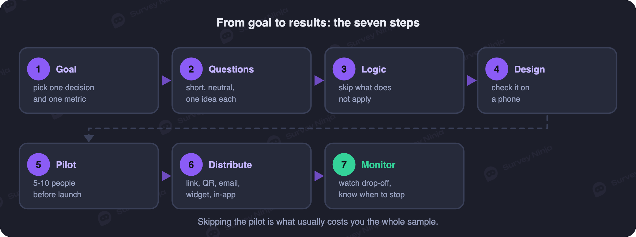
This article is the operational half of the job: choosing a goal and a metric, wording the questions, wiring the logic, checking the thing on a phone, piloting it, picking a distribution channel and turning the results into a decision. It skips the theory on purpose. If you need to know what a questionnaire actually is and where surveys get used, that ground is covered in our guide to what a questionnaire is, and the catalogue of formats sits in types of surveys and question types. Here we assume you roughly know what you want to ask and need a process. Seven steps, and the order matters more than it looks.
Step 1. Decide what you will do with the answers
Survey work does not start with questions. It starts with the decision you plan to make once the answers are in, and skipping that gives you a form about everything in general and a report nobody can act on. Compare two goals. "Understand what customers think" is not a goal, because when the responses arrive you will have no idea what to do with them. "Find out why people abandon onboarding on the second screen, so we can decide whether to rebuild it" is a goal, and it practically writes the question list for you. Put that sentence at the top of your draft and leave it there while you build.
The goal also picks your metric. Overall attitude to the brand is what NPS is for, satisfaction with one specific interaction belongs to CSAT, and the effort a person had to spend is CES; the trade-offs between the first two are laid out in CSAT vs NPS. If none of them fits, do not bolt an index on for the sake of having one, because two well-aimed open questions beat a borrowed metric. From here every question has to survive one test: what would I do differently depending on the answer? If there is no answer to that, cut it. This is the cheapest way to shorten a survey, and it costs no respondents.
Step 2. Write questions everybody reads the same way
Wording is where trust in the data is won or lost, because a question two people interpret differently produces numbers that look solid and mean nothing. Four habits cover most of it.
One idea per question. "Are you happy with our speed and our support?" is two questions wearing one coat, and somebody who loves the speed and hates the support has nowhere to go. Split it.
Neutral phrasing. Evaluative words lean on the answer. "How much did you enjoy our easy-to-use service?" has already told the respondent what you want to hear; "Rate how easy the service was to use, from 1 to 10" has not. Watch absolutes too, since "do you always check the dashboard" pushes people toward no.
Labelled scales. A bare 1 to 10 means different things to different people and to different cultures. Label the endpoints and keep the direction consistent across the whole survey; for agreement statements, follow the conventions in our Likert scale guide.
Mostly closed, with a little open. Closed questions count easily and open ones explain the counts, so the working ratio is a majority of closed plus one or two open near the end, a balance we unpack in open vs closed questions. Give people an honest exit too, since "not applicable" prevents invented answers, and be sparing with required fields, because forcing an answer mostly buys a guess or a closed tab. For a first draft to edit rather than accept, an AI question generator saves the blank-page stage.
Step 3. Wire the logic so nobody answers questions meant for someone else
Branching means each respondent sees only what applies to them: somebody who does not use the mobile app skips the whole app block, and somebody who rates you a 3 gets a different follow-up than somebody who rates you a 9. Our entry on branching logic covers the mechanics. This is not complexity for its own sake, it is how you keep the survey short for each individual without narrowing what it covers overall, and irrelevant questions are one of the top reasons people quit halfway. A screener at the start is worth adding too, so people outside your target group are politely ended rather than counted.
Then walk every branch, including the unlikely ones. Dead ends are the classic bug: a path where the respondent is stranded with no valid answer, or one where a whole group silently skips the question you built the survey for. Take each route yourself and choose the odd combinations on purpose.
Step 4. How many questions, and how long it should take
The rule is monotonous but reliable: the shorter the survey, the more people finish it. Rough brackets to plan against:
- Up to five questions. A pulse check, a single metric, quick feedback after an event. People answer these willingly.
- Six to ten questions. The sweet spot for most real studies, with room for a segmentation question and one open follow-up.
- Fifteen or more. Justified only for a motivated audience, an internal survey with visible sponsorship, or a genuine incentive.
Checking the real length is easy: take your own survey and time it. If it cost you eight minutes, budget roughly twelve for somebody who has not seen the questions before, and twelve minutes sits squarely in the zone where survey fatigue starts eating your data. Stating the honest duration in the invitation helps as well, since a promised two minutes that turns into nine is how you lose people for good.
Step 5. Open it on a phone before anyone else does
Most responses arrive from a phone, so the phone is where the survey gets reviewed, and before distribution rather than after the first complaints. Four things break predictably on a small screen.
- Matrix questions. A wide grid of statements against a scale is close to unusable at 375 pixels wide. Break it into single questions, even though that makes the survey look longer.
- Long option lists. Twenty radio buttons become endless scrolling. Group them, or turn the list into a search field.
- Cramped layout and small tap targets. Mis-taps are quietly destructive, because a wrong answer is indistinguishable from an honest one in your data.
- A missing progress indicator. Knowing how much is left is one of the cheapest ways to lift completion.
Check the last screen too: a thank-you page saying what happens to the answers costs one sentence and buys goodwill for the next survey. The wider set of fixes lives in our piece on how to reduce survey dropout.
Step 6. Run a pilot before you run the survey
A pilot survey is a small test run on five to ten people who resemble your real audience, and it is the step most teams skip and most regret skipping. Send it as though it were the real thing, through the channel you plan to use, so you test the invitation as well as the form. What you are looking for is not opinions about the design: watch for questions people read twice, answers that pile up on one option (usually a wording problem rather than a finding), open comments that answer a different question than the one you asked, and the time it really took.
Then do the thing almost nobody does and analyse the pilot data. Open the report, build the exact cut you intend to present, and see whether it works. This is where you discover that a multiple-choice question cannot be averaged, that your segmentation question has no "other" option, or that two answer choices overlap so respondents split between them at random. Finding that on ten pilot responses costs an afternoon. Finding it on eight hundred real ones costs the study.
The pre-launch checklist
Before anything goes out, walk this list. If one line is not true, the survey is not ready.
- The goal is written as a decision you will make from the results.
- Every question survives the "what would I do with this answer" test.
- Questions are short, single-idea and free of leading words.
- Every scale has labelled endpoints and a consistent direction.
- Irrelevant questions are hidden behind logic, and every branch has been walked.
- Sensitive and open questions sit near the end, demographics last.
- Required fields are the exception, not the default.
- The survey has been completed on a phone.
- The final screen thanks people and says what happens next.
- A pilot has run and its data has been analysed, not just glanced at.
- The target number of responses is calculated, not guessed.
- Time is booked to read the first responses on launch day.
Step 7. Distribute it, and remember the channel picks your respondents
There are five workhorse ways to get a survey in front of people, and they are usually combined rather than chosen. The thing to keep in mind is that each channel quietly selects a different slice of your audience, which makes distribution a sampling decision dressed up as a technical one.
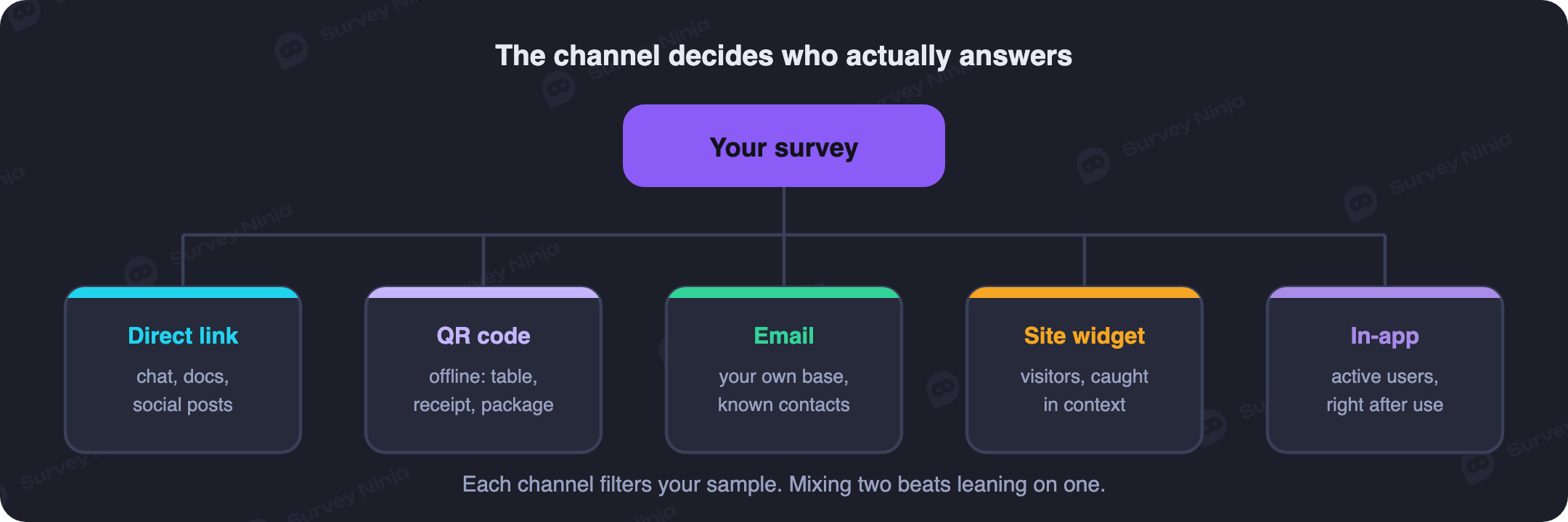
- A direct link is the most flexible option, dropping into a newsletter, a social post, a messenger or chat app, an SMS. The trade-off is that an open link tells you nothing about who answered and can collect duplicates and people outside your target group.
- A QR code bridges the offline world: a receipt, a table tent, packaging, an event badge. It reaches people who are physically present, close to the moment of the experience, which makes it excellent for feedback on a visit and useless for hearing from customers who stopped coming.
- Email is the only channel where you know exactly who was invited, can personalise the message and can follow up with people who stayed quiet. It also reaches only the part of your base that opens email, and the ones who answer lean toward the delighted and the furious while the mildly content say nothing.
- A website widget catches people mid-visit, triggered by a page or by time on site, so you hear from current visitors: not lapsed customers, and not those who bounced before it fired.
- An in-app prompt usually wins on response rate for product questions because it appears in context, right after the relevant action. It reaches active users only, which is exactly the group least able to tell you why other people churned.
So pick the channel that matches your question rather than the one that is easiest, then tag responses by source so you can compare them later. If the same question comes back differently by email and in-app, that gap is a finding rather than noise.
How many responses is enough, and when to stop collecting
"The more the better" is a bad target because it never tells you when to stop. The number you need depends on the size of the population, how precise you want to be and how split the answers are, so it is a calculation rather than a feeling, and our sample size calculator walks through it. The multiplier most people miss is segmentation: if you intend to compare plans, regions or tenure bands, each group needs its own usable base, so slicing four ways does not need one sample, it needs four. Decide on those cuts before you launch, and read up on segmentation if the groups are new to you.
Three sensible stopping rules, in order of preference. Stop when you hit the number you calculated. Stop when the numbers stabilise, meaning another hundred responses no longer move the percentages by anything you would act on. Or stop at the end of a fixed window, typically one to two weeks, so the data describes a single period. What you should not do is leave a survey open for months, because responses collected across different seasons, campaigns and product versions average into a picture of no particular moment.
Watch the first day of collection
Open the responses on launch day, while fixing things is still cheap. Everyone abandoning at the same question means that question is broken. An open field full of question marks and single characters means people did not understand what was being asked. One option taking ninety percent of the answers usually means the wording steered them there. Fixing a question on day one costs you a handful of responses, whereas finding the same problem at the end costs you a whole block of data. One caveat: editing a question mid-flight splits your dataset, since answers before and after the change are not strictly comparable. That is an argument for deciding fast, not for leaving a broken question alone.
What to do once the answers are in
A finished survey is not a result, and four moves turn one into a result. Start with distributions rather than averages on the closed questions, because an average of 7 hides whether everyone said 7 or half said 4 and half said 10, and those are different businesses. Then apply the cuts you planned in advance, since the interesting finding is almost always in a segment rather than the total. Read the open answers next and code them into themes, counting how often each theme appears so the loudest comment does not outrank the most common one; our guide to thematic analysis shows how to do that without drowning in text.
Then go back to the sentence you wrote in step 1 and answer it in one line. "We are rebuilding the second onboarding screen, because 61% of the people who dropped out named the same field" is a result; a deck of charts with no sentence in it is not. Finally, tell respondents what changed, which costs an email and is the difference between a survey programme and a one-off. Keep the wording of anything you plan to track, because changed questions cannot be compared across rounds.
Consent, anonymity and where the answers are stored
Collect only the fields you need. If you promise anonymity, that means not attaching responses to an email address or a user ID, and it also means watching for the combination of fields that identifies somebody anyway: department plus tenure plus age can name a person in a small company with no name field in sight.
Say plainly what happens to the data, who sees it and how long it is kept, ideally on the first screen. Where personal data is involved, privacy law such as GDPR expects a lawful basis and clear, freely given consent rather than a pre-ticked box, and plenty of organisations also have data residency rules about the region their respondents' data may sit in. Settle both before choosing a tool, because they are painful to retrofit once answers exist.
Common mistakes
- Starting from questions instead of from the decision. The most common failure, and the one that makes every later step harder.
- Asking everything because asking is free. A long form has no marginal cost for you and a real one for the respondent.
- Leading wording and unlabelled scales. Both produce numbers that look clean and cannot be trusted.
- Making every field required. This does not raise data quality, it manufactures guesses.
- Skipping the phone check and the pilot. Two short steps that catch most of what would otherwise ruin the dataset.
- Choosing the channel by convenience. Emailing the whole base when the question is about first-time visitors gives you a confident answer from the wrong people.
- Collecting and then doing nothing. The answers age fast, and respondents remember that last time nothing happened.
Where to build it
For a two-question form, a free general-purpose form tool is fine. The ceiling arrives quickly though: branching logic, proper rating and NPS scales, filtered analytics, response tagging and control over where data is stored are the point where a general tool stops being enough and a dedicated builder starts paying for itself. Keep the cost comparison honest, since a paid plan generally costs less than an hour of the analyst time it saves in a month, and the current tiers are on the pricing page. Starting from a ready-made template also removes most of the wording mistakes above, because those questions have already been tested on other people.
SurveyNinja covers this whole workflow in one place: branching logic, labelled scales, a mobile layout you do not have to fix, source tagging by channel and reports with segment filters, whether you are building a survey in the form builder or a scored knowledge check in the quiz maker. The free plan has no limit on the number of responses, so a pilot and a real launch never compete for the same quota. Create your survey and put the seven steps to work on your own audience.
Frequently asked questions
How do you create an online survey step by step?
Write down the decision you will make from the results, pick a metric that fits it, word the questions so everyone reads them the same way, add branching so nobody answers irrelevant questions, keep the length honest, review the survey on a phone, pilot it on five to ten people, then distribute it through the channel that reaches the right group and read the first responses on launch day.
Can you create an online survey for free?
Yes. SurveyNinja has a free plan with no limit on the number of responses, plus branching logic, rating scales and ready-made templates, which is enough for most small and medium studies. Paid plans exist for heavier analytics and team work, not for the privilege of collecting answers.
How many questions should a survey have?
Six to ten covers most objectives. Up to five is right for a pulse check or a single metric. Fifteen or more only works with a motivated audience or a real incentive, because completion falls steadily as the form grows.
How many responses do you need before you can trust the results?
It depends on the size of your audience, the precision you need and how split the answers are, so it is worth calculating rather than guessing. The factor people forget is segmentation: if you plan to compare four groups, each group needs its own usable base, not the total.
What is a pilot survey and do you really need one?
A pilot is a small test run on five to ten people who resemble your real audience, sent through the channel you plan to use. It catches confusing wording, broken logic branches and questions whose answers cannot be analysed. Analyse the pilot data rather than skimming it, because that is where unanalysable questions reveal themselves.
Which distribution channel gets the most responses?
In-app prompts and website widgets usually win on response rate because they appear in context, while email wins on knowing exactly who was invited. Response rate is the wrong thing to optimise alone, though, since each channel reaches a different slice of your audience. Pick the one that reaches the people your question is about.
How do you make a survey anonymous?
Do not collect identifying fields, and turn off any link between responses and an email address or user ID. Watch the combinations too, because department plus tenure plus age can identify somebody in a small company even with no name collected. Say on the first screen what is stored and who sees it.
How long should you keep a survey open?
Usually one to two weeks, or until you reach the number of responses you calculated. Leaving it open for months mixes different seasons, campaigns and product versions into one average that describes no particular moment.
Updated: Sep 29, 2026 Published: Aug 5, 2026