


How to Do Descriptive Analysis on Survey Data
Useful  Mike Taylor Sep 1, 2026 Reading time ≈ 27 min

Descriptive analysis is the set of numbers and charts that describe the data you collected: what people said, how often, and how spread out their answers were. It does not explain why, and it says nothing about anyone who did not respond.
That boundary sounds obvious written down. It gets ignored constantly. The moment a report says "62% of users want this feature," someone in the room treats it as a fact about the whole market. It is not. It is a fact about the people who answered a specific question on a specific day, nothing more. Everything in this guide, from picking the right average to knowing when to stop and call a statistician, follows from taking that boundary seriously.
The most common way practitioners break it is smaller and quieter than overclaiming about the market. It is reporting a single average and calling the analysis done. A mean by itself hides more than it reveals. On the wrong kind of data it is not just incomplete, it is dishonest. That argument runs through every section below.
What descriptive analysis actually does, and where it stops
Descriptive analysis has exactly three jobs. Summarize the middle of a variable with one number. Show how spread out the responses are around that number. Describe the shape of the distribution, so you know whether the middle number is even a fair summary. That is the whole toolkit: central tendency, spread, and shape, applied to data you already have in hand.
What it cannot do is just as short a list. It cannot tell you why people answered the way they did, because correlation and pattern are not explanation. It cannot tell you anything about people who never took the survey, no matter how confident the wording sounds. Nor can it tell you whether a difference between two groups is real or just noise from a small sample. That question belongs to inferential statistics, covered near the end of this guide.
Practitioners cross this line without noticing. A satisfaction score goes up two points after a product change, and the writeup says the change worked. Descriptively, all you know is that the score went up. Three separate questions hide behind that claim. Did the change cause it? Is the increase bigger than random month-to-month wobble? Would it hold for customers who never answered? Descriptive statistics cannot answer any of them on their own. Keep the claim to what the data actually shows: the score for these respondents, in this period, went up by this much. That sentence survives scrutiny. The causal version usually does not.
Mean, median, or mode: the number that tells the truth
Central tendency asks one question: what is a typical answer here? Three statistics answer it, and picking the wrong one produces a number that is technically correct and practically misleading.
The mean adds every value and divides by how many there are. It uses every data point, which sounds like a strength. It is, right up until one or two extreme values pull it away from where most people actually sit. The median is the middle value once everything is sorted, so half the responses sit above it and half below. Extreme values barely move it, which is exactly why it survives outliers. The mode is simply the most common answer. It is the only one of the three that means anything for a question where people pick one option from a list rather than a number on a scale.
Here is where the choice stops being academic. Say you just closed a 372-response survey about a redesigned checkout flow for an online store. The numbers below are invented for this walkthrough, not a real study, but the shape of the problem is not invented at all. One open question asked how many minutes checkout took. Most shoppers answered somewhere between one and fifteen minutes, and the middle of that group sits at four minutes. Four shoppers, though, reported 180, 240, 300 and 420 minutes, almost certainly because they left the tab open and paid later. Those four numbers alone drag the mean up to seven minutes.
Now the decision. If leadership reads "average checkout time: seven minutes" and schedules an emergency redesign sprint, they are solving a problem four people had. The median, four minutes, matches what the other 368 shoppers actually experienced, and it says the flow is fine for nearly everyone. Reporting the mean here is not a rounding error. It is describing the wrong population's experience and calling it typical.
The same survey asked which device people checked out on: mobile, desktop, or tablet. You cannot average those. "Mobile plus desktop divided by two" is not a number. Device is a label, not a quantity. The mode is the only honest summary, and in this dataset it is mobile, chosen by 210 of 372 shoppers. That single fact, that most checkouts happen on a phone, matters more for a design decision than any mean ever could on this question.
A rule of thumb that holds up: reach for the median whenever a few extreme values could exist, which is most of the time with money, time, and anything self-reported. Reach for the mean when the scale is a genuine quantity and the distribution looks reasonably even. Reach for the mode whenever the question was pick-one, full stop, because it is the only statistic on that data that survives translation into a decision.
Spread: the statistic most reports skip
A mean without a measure of spread is half a sentence. The missing half usually carries the actual finding, and skipping it is the single most avoidable mistake in this whole field.
Picture two rooms after a training session, each asked to rate it from zero to ten. In the first room, every single person answers seven. In the second, three people answer three and four answer ten. Average those two rooms and you get seven both times. Same mean, two completely different sessions. One room is uniformly, mildly satisfied. The other is split between people who hated it and people who loved it, and averaging those two camps together erases the split instead of reporting it. Anyone who reads only the mean walks away thinking both trainings landed the same way. They did not.
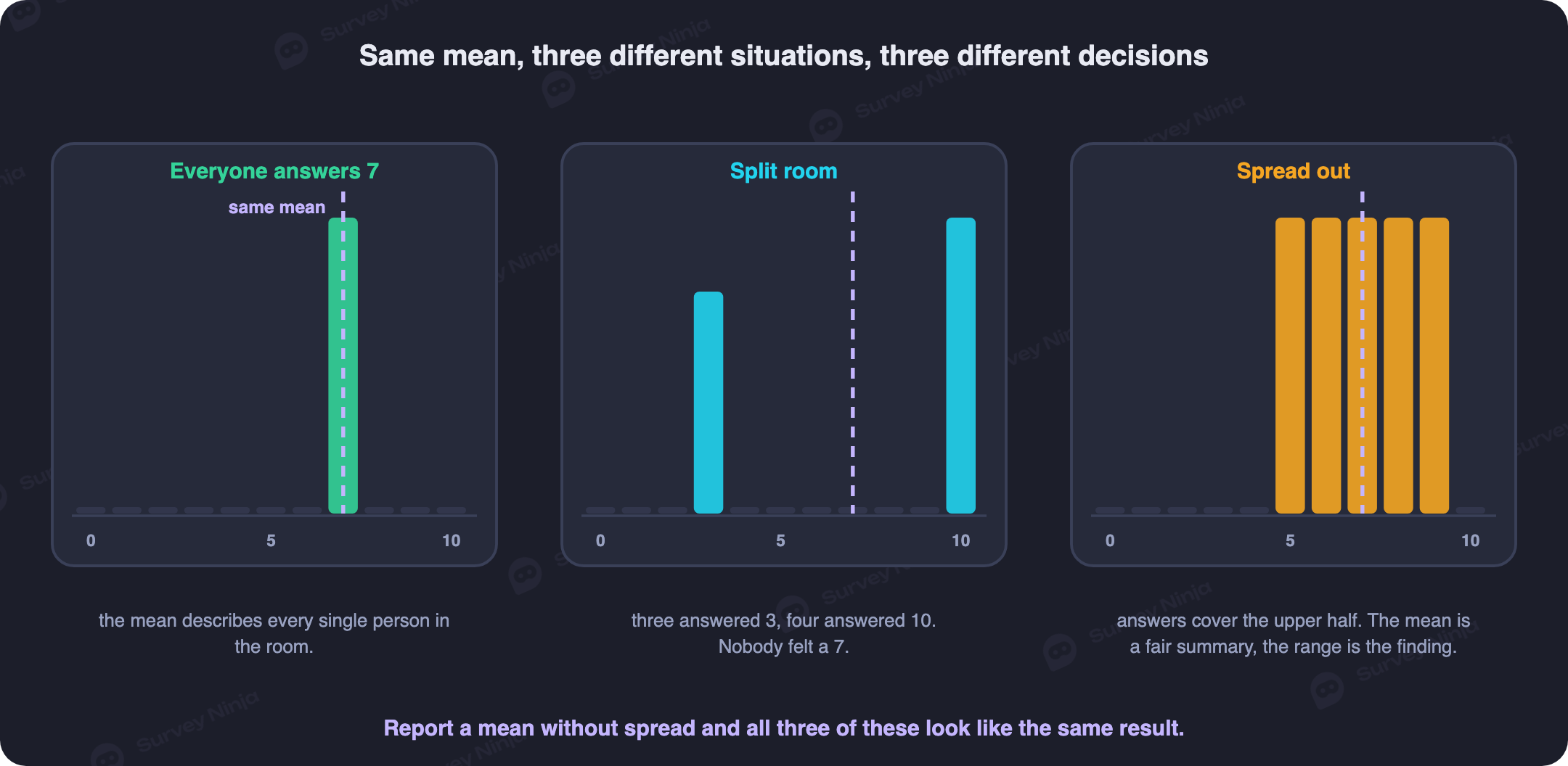
Three statistics describe spread, each doing slightly different work. The range is the highest value minus the lowest. It is quick to compute and easily wrecked by one strange answer. The interquartile range is sturdier. Sort the data, find the value a quarter of the way through and the value three quarters of the way through, then subtract the first from the second. That gap covers the middle half of your responses and mostly ignores outliers, which is why it pairs so naturally with the median. The standard deviation measures how far, on average, individual answers sit from the mean, and it is the standard companion to the mean itself. A tight cluster produces a small standard deviation. A room split between opposite extremes produces a large one even when the average looks calm.
Back to the checkout survey. Overall satisfaction with the new flow averaged seven out of ten, a fine-looking number on its own. Split by device, mobile and desktop both averaged close to seven as well, so a mean-only report would call the experience consistent across devices. It was not. On mobile, 40% of shoppers rated the flow a three and 60% rated it a ten, with almost nobody choosing anything in between: a bimodal split, not a happy middle. On desktop, most ratings landed between six and eight, a genuinely tight cluster around the average. Same mean, same device count in the same survey, two completely different stories, and only the spread tells them apart. The mobile checkout needs a fix for a specific unhappy segment. The desktop checkout does not need fixing at all.
Distribution shape: what the curve tells you to do next
Spread tells you how wide the data is. Shape tells you which way it leans, and that shape should change what you do next, not just how you describe the chart.
A normal-ish distribution clusters around the middle and tapers off evenly on both sides. It is the shape that makes the mean and standard deviation trustworthy together. When you see it, report both and move on with confidence. A right-skewed distribution has a long tail stretching toward high values, common in anything involving money, time, or counts. Most people spend a little, a few spend a lot, and that tail pulls the mean above where most respondents actually sit. Report the median here, and mention the tail separately if it matters. A left-skewed distribution is the mirror image: a long tail toward low values with most responses bunched near the top, which shows up in things like completion percentages on an easy task.
Bimodal means two humps rather than one, exactly what the checkout satisfaction scores on mobile looked like. A single average describing a bimodal distribution is actively misleading, because no respondent actually sits near that number. The moment you see two peaks, the real analysis is finding what separates the two groups, not reporting the number between them.
The shape practitioners meet most often on satisfaction questions is the ceiling effect. Almost everyone picks the top one or two options on a scale, and the bottom of the range sits nearly empty. It looks like great news, and often is, but it also compresses your ability to detect change. Say 90% of respondents already answer "satisfied" or "very satisfied." A product change that actually helps has very little room left to move the average, so a small dip can look alarming even when it just reflects the same crowded ceiling shifting slightly. Watch the shape of a satisfaction question over time, not just its mean, or you will misread ordinary compression as a real swing.
Data types: which statistic each scale can honestly support
Not every statistic is legitimate on every kind of data, and this is where the most common professional shortcut lives.
Nominal data is a label with no order: device type, referral channel, plan tier. Only counts, percentages, and the mode make sense here. Ordinal data has a meaningful order, but the gaps between points are not guaranteed to be equal. A five-point agreement scale is the textbook case. The distance between "disagree" and "neutral" is not provably the same as between "agree" and "strongly agree." The honest statistics for ordinal data are the median, the mode, and percentages by category. Interval data has equal, meaningful gaps but no true zero, and it is rare in survey work outside of things like calendar dates. Ratio data has equal gaps and a real zero, like minutes to complete checkout or number of sessions. It is the one type where the mean and standard deviation are unambiguously correct.
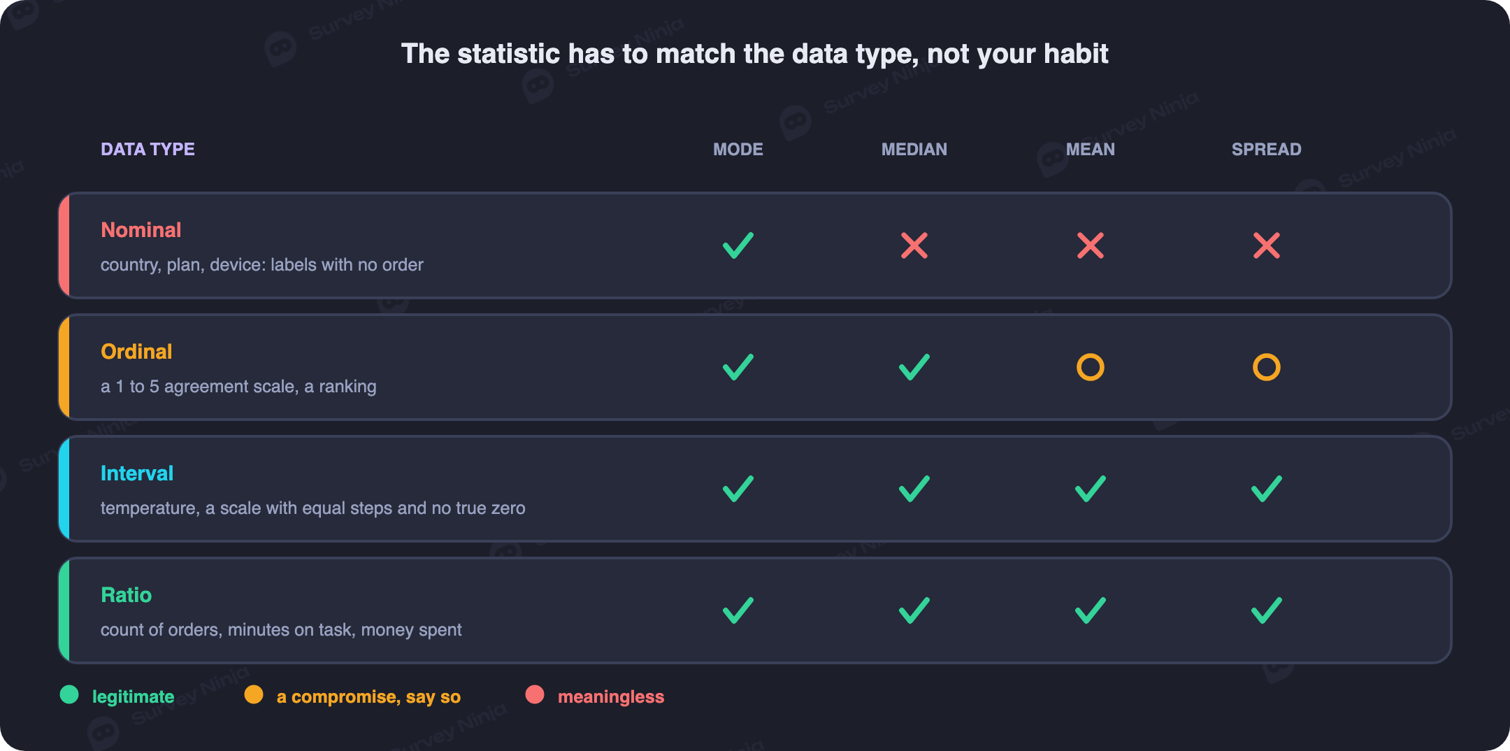
| Data type | Example question | Legitimate | Avoid |
|---|---|---|---|
| Nominal | Which device did you use? | Mode, frequency counts, percentages | Mean, median, standard deviation |
| Ordinal | Agreement scale, 1 to 5 | Median, mode, percentages by category | Mean treated as exact, without the distribution alongside it |
| Interval | Calendar year of a milestone | Mean, median, standard deviation | Ratios like "twice as much," since zero is not a true absence |
| Ratio | Minutes to complete checkout | Mean, median, standard deviation, IQR, ratios | Nothing, all standard statistics apply |
The uncomfortable case is the one every survey tool ships with anyway: the Likert scale. Coding "strongly disagree" through "strongly agree" as 1 through 5 and averaging the result technically applies an interval statistic to ordinal data. Strictly speaking, that is a compromise, not a clean fit. The field runs on this compromise anyway, because a five-category ordinal distribution is genuinely hard to summarize any other way in a single number. The cost is real. The mean implies the gap between 2 and 3 equals the gap between 4 and 5, which nobody actually validated. Pay for the convenience by never reporting the mean alone. Report it next to the full distribution, or next to the standard deviation, so a reader can see whether "3.8 average" means everyone landed near 4 or a crowd split between 2 and 5. Our full breakdown of scoring and wording choices is in the Likert scale guide, and the closed-question mechanics behind the nominal row above are covered in open versus closed questions.
Percentages and proportions: two quiet ways they mislead
A percentage feels more solid than it is. Two failures account for almost every misleading one you will meet in survey work, and both are easy to miss because the number itself looks perfectly clean.
The first is a tiny base dressed up as a finding. In the checkout survey, filtering down to Enterprise-plan customers leaves just 11 respondents, and 8 of them, 73%, said they were extremely satisfied. Seventy-three percent sounds authoritative. It describes eight people. Move one of them into the unhappy column and the number drops to 64%. Move one the other way and it jumps past 80%. A single response is doing that much work. Always report the base count next to the percentage. "73% (n=11)" tells the truth in five characters that "73%" alone hides completely.
The second failure hides the base rather than shrinking it. "70% would recommend us" invites a question: 70% of whom? Everyone invited, or only the people who bothered to answer? Say the survey went to 1,000 customers and 200 replied. That 70% describes 140 people, off a 20% overall response, and a further, separate question is whether the 800 who stayed silent look anything like the 200 who spoke up. This is exactly how top-two-box metrics like CSAT get reported: the percentage choosing the top categories on a satisfaction scale. That number is legitimate and useful, but only once it is paired with how many people it was calculated from. Our comparison of the two most common satisfaction metrics is in CSAT versus NPS. Report n every time a percentage appears in a document. No exceptions, not even for numbers that look too obviously true to need it.
Charts and tables: matching the picture to the data
The right visual depends on what kind of statistic it is carrying, and getting that match wrong is how a correct number still communicates the wrong idea.
Nominal and ordinal frequencies belong in a bar chart, one bar per category, sorted by count rather than alphabetically unless the categories already have a natural order like a rating scale. A pie chart works only up to three slices. Past that, human eyes cannot reliably compare wedge angles. A pie with seven near-equal slices looks like a puzzle rather than an answer. Distributions of a continuous ratio variable, like the checkout-time data, belong in a histogram instead, the only chart type built to show shape rather than just rank.
Charts and tables are not competitors. They solve different problems. A bar chart wins for comparison, because a reader spots the tallest bar in under a second, faster than scanning a column of numbers. A table wins for lookup: a reader who needs the exact value for tablet respondents in March wants a cell, not an estimate read off a bar's height. Use a chart for the headline finding, and a table right after it for anyone who needs the precise numbers behind that picture.
Two axis tricks turn an honest number into a misleading picture, and both are common enough in vendor decks to watch for deliberately. Truncating the y-axis so it starts at 60 instead of zero turns a real but modest three-point gain into a bar that looks twice as tall. Stretching the x-axis while compressing the y-axis exaggerates a trend line's slope without changing a single underlying number. Neither trick touches the data. Both change what a reader concludes from it. That is the entire point of a chart, so build every axis from zero unless there is a stated, visible reason not to.
Cleaning the data before you compute anything
Every statistic above assumes clean input, and that assumption is usually wrong on the first export from your survey tool. Cleaning comes first, and skipping it quietly poisons every number that follows.
Start by removing duplicates. These happen more than people expect, when a link gets shared twice or a respondent double-submits after a slow save. Next, flag straight-lining: a respondent who picked "4" on every single item of a twenty-question grid answered fast, not honestly, and including them inflates your ceiling effect while adding nothing real. Check completion status separately from response count, too. A survey tool that counts partial responses as completed will overstate your sample size and understate your dropout, and the two problems compound. Finally, sanity-check the ranges on open numeric fields. A "minutes to complete checkout" field with a value of 0 or 9999 is a data entry event, not a customer experience, and belongs in a short exclusions note rather than in your mean.
None of this is glamorous, and none of it shows up in the final report. It is also the single step most responsible for whether the numbers that do show up are true.
A full walkthrough: from frequencies to a written finding
With cleaning done, the order of operations is the same on almost every survey: frequencies first, then central tendency and spread, then cross-tabs, then the writeup. Running it once on the checkout survey shows how the pieces fit together.
Frequencies first. Before computing a single average, count how often each answer occurred on every question. This catches problems central tendency alone would hide. It is where you would first notice, for instance, that only 14 of 372 respondents checked out on a tablet, a number that matters for everything that follows.
Central tendency and spread together. For the checkout-time question, that means the median (four minutes) alongside the mean (seven minutes) and a one-line note about the four outliers, not one number standing alone. For the ordinal item asking whether checkout was easy, the responses split 8 strongly disagree, 19 disagree, 54 neutral, 151 agree, and 140 strongly agree, a mean of about 4.1 with 78% landing in the top two categories, reported together rather than as a bare average.
Cross-tabs. This is where a finding usually gets sharper, and where sample size quietly runs out. Splitting the top-two-box "easy to check out" rate by device shows mobile at 79%, desktop at 80%, and tablet at 57%, on base sizes of 210, 148, and 14. The first two numbers are solid. The third is 8 people out of 14. Slice it further, say by first-time versus returning shopper, and those 14 fall into cells of six or seven. That is too small for any conclusion beyond "the tablet number needs more responses before anyone acts on it."
| Device | Respondents | Top-two-box, easy to check out |
|---|---|---|
| Mobile | 210 | 79% |
| Desktop | 148 | 80% |
| Tablet | 14 | 57% (too small to act on) |
The writeup. Everything above compresses into a few honest sentences instead of a wall of numbers. "Checkout takes a median of four minutes; a small group of four respondents reported far longer sessions, likely due to abandoned and resumed carts. Mobile and desktop shoppers report similar ease of checkout (79% and 80% top-two-box), while satisfaction on mobile splits sharply between very unhappy and very happy users rather than clustering in the middle, worth investigating before the next release. The tablet segment is too small, 14 respondents, to draw a conclusion yet." One survey, four kinds of statistic, and a paragraph a non-technical stakeholder can act on without reading a single raw number. Building a clean instrument in the first place makes every step above easier, and the fundamentals of question and flow design are in how to create an online survey.
Doing this in a spreadsheet
Nearly all of the above runs on a handful of spreadsheet functions, in Excel or Google Sheets alike. AVERAGE gives the mean. MEDIAN gives the median. MODE.SNGL (or plain MODE in older versions) gives the single most common value. STDEV.S computes the standard deviation from a sample, which is what survey data almost always is. QUARTILE.INC with an argument of 1 and 3 gives the 25th and 75th percentiles; subtract one from the other for the interquartile range. COUNTIF and COUNTIFS build the frequency counts that should come first, counting how many rows match one condition or several at once.
For cross-tabs, a pivot table beats a wall of nested COUNTIFS every time. Drag the grouping variable, device in the checkout example, into rows. Drag the question you are analyzing into values, and set it to count or average as needed. The base size for every cell sits right next to the statistic, which is exactly the habit that catches a 14-respondent tablet cell before it makes it into a slide. If your survey tool exports straight into a spreadsheet or a connected sheet through an integration, this entire section becomes five minutes of dragging fields rather than an afternoon of formulas. SurveyNinja's own reporting view computes frequencies, central tendency and cross-tabs automatically as responses come in, worth knowing before you rebuild that logic by hand.
Common mistakes that undermine a descriptive report
- Reporting a mean with no spread. A single average hides whether everyone agreed or the room was split down the middle, and those are opposite findings wearing the same number.
- Comparing groups of wildly different sizes. A 79% from 210 respondents and a 57% from 14 are not comparable. They carry completely different amounts of noise.
- Slicing a small sample until the cells are empty. Cross-tabbing by device, then by plan, then by tenure looks thorough and produces cells of two or three people, from which nothing can honestly be concluded.
- Treating a top-two-box percentage as if it were a mean. The share of respondents who chose the top categories on a scale is a proportion, not an average, and the two answer different questions even when they come from the same data.
- Reporting a difference smaller than the noise. A two-point gap between two groups of 20 respondents each is well within normal sampling wobble, and calling it a finding without checking that is the most common overclaim in this entire field.
Where descriptive analysis ends and inferential begins
Every example in this guide describes the people who actually answered. The moment you want to say something about people who did not, you have left descriptive analysis, whether the report admits it or not.
"Checkout satisfaction averaged seven out of ten among our 372 respondents" is descriptive, true by definition. "Checkout satisfaction across our customer base is around seven out of ten" is an inference. It claims something about people who were never asked. Making that claim honestly requires tools this guide has not covered: a confidence interval around the estimate, a stated margin of error, and a check for statistical significance before calling any group difference real rather than noise. All three depend on how the sample was drawn in the first place. That is why probability sampling matters more than most teams assume, and why the sample size calculator is worth using before a survey goes out rather than after.
Keep the two apart in every document you write. Describe what you found, in the plainest language the data supports, and mark clearly the moment a claim starts reaching past your respondents. Readers trust the second kind of claim less when the first kind was made carelessly right next to it.
Frequently asked questions
What is descriptive analysis in simple terms?
It is summarizing data you already collected: the typical answer, how spread out responses were, and what shape the distribution takes. It describes what happened in your sample and stops there, without explaining causes or extending to people who were not surveyed.
When should I use the median instead of the mean?
Use the median whenever a few extreme values could exist, which covers most self-reported time, money, and count data, and whenever the data is ordinal, like a ranked or agreement scale. The median barely moves when an outlier appears, while the mean can shift substantially from a handful of unusual responses.
Is it acceptable to average a Likert scale?
It is common practice and a real compromise rather than a clean fit, since coding categories as 1 through 5 assumes equal gaps between them that were never confirmed. Report the mean alongside the full distribution or the standard deviation so a reader can tell whether it reflects genuine agreement or a split crowd.
Why does standard deviation matter if I already have the mean?
Because two groups can share an identical mean while looking nothing alike: one uniformly moderate, one split between very unhappy and very happy respondents. The standard deviation is what tells those two situations apart, and skipping it is how a real problem stays invisible inside an average-looking number.
How small a sample is too small for a cross-tab cell?
There is no universal cutoff, but once a cell drops under roughly 30 respondents, treat any percentage from it as directional rather than reliable, and once it drops into the single digits, do not report a percentage from that cell at all. Report the count instead and say more data is needed.
What is a ceiling effect and why does it matter?
It is when almost every respondent picks the top one or two options on a scale, leaving the bottom of the range nearly empty. It compresses how much an average can move even when a real change happened, so a small dip in a heavily ceiling-affected score can look alarming while reflecting the same crowded distribution shifting slightly.
How many categories can a pie chart show before it stops working?
Three, as a practical ceiling. Beyond that, comparing wedge angles by eye becomes unreliable, and a bar chart sorted by count communicates the same frequencies far more clearly with any number of categories.
When do I need inferential statistics instead of descriptive?
The instant a claim reaches past the people who actually answered, whether that means estimating a population value, comparing two groups and asking if the gap is real, or projecting a trend forward. Descriptive statistics describe your sample; inferential statistics are what let you say something, carefully, about anyone beyond it.
Published: Sep 1, 2026