 25 Questions for a Travel Agency Customer Satisfaction Survey
How to Use Correlation on Survey Data Without Fooling Yourself
Useful  Mike Taylor Updated: Sep 29, 2026 Reading time ≈ 23 min

Two questions in your survey move together. That is the entire claim a correlation coefficient makes, and most teams read four or five extra claims into it. Survey data breaks correlation in specific, predictable ways, and knowing which ones apply to your dataset is most of the skill.
The arithmetic is not the hard part. Paste two columns into our Pearson correlation calculator and you have r, r squared and a p value in a second. Judgment lives everywhere else: whether the two columns should be compared at all, and what sentence you may write under the result.
This assumes the definition, which our glossary entry on correlation analysis covers. What follows sits on top of it, aimed at questionnaire data.
What a correlation actually claims, and what it does not
A coefficient answers one question: how well does a straight line describe the cloud of points when you plot answer A against answer B. Everything else people attach is an addition, usually unearned.
It carries no slope in real units. An r of 0.6 between a support rating and a recommendation score says nothing about how many NPS points you gain per point of support. That is a regression slope, and usually the number finance wanted.
It carries no direction of cause. None. The r of A with B equals the r of B with A, down to the last decimal. Any arrow you draw comes from your head.
It says nothing about subgroups. An overall 0.4 can be 0.7 among new customers and 0.05 among long tenured ones, and it can flip sign inside segments while staying positive overall.
And it says nothing about whether the link matters. An r of 0.15 across forty thousand respondents is wildly significant and commercially irrelevant, a distinction our entry on effect size covers. And 0.5 does not mean half. Square it. You get 0.25, the variance the two answers share.
Two survey items, or a survey item and an outcome
There are two fundamentally different correlations you can run on survey data. Teams run the first because it is free.
Item to item. Both numbers come from the same questionnaire, the same person, the same sitting. Trivially easy, since the columns already sit side by side in the export, and the most contaminated numbers you will ever produce.
They are useful for one job: understanding the structure of your questionnaire. Which items cluster. Which ask the same thing twice. Whether your six drivers are one halo wearing six labels.
Item to outcome. One number comes from the survey, the other from billing, product logs or the CRM. Did they renew. How many tickets did they file. You join the two on a respondent identifier.
Harder to set up, worth every hour. The two ends no longer share a method, a mood, a scale or a session, so most of the artificial inflation disappears. Expect smaller coefficients: that is what the relationship looked like all along.
One tension worth naming. Joining to behavioral records needs identified responses, and identification changes what people write. You can have the join or full anonymity. Decide before you field.
Likert data: Pearson, Spearman, and why the argument never ends
Pearson's r assumes interval scaling: the gap between 2 and 3 equals the gap between 4 and 5. A Likert scale does not guarantee that, since the distance from "disagree" to "neutral" is not obviously the distance from "agree" to "strongly agree." Likert answers are ordinal. Strictly, Pearson on them is wrong.
Almost everyone does it anyway, and the results are usually fine. Simulation work suggests Pearson on a 5 or 7 point scale recovers something close to the true relationship when distributions are not badly skewed. The violation is real, the damage often small.
So ask when the choice changes your answer. Reach for Spearman when the scale has three or four points rather than seven. When a distribution is heavily skewed, which in satisfaction research means almost always. When a few extreme respondents are doing the work. When the relationship looks monotonic but bent. Spearman correlates ranks, so scale point spacing stops mattering.
Run both. It costs nothing. Pearson 0.52 against Spearman 0.49, report either and move on. Pearson 0.61 against Spearman 0.38, and something is distorting the linear fit: you have a finding rather than a coefficient.
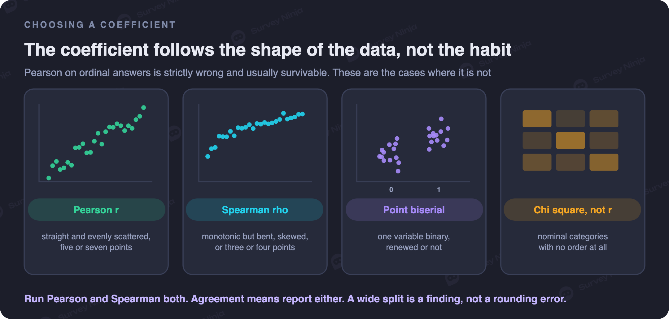
Two edge cases get handled badly. When one variable is binary, renewed or not, and the other is a rating, you want the point biserial coefficient, arithmetically Pearson with the binary coded 0 and 1. When both are nominal categories, the job belongs to a chi square test instead. For scales that behave in the first place, see our guide to Likert scales.
How many responses before r means anything
Most correlation articles skip this. It changes more decisions than anything else here.
A coefficient from a small sample is not slightly imprecise. It is unstable, far more so than intuition suggests. Draw two random columns of forty numbers with no relationship and you will fairly often see an r near 0.3 out of luck. That number gets presented in monthly reviews as a finding.
So put an interval around every coefficient. Below, the 95 percent interval for an observed r of 0.30, next to the smallest coefficient that clears the usual statistical significance threshold.
| Responses | Smallest r that reaches p < 0.05 | 95% interval around an observed r of 0.30 | What you can honestly say |
|---|---|---|---|
| 30 | 0.36 | -0.07 to 0.60 | Nothing. The interval crosses zero |
| 50 | 0.28 | 0.02 to 0.53 | Probably positive, size unknown |
| 100 | 0.20 | 0.11 to 0.47 | A positive link, weak to moderate |
| 200 | 0.14 | 0.17 to 0.42 | A modest positive link, worth tracking |
| 400 | 0.10 | 0.21 to 0.39 | A modest link you can quote with a range |
| 1000 | 0.06 | 0.24 to 0.36 | A stable estimate, comparable across waves |
Read the first row again. At thirty responses, 0.30 is compatible with no relationship and with a fairly strong one. That is not a weak finding. It is not a finding.
Around 200 completed responses is where correlations on survey data start behaving like estimates rather than rumors. Comparing coefficients between waves or segments needs a good deal more, because two wide intervals almost always overlap. Plan with our sample size calculator, then bound the result with the confidence interval calculator.
Watch the denominator. If one question sat near the end of a long form, the pair rests on far fewer people than your response count suggests, and drop off is not random.
Common method bias, or why your correlations look better than they are
When two measures come from the same respondent, through the same instrument, at the same moment, a chunk of the relationship between them belongs to the method rather than the subject. Reviews of self report research put the variance attributable to the method itself at roughly a quarter.
A quarter. Before anyone has said a word about support quality.
The mechanisms are unglamorous and human. People like to be consistent, so having rated support 4 they feel a pull toward rating the overall experience 4 too. A general impression bleeds across specifics, which is why someone who loves the brand marks the invoicing process generously. Some respondents lean toward agreement whatever the content, a habit documented as acquiescence bias. Mood colors the session, and question order primes.
Straightliners deserve a mention, because their effect is mechanical rather than psychological. Someone answering 5 to everything without reading contributes a perfectly correlated pair to every cell of your matrix. A handful in a sample of 200 lifts the whole grid. Screen them out on time spent and response variance.
You cannot eliminate this, only shrink it, and mostly at design time. Take the outcome variable from outside the survey. Separate the two measures in time. Vary the scale formats so predictor and outcome do not share anchors. Randomize item order. Include a marker variable unrelated to everything else, and treat whatever it correlates with as your noise floor.
Then discount honestly. If the survey to survey correlation is 0.55 and the survey to behavior correlation is 0.20, the second is closer to the truth about the world. The first is closer to the truth about your questionnaire.
The driver analysis trap in NPS and CSAT
Almost every loyalty program runs the same analysis. Correlate each service attribute against the headline score, rank them, present the top three as the drivers. It is the most common use of correlation in survey research, and the reasoning under it does not hold.
Four different structures produce exactly the same coefficient, and the coefficient cannot tell them apart.
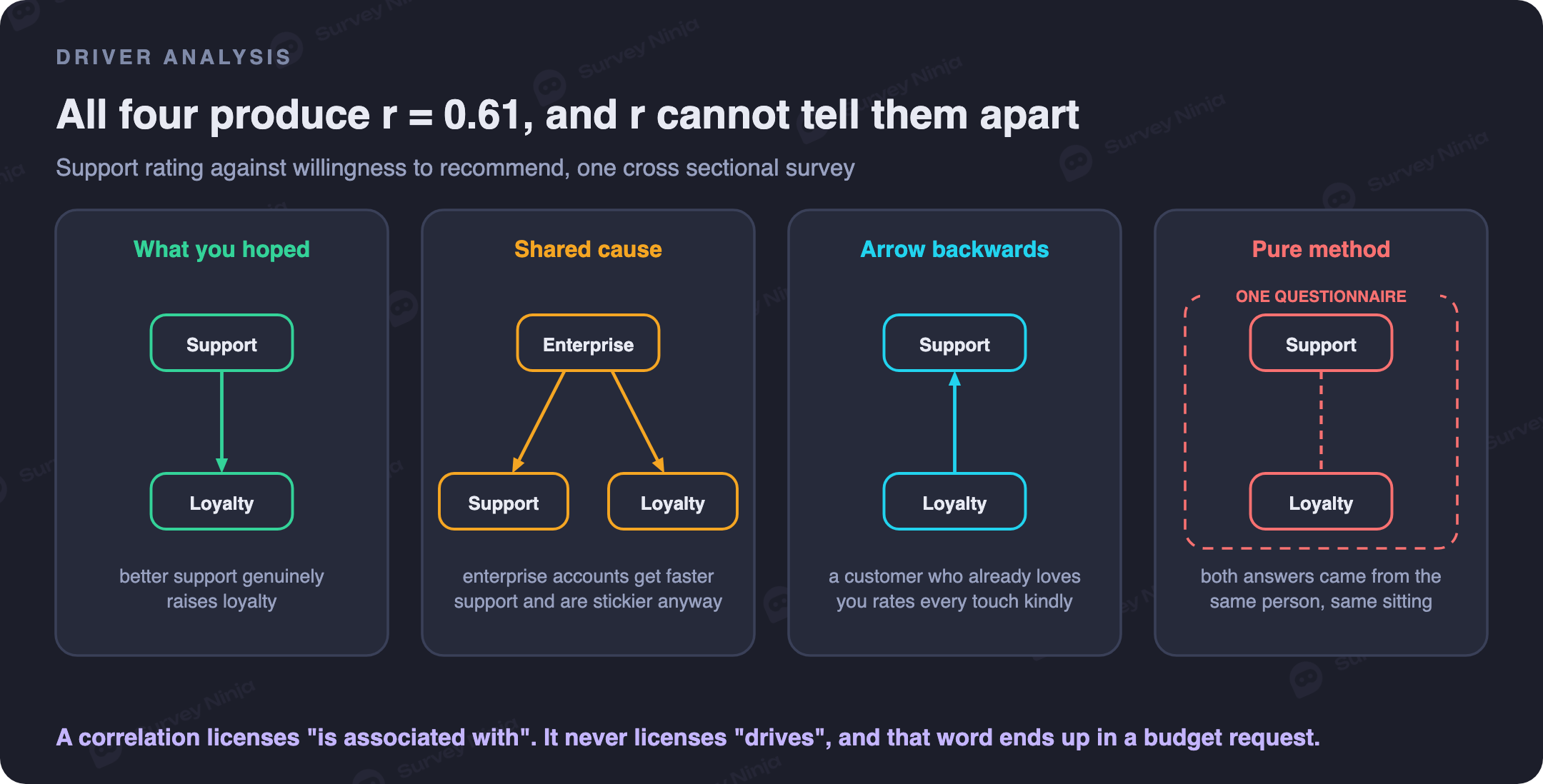
The first is the one you hoped for: better support genuinely raises loyalty. The second is a shared cause, since enterprise customers get faster support and are stickier anyway. The third is the arrow running backwards, more plausible than teams admit, because a customer who already loves you rates every interaction generously. The fourth is pure method.
Nothing in r tells you which one you are looking at. Nothing in the ranking tells you either, because all four inflate the number the same way.
The word to police is "drives." A correlation licenses "is associated with." It does not license "drives," "causes," or "improving X will raise Y by Z." That last sentence ends up in a budget request, and a cross sectional coefficient does not support it at any size.
Rank them if you like, but treat the ranking as a hypothesis generator. Then test the leading candidate: change the thing for one group and not another, and watch the score. One experiment beats a matrix across twenty attributes. Our comparison of NPS, CSAT, CES and CSI covers which headline metric suits which job.
Look at the scatter plot before you quote the number
Compute r, then plot the points. In that order, and never skip the second step. A coefficient is a one number summary of a two dimensional picture, and summaries lose things.
The picture shows the outliers. In survey data these are rarely entry errors and usually real people: the furious customer, the enthusiast, the account ten times everyone else's size. One of them in a sample of 60 can move r by 0.15.
It shows curvature. Satisfaction data bends, because attributes have diminishing returns baked in. Moving a customer from 1 to 3 on support changes loyalty a lot. Moving them from 4 to 5 barely registers. A straight line understates the bottom and overstates the top.
It shows the ceiling. If your CSAT question averages 4.6 out of 5 with eighty percent of answers at the top, almost no variance is left to correlate. Restricted range shrinks r mechanically, so a low coefficient in a very satisfied sample may be about your scale rather than your customers.
One more attenuation, and this one has a fix. Unreliable measures cap the correlation you can observe, so two shaky single item questions cannot produce a high coefficient even when the underlying ideas are tightly linked. A three or four item scale raises that ceiling; check yours with our Cronbach's alpha calculator.
Correlation matrices and the fishing problem
A correlation matrix is seductive. Twenty items, one grid, every pair at once, colored red and blue. It looks like an analysis.
Count the cells. Twenty items give 190 unique pairs, and at the usual five percent threshold roughly nine or ten will look significant by chance, even if every variable is independent. Scan for the reddest cells and you will find them. They will be chance.
Three ways to stay honest. Write your hypotheses before you look. Correct for multiple testing if you insist on scanning everything. Or treat the matrix as exploration, pull the pairs that surprised you, and confirm them next wave on fresh respondents. A pattern that replicates beats a smaller p value on the data that produced it.
When correlation is the wrong tool entirely
Several very common survey questions look like correlation problems and are not.
Comparing two groups is not one. Whether enterprise customers are more satisfied than small business ones is a difference between two means with an interval around it.
Nominal categories are not one. Region, plan and acquisition channel have no numeric order, and coding them 1 to 5 gives you a coefficient that changes when you reorder the list. Use a cross tabulation and a chi square test.
More than two variables at once is not one. Wanting the effect of support quality while holding plan size and tenure constant puts you in regression analysis. This bites hardest in driver work, where a pairwise ranking credits every attribute for the same shared variance.
Items measuring one idea are not one either: three questions tapping ease of use raise a reliability question. And two metrics tracked over time are a trap, since both trending upward for unrelated reasons will correlate near perfectly.
A worked example: support speed and willingness to recommend
A software company surveys 620 customers after a support ticket closes. Three service ratings from 1 to 5, speed of first reply, quality of the resolution and tone of the agent, then the recommendation question from 0 to 10. Separately, the helpdesk log holds the real reply time in minutes, and billing knows who renewed.
The item to item correlations come out strong. Resolution quality against recommendation, 0.61. Speed rating, 0.47. Agent tone, 0.44. On that basis the team is ready to name resolution quality the primary driver and build a quarter of work around it.
Now bring in the outside data. Measured first reply time against recommendation: -0.12. Renewal against recommendation: 0.19.
That gap is the whole lesson. Perceived speed correlates with loyalty at 0.47, logged speed for the same tickets at -0.12. Both cannot be measuring the same thing. The 0.47 mostly captures that people who feel good about a company report every part of it warmly.
Now check the service items against each other, which most teams never do. Resolution against speed rating, 0.58. Resolution against tone, 0.55. Speed against tone, 0.52. Three supposedly independent levers correlate with each other almost as strongly as any of them does with the outcome. They are not three drivers. They are one impression measured three times, and ranking them is ranking noise.
Something real does survive: renewal against recommendation at 0.19 is positive and stable at this sample size. The honest write up says the service block as a whole is associated with loyalty, that the attributes cannot be separated with this data, and that testing one change is the next step.
Explaining r to people who do not do statistics
The fix is to stop making it the headline and report a difference. Not "support correlates with recommendation at 0.61," but "customers who rated support 4 or 5 gave an average recommendation of 8.4, against 5.1 among those who rated it 1 or 2." Same relationship, units the room understands. Keep r in the appendix.
Show the picture too: a scatter plot with a fitted line, or a bar chart of the outcome binned by the predictor. And give the range. "Around 0.3, somewhere between 0.2 and 0.4" inoculates the room against next quarter's 0.27 reading as a decline.
| If you say this | They hear this | Say this instead |
|---|---|---|
| Support correlates with NPS at 0.6 | Support causes 60% of our NPS | People happy with support score 3.3 points higher on average |
| The correlation is statistically significant | The effect is big and proven | The link is unlikely to be chance, and it is small |
| Onboarding is the top driver | Fix onboarding and the score goes up | Onboarding ranks first on association, and cause is untested |
| r squared is 0.25 | We explain a quarter of customer behavior | Three quarters of the variation comes from things we did not measure |
| The correlation rose from 0.27 to 0.31 | The relationship is strengthening | Both readings sit inside the same range, so nothing moved |
Build one sentence into every report as boilerplate: this shows that the two move together, and not which one moves the other. For what belongs alongside a coefficient in the same deck, see our guide to descriptive analysis.
Mistakes that show up again and again
Quoting a coefficient with no sample size next to it. An r of 0.4 from 35 people and an r of 0.4 from 3,500 are not the same claim.
Ranking correlated attributes as independent levers. If six drivers correlate 0.5 with each other, the ranking will reshuffle next wave.
Comparing coefficients across waves without intervals. Most quarter over quarter movement is sampling noise, and treating it as a trend generates work for nothing.
Letting the word "driver" into the write up unchallenged. It converts an association into a causal claim silently, in one word, and nobody removes it later.
Where to go from here
With data in hand, the sequence is short. Clean out the straightliners. Plot the pair before computing anything. Run Pearson and Spearman and see whether they agree. Put an interval around the result. Then check the sentence you intend to present against the four structures above.
If the study is still being designed, the highest leverage decision is the one from the second section: measure at least one side of the relationship outside the questionnaire. Everything else here is damage control.
To pressure test a questionnaire before it goes out, including the scale formats and item ordering that feed method bias, run it through the survey improver. Building from scratch, create a survey for free and export responses straight into any of this.
Frequently asked questions
Can you use Pearson correlation on Likert scale data?
In practice yes, with caveats. Likert responses are ordinal, so Pearson's interval assumption is formally violated, but simulation work suggests the damage is small on 5 and 7 point scales with reasonably symmetric distributions. Switch to Spearman when the scale has only three or four points, when the distribution is heavily skewed, when outliers are visible, or when the relationship looks bent. A large gap between the two is a signal to inspect the scatter plot.
How many survey responses do you need for a correlation to be meaningful?
Around 200 completed responses is where correlations on survey data start behaving like estimates rather than rumors. Below 100 the interval is wide enough that a moderate result and no result look alike. At 30 responses an observed r of 0.30 carries a 95 percent interval of about -0.07 to 0.60, which makes it compatible with no relationship at all.
Why do two questions in the same survey always seem to correlate?
Because part of what they share is the measurement, not the subject. Consistency motives, a general halo, a tendency to agree, the mood of the moment and question order all push answers from the same respondent in the same direction. Reviews of self report research put the variance attributable to the method itself at roughly a quarter. This is common method bias, and the only reliable fix is to source one side of the pair from outside the questionnaire.
Does a strong correlation with NPS mean that attribute drives loyalty?
No. Four structures produce the same coefficient: a real causal effect, a shared third cause such as plan tier or tenure, causation running backwards because satisfied customers rate every interaction generously, and shared measurement method. A correlation cannot tell them apart. Use the ranking as a hypothesis generator, then test the leading candidate with an experiment.
Should you use Spearman or Pearson for survey data?
Pearson when both variables can reasonably be treated as interval, the scale has enough points and the relationship looks linear. Spearman when the data is clearly ordinal with few points, when distributions are skewed, when outliers are present, or when the relationship is monotonic but curved. Spearman correlates the ranks rather than the values, which removes the question of whether scale points are evenly spaced.
How do you explain a correlation coefficient to a non technical audience?
Convert it into a difference between groups. Instead of "support correlates with recommendation at 0.61," say "customers who rated support 4 or 5 gave an average recommendation of 8.4, against 5.1 among those who rated it 1 or 2." Show a scatter plot alongside it, give a range rather than a single decimal, and attach one standing sentence: this shows the two move together, not which one moves the other.
What is a good correlation coefficient in survey research?
There is no universal threshold, and the conventional bands are looser than they look. In self report data, correlations between attitude items routinely land between 0.4 and 0.7 largely because of shared method, while correlations between a survey answer and a real behavior such as renewal are often 0.1 to 0.3 and still commercially important. Judge a coefficient against what the same approach usually produces in your field.
Updated: Sep 29, 2026 Published: Sep 11, 2026