


Is NPS Outdated? What's Wrong With the Loyalty Score
Useful  Mike Taylor Updated: Sep 29, 2026 Reading time ≈ 30 min

NPS landed on almost every dashboard over the past fifteen years. One number that's easy to show a board, easy to compare with last quarter, and comfortable to drop into an annual report.
That convenience turned out to be a trap: bonuses, annual targets and team reputations all got built around a single question, while the metric itself quietly piled up a long list of complaints. In 2026 executives are asking a sharper version of the question more and more often: can one number really be trusted with decisions about the product and the money.
Let me state the position up front, so the rest reads more easily. NPS is not useless and it is not dead. What broke is something else: the habit of treating it as the only measure of loyalty and pinning compensation to it. Below we trace where the criticism came from, what the original sources and analysts actually say, and which system of metrics belongs beside it so you can see your customers whole, rather than as a single averaged mark.
A quick primer on the metric
Net Promoter Score was invented by Fred Reichheld at Bain & Company, and the founding article appeared in Harvard Business Review in 2003. The idea is almost brilliantly simple: ask a customer a single question, "how likely are you to recommend us to a friend or colleague," on a scale from 0 to 10. People then split into three groups. Anyone who answers 9 or 10 is a promoter. A 7 or 8 makes a passive. Everything from 0 to 6 counts as a detractor. The final score is the share of promoters minus the share of detractors, and the passives simply drop out of the formula. If you want the full walk-through of the calculation and the industry benchmarks, we cover it in a separate piece on the Net Promoter Score.
Why the metric won people over is easy to see. One question instead of a long form, an answer that fits in a text message or a pop-up, and a result that collapses into a number from minus 100 to plus 100 you can lay next to last quarter or next to a competitor. For senior management that's an ideal format: glance at it and you instantly know whether things got better or worse. The trouble starts exactly where that convenience gets mistaken for a full picture.
Where the cult of one number came from
To understand why NPS became the only KPI in the first place, it helps to remember how it was sold. Reichheld's 2003 article was titled "The One Number You Need to Grow." The headline itself pitched the metric as sufficient on its own, and management loved the packaging instantly: a simple figure is easy to drop into a dashboard, tie to bonuses and compare across quarters. That's how one indicator ended up occupying a seat it should really have shared with others.
Doubts showed up almost immediately. As early as 2004, Harvard Business Review ran two critical responses, one from Morgan and Rego and one from Kristensen and Westlund, that disputed whether a single number reliably measures loyalty. And a careful reading of the original data turned up a subtlety: Reichheld matched the growth companies had already achieved between 1999 and 2002 against the NPS they had accumulated by 2001 to 2002. That shows a coincidence in time, but it does not yet prove that NPS predicts future growth. The loud claim that "high NPS means growth" rested from the start on a shakier footing than the slide decks suggested.
The main complaint: one number hides the distribution
Say two companies both post an NPS of 30. In the boardroom they report identically. Inside, completely different things are happening.
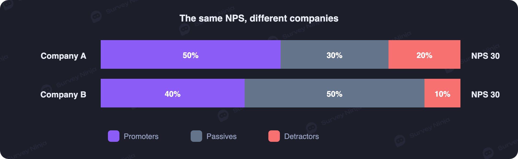
At the first company half the customers are delighted, but one in five is openly unhappy: the base is polarized, with hot fans on one side and angry detractors on the other who are about to leave and write a review. At the second company there are almost no detractors, but half the customers sit in the passive zone, which is to say they don't much care. Those are two different businesses with different risks and different priorities, yet the same figure of 30 glues them into one report. The arithmetic of "minus the detractors" throws away half the audience and erases the thing that matters most: where the energy is concentrated and where churn is brewing.
This is the root of the problem. NPS is a summary, and a summary by definition loses detail. To see what sits behind the number you need a proper breakdown by segment and over time, an ordinary analysis of the responses rather than one averaged value. Without it, you can happily enjoy a steady 30 for six months without noticing that your fans are quietly leaking away and indifferent customers are taking their place.
Intent is not behavior
The second blow to the metric came from its own creator. The NPS question measures intent: a person says they will probably recommend you. But between "put a 9 on the scale" and "actually brought a friend in" lies a chasm. People give high marks out of politeness, out of a good mood, or just to close the survey pop-up faster. And then they recommend no one.
In 2021 Reichheld acknowledged the gap and published an update called Net Promoter 3.0, again in Harvard Business Review. Its central point: NPS is misused in roughly 90% of cases, and a survey number slips far too easily into a game of self-scoring. Alongside the survey he proposed a harder metric, Earned Growth Rate, the share of revenue growth that comes from returning customers and the new ones they bring in. The logic is plain: real loyalty shows up not in promises on a scale but in money and in actual referrals you can pull from your accounting system. When the author of the metric says one survey isn't enough and you need behavioral data, that's worth hearing.
What breaks the data most: bonuses tied to NPS
The same Reichheld calls the worst distortion of all the practice of tying NPS to employee pay and bonuses. On paper it sounds logical: we want a high score, so we'll attach motivation to it. In practice it kills the honesty of the data faster than anything else.
The moment a bonus depends on the number, the hunt for scores begins. A delivery driver asks outright, "please give me a ten, I get paid for it." A support agent hints that a seven is bad, even though on the scale it's neutral. Surveys get quietly handed only to happy customers while the unhappy ones are steered around. What you end up measuring is not customer loyalty but your team's skill at extracting high marks. It's a textbook case of incentives producing biased answers: the data looks wonderful right up until churn suddenly spikes while NPS still reads 60. A metric with money attached stops being a metric and becomes a target.
The odd math of the scale
There's a purely methodological complaint that analysts love. The 0-to-10 scale gives eleven gradations, but NPS crudely collapses them into three buckets, and the boundaries are drawn in a non-obvious place. A customer who gives a 6 lands among the detractors alongside someone who gave a 0, even though those are very different people. Moving a rating from 6 to 7 changes the result dramatically, since a detractor has just become a passive, while moving from 7 to 8 changes nothing at all, because both stay passive.
Because of this, the same rise in the average rating can either move NPS or leave it flat, depending on where along the scale it happened. Comparing the index across countries is risky too: in some cultures people hand out tens generously, in others even a satisfied customer rarely goes past an eight. So the absolute value of NPS says almost nothing out of context; what's meaningful is the trend within one audience and one collection method. Anyone curious about how collapsing an eleven-point rating scale distorts comparisons will find the same mechanics at work there. Play with the shares in the three buckets and you can watch two very different distributions produce one and the same figure.
What to measure alongside NPS
Here's the good news: the replacement has existed for a long time. There's no new magic number, just a set of indicators where each answers its own question. On its own, any one of them is as one-sided as NPS. Together they give you a picture with depth.
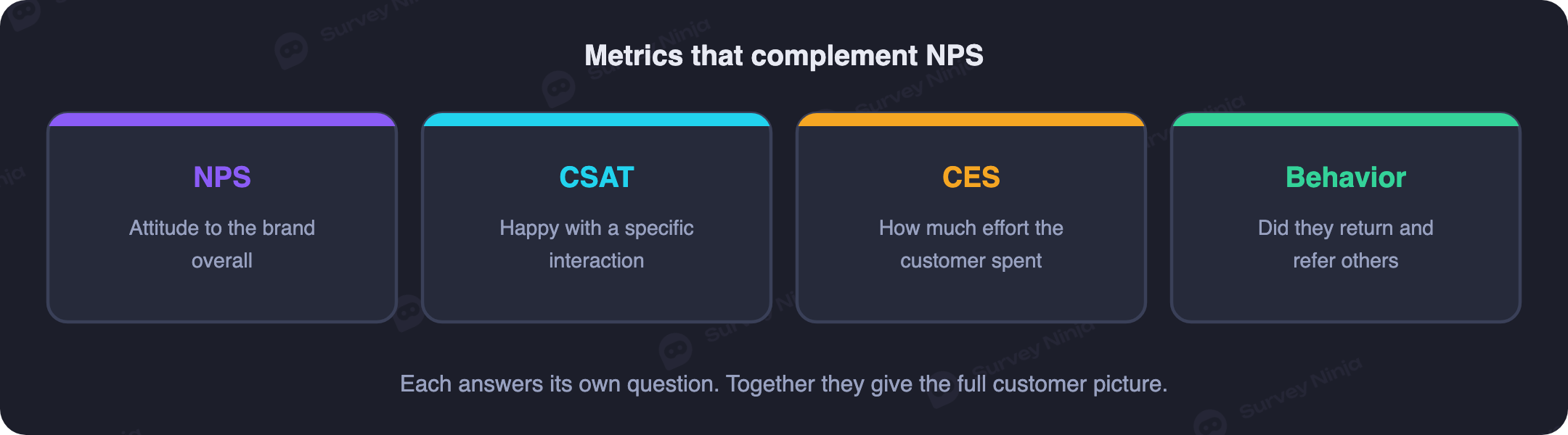
- NPS answers the strategic question of how well disposed customers are toward the brand in general. It's a slow measure of overall attitude, best taken once a quarter and watched over time by segment.
- CSAT captures satisfaction with a specific interaction right after it happens: a purchase, a support ticket, a delivery. How to calculate it and where it beats NPS we cover in the piece on CSAT vs NPS.
- CES measures the effort a customer had to put in to get their problem solved. Often it's a high Customer Effort Score that predicts churn better than warm answers about willingness to recommend.
- Behavioral data is the real behavior Reichheld pointed to: retention, repeat purchases, the share of revenue from returning customers, the number of friends actually referred. Words on a scale get checked against deeds here.
- The open "why" question explains any of the numbers above. Without it you know NPS dropped ten points but not what caused it. This is where thematic analysis of open comments earns its keep, turning raw text into clear drivers you can act on.
The point of the system is that the metrics check each other. A high NPS alongside rising churn is a warning sign, not a reason for a bonus. Steady CSAT at individual touchpoints while the overall index falls tells you exactly where to go looking. No single indicator can answer questions like that.
To keep the system in your head, here's a short cheat sheet: what each metric answers, how often to take it, and where its blind spot is.
| Metric | What it answers | When to measure | Blind spot |
|---|---|---|---|
| NPS | How well disposed the customer is to the brand overall | Once a quarter, as a trend | Hides the distribution and segments |
| CSAT | Whether the customer is happy with a specific interaction | Right after the event | Says nothing about long-term loyalty |
| CES | How much effort the customer had to spend | After the task or ticket is resolved | Narrow focus on a single stage |
| Behavior and Earned Growth | Whether the customer came back and brought others | Continuously, from your records | Explains "what" but not "why" |
| Open "why" question | What sits behind the score and what to fix | Alongside any scale above | Needs text analysis, slow by hand |
What analysts and the market say
The criticism reached the big research firms too. In 2021 Gartner loudly predicted that by 2025 more than 75% of organizations would abandon NPS as a measure of customer-service success, advising companies to measure experience at the level of specific interactions instead of one loyalty figure: satisfaction with the contact (CSAT), customer effort (CES) and the value of the interaction. The forecast was sharp, and it's all the more convenient that now, in mid-2026, we can check it against reality rather than take it on faith.
Reality turned out milder than the forecast. No mass exodus from NPS happened by 2025; the metric didn't go anywhere. Something subtler happened instead: NPS was demoted. From the only KPI on the headline slide it became one line in a set of indicators, and the share of companies still treating it as the main measure of success visibly shrank. The market didn't throw the metric out, it just stopped worshipping it alone. That's the sensible outcome: the metric wasn't declared bad, it simply stopped being treated as self-sufficient.
Academics put NPS to the test and found no advantage
Gartner are analysts, but the skepticism has a firmer foundation too: peer-reviewed science. In 2007 a group of researchers (Keiningham, Cooil, Andreassen and Aksoy) published a paper in the Journal of Marketing with a long title, "A Longitudinal Examination of Net Promoter and Firm Revenue Growth." They took longitudinal data on 21 companies and more than 15,500 interviews from the Norwegian Customer Satisfaction Barometer, repeated the calculations from Reichheld's book, and compared NPS with the American Customer Satisfaction Index (ACSI).
The finding was awkward for the cult of the metric. The claim of NPS's "clear superiority" over other measures could not be reproduced: in predicting company growth NPS did not outrun ordinary satisfaction, and in some industries it actually trailed it. This is no marginal quibble: the same paper won the 2007 Marketing Science Institute / H. Paul Root Award for the most significant contribution to marketing practice. In other words, science tested the central promise of NPS and did not confirm it.
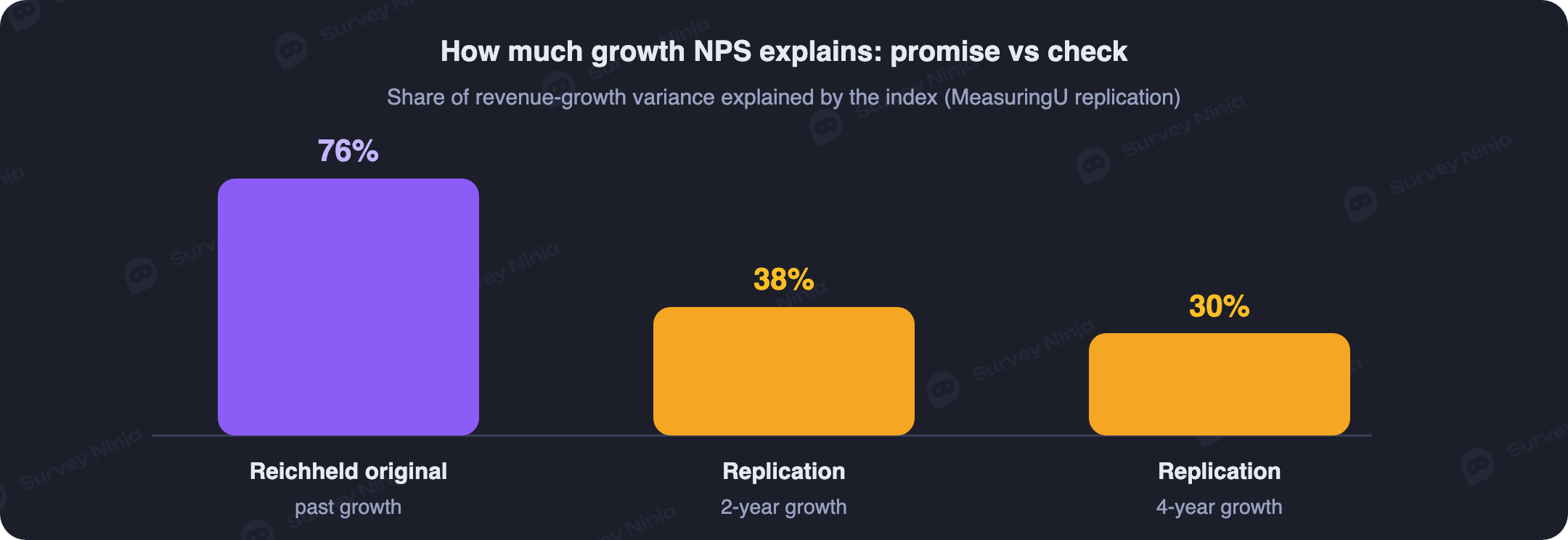
The story was later recalculated once more, carefully. In a MeasuringU replication, the famous original correlations, where NPS explained around 76% of the variation in growth, turned out to have been computed on past growth that had already happened. Apply the same logic to future growth and the explanatory power fell to roughly 38% over a two-year horizon and about 30% over four years. And the spread across industries is enormous: for airlines it's only about 8%, for internet providers around 20%. The takeaway for an executive is simple. NPS is not useless, but it is not unique either: it relates to growth about as well as ordinary satisfaction does, so there's no scientific basis for leaning on it as the single number.
Who actually answers your survey
Even an honest NPS with no bonuses attached can mislead, because of who produces it. The number is computed from the people who replied, and far from everyone replies, and the mix of respondents is skewed. The more often and more insistently you send surveys, the lower the response: tired people abandon the form halfway or answer at random.
The skew runs toward extreme opinions. The ones who finish the survey are mostly those who are delighted and those who are furious, while the moderately content silent majority simply closes the email. As a result NPS becomes polarized and stops reflecting the mood of the bulk of your customers. That's how customer-experience practitioners explain it, and the logic is backed by survey methodology: non-response bias becomes serious when two conditions meet, a low response rate and a big difference between those who answered and those who stayed quiet. For NPS both conditions are typical.
The practical implication for decisions is this: always look at the base the index was computed on. An NPS of 45 from thirty replies out of five thousand customers, and the same NPS of 45 from fifteen hundred replies, are numbers of very different reliability. A bare score tells you nothing about how much the respondents resemble your real audience, and without that, comparing it over time and against competitors is risky.
A real example: the score held while customers left
To make the abstract criticism concrete, consider a typical situation in a B2B service. For three quarters running the company's overall NPS sat at 42. In the boardroom that sounded reassuring: the score is stable, so loyalty must be fine, and we can get on with other things.
Break that same figure down by segment and the picture flips. Among large enterprise clients NPS stood at 55 and didn't budge: they paid a lot, got a dedicated account manager, and were happy. Among small clients on the self-serve plan, though, the index had sagged to 20 and was still falling. The many satisfied large clients were masking, on average, real anxiety among the small ones. An open "why" question finished the picture: the small clients complained that they couldn't figure out the setup without a manager's help, which is to say they were hitting high effort at the very start.
Behavioral data confirmed the worst. While the overall NPS sat prettily at 42, churn in the small-client segment climbed from 4% to 9% a month. One averaged figure calmly hid a fire in the largest segment for nearly six months. It only became visible once the index was joined by a segment breakdown, open answers and real retention, and the reasons for leaving were dug out through a proper churn survey. Tracking NPS regularly by segment and over time, ideally with dedicated NPS tracking software, is exactly what catches discrepancies like this in time. That's the difference between a reporting mark and a working diagnosis.
Transactional and relational NPS: one label, two measurements
There's another reason "overall NPS" is deceptive: companies blend two measurements that mean different things. Relational NPS (rNPS) measures attitude to the brand as a whole, accumulated over the entire relationship. It's collected rarely, once a quarter or once a year, and used for strategy and a baseline. Transactional NPS (tNPS) measures the impression right after a specific contact: a support call, a purchase, onboarding. It exists for pinpoint, tactical improvements.
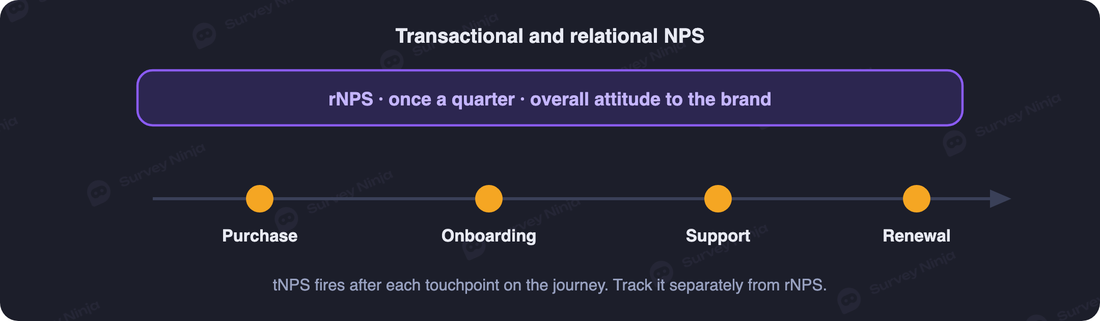
A common mistake, especially when NPS is calculated "for the report," is to fold both measurements into one score. Then "how do you feel about us overall" gets added to "how did that one call go," and the resulting number means nothing. Mature teams do it differently: they set rNPS as a baseline, add tNPS at key points of the customer journey, and interpret them separately. So even inside NPS itself you can see that one averaged figure hides more than it shows.
How to rescue your NPS if you already measure it
You don't need to throw the metric out. It's enough to stop handling it in the ways you shouldn't. A few practical rules bring NPS back to usefulness.
- Don't tie it to bonuses. The moment the number becomes the source of a bonus, it stops being honest. Let NPS stay a diagnostic, not a KPI in someone's compensation scheme.
- Look at the distribution, not the total. The share of promoters and the share of detractors say more separately than their difference does. Cut by segment, plan, channel and cohort.
- Always ask an open question. "What was the main reason for your score" turns a bare number into a list of concrete drivers you can work with. An NPS question generator helps you word that question and the segmentation around it.
- Check against behavior. Match scores against real retention and repeat purchases. If customers who are happy in words don't come back, the problem isn't the product, it's the survey.
- Don't compare blind. Someone else's NPS from a press release means almost nothing without the context of their industry and collection method. Compare yourself with yourself over time.
The same principles underpin any sensible work on customer experience: the metric exists for the sake of concrete decisions that change the product and keep customers, not for a pretty slide in a report.
Collect NPS and do nothing: why a number without a loop is dead
The most common reason NPS delivers neither growth nor retention is dull and a little embarrassing: the company gathers scores and stops there. Closing the feedback loop means carrying feedback through to an action and recording the result, and a chart on the wall doesn't close the loop by itself. Until something has been done about the feedback, the loop is open, however many handsome dashboards are hanging up.
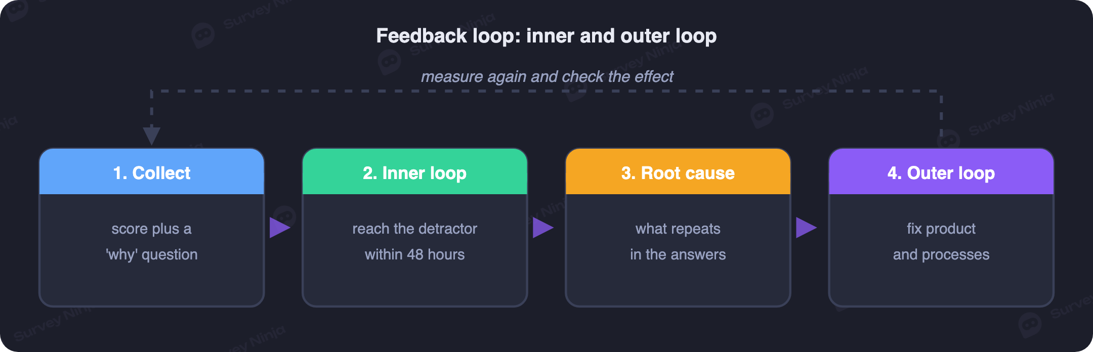
In practice there are two loops. The inner loop is quick, personal contact with a specific customer, especially a detractor, within the first hours or days: you reach out, work through the problem, keep the person. The outer loop is the work on recurring complaints, where the systemic cause is fixed at the level of the product and the processes so the same trouble doesn't hit the next customers. The inner loop saves an individual customer; the outer loop cures the disease itself.
The trap is that many people consider the loop closed when only the collection is complete. The answers are in, the report is ready, yet no one has received a response and no process has changed. At that moment NPS turns into cosmetics for the board. One number isn't enough for this reason too: on its own it triggers no action at all, and you need a built-in mechanism for reacting to the score.
Why other people's benchmarks almost always mislead
When an executive sees their NPS, the first question is usually the same: is that good or bad? The temptation to compare yourself with the "industry average" is strong, and here's where a trap waits. There's no universal good NPS; the same number means different things in different niches. A notional 30 can be a strong result for airlines, average for SaaS and weak for a consumer-electronics maker, where customers are used to giving high scores.
You can get a sense of the orders of magnitude, but with a caveat about the source. By Survicate's 2025 roundup the median NPS across industries sat around 42, and yet in ten industries out of eleven the score fell over the year, rising only in manufacturing. Forrester confirms a similar picture of decline. But the figure of 42 is one specific provider's metric: other measurements report a different median and a different set of industries, because each has its own methodology, channel and moment of asking.
What to do about it. Comparing your score directly against public benchmarks isn't worth it, since there are too many hidden differences in methodology, and doing this well is a discipline of its own, closer to structured benchmarking than to glancing at a headline figure. It's more useful to watch your own trend and whether you're moving in the same direction as your industry and your direct competitors. And here the main idea surfaces again: a bare score, without the context of industry, collection method and trend, won't tell you whether you're doing well or badly.
What about internal surveys and eNPS
NPS has a close relative for employees, eNPS, and the very same caveats apply, only in a stronger form. Tying it to bonuses is entirely out of the question here: an employee understands perfectly that anonymity is conditional and plays it safe with their scores. An eNPS number without open answers and without a breakdown by team is nearly useless, because it doesn't show which department a problem is brewing in. If you want to run this kind of measurement honestly, an employee engagement survey with open follow-ups and team-level cuts is a far better starting point than a lone score.
When one NPS really is enough
It would be dishonest to claim a single number is always harmful. There are situations where it works fine. A very young product at launch needs a fast pulse more than deep analytics: a couple of dozen answers and a rough trend already hint whether the team is heading the right way. A small B2B with a dozen clients hardly needs a survey at all, since every client is spoken to personally anyway, and NPS serves more as a formal marker for an investor update. If you need to launch a correct measurement quickly without building from scratch, an NPS question generator gets you a clean survey in minutes.
The boundary is simple. As long as NPS stays one of the hints you look at alongside other signals, it's harmless and even useful. The danger switches on the moment the number is made the sole measure of success, bonuses are pinned to it and product decisions are taken from it. Even in the lightest scenario it's worth adding an open "why" question to the scale: the answer costs the customer ten seconds and saves you weeks of guessing at causes.
How SurveyNinja approaches this
At SurveyNinja we deliberately avoid betting on a single number. Right next to an NPS question you can just as easily collect CSAT and CES, and to any rating you can attach an open "why," with different follow-ups for detractors and promoters. Then the analysis kicks in: the tool reads the free-text comments, groups them into drivers and shows which themes are dragging the score down. Instead of a 30 floating in a vacuum, you see its distribution across segments, its movement over time and the reasons behind every change.
So instead of one slide with a figure on it, you get a working dashboard you can actually make decisions from: where churn is rising, which segment has cooled, what to fix first. Building a survey like that and reading the report is free, and on a free plan with no response limit that's more than enough to start. Open the SurveyNinja survey builder and check on your own audience how far one number drifts from the real picture.
Frequently asked questions
So is NPS outdated or not?
As the only loyalty metric on the dashboard, yes, it's outdated. As one indicator in a set it's still useful: it gives a quick strategic read on attitude to the brand. The problem isn't the question itself, it's the habit of treating it as exhaustive and pinning money to it.
What should you use instead of NPS?
Not one metric, but a system. Keep NPS for overall attitude, add CSAT for specific interactions, CES for the effort a customer spends, behavioral data on retention and repeat purchases, and always an open "why" question. Together they show what one number cannot.
Why shouldn't you tie NPS to employee bonuses?
Because it's the most destructive distortion of the metric, something its own creator Fred Reichheld warns about directly. As soon as a bonus depends on the score, staff start begging for high marks and steering around unhappy customers. The data turns pretty but stops reflecting reality.
What is Earned Growth Rate?
It's the metric Reichheld proposed in 2021 as a hard complement to NPS. It shows the share of revenue growth delivered by returning customers and the new ones they bring in. Unlike a survey figure, it's computed from your accounting records, so you can't fake it with intentions on a scale.
What counts as a good NPS?
There's no universal benchmark: different industries and cultures hand out scale scores differently, so an absolute value out of context says little. Far more important is the trend within your own audience and the distribution across segments. Industry reference points are gathered in our separate guide to the Net Promoter Score.
What's the difference between NPS and CSAT?
NPS asks about attitude to the company as a whole and willingness to recommend, while CSAT captures the impression of a specific moment: a support call, a purchase, a new feature. They're two different cuts, and one doesn't replace the other. CSAT shows faster what broke this week; NPS shows more slowly where loyalty is heading overall.
How is transactional NPS different from relational NPS?
Relational NPS is collected periodically, once a quarter or half-year, and measures overall attitude to the brand with no tie to an event. Transactional NPS arrives right after a specific action (an order, a support ticket, onboarding) and shows the quality of that particular step. It's handy to keep both, but to calculate and read them separately rather than folding them into one score.
How often should you measure NPS?
For relational NPS, once a quarter in B2B and once every half-year in B2C is usually enough, otherwise the figure barely moves and people tire of the form. Send a transactional survey by event, but no more than once every one to two months per person. A falling response rate and one-word answers are the first sign you're asking too often.
What does closing the feedback loop mean?
It means going back to the person with a response to their answer and carrying it through to a result. The inner loop is quick personal contact with a detractor, ideally within the first two days, to work through a concrete problem. The outer loop is systemic fixes to the product and processes based on what recurs in the answers. Without this step NPS stays a number on a dashboard and changes nothing.
Is NPS really useless?
What makes it useless is how it's applied. Tied to bonuses, measured once a year and cut off from customer behavior, NPS says almost nothing. Look at the distribution, read the open answers and check scores against what people actually do, and it's a working indicator of loyalty. It's a matter of discipline in use; the metric itself is not to blame.
Updated: Sep 29, 2026 Published: Aug 4, 2026