


SUS: How to Measure Product Usability in Ten Questions
Useful  Mike Taylor Updated: Aug 26, 2026 Reading time ≈ 13 min

The System Usability Scale, or SUS, is a ten-item questionnaire that measures how usable a product feels: a website, an app, a service or a device. The respondent rates how strongly they agree with each statement, and those ten answers collapse into a single score from 0 to 100.
Over roughly four decades SUS has become the de facto standard in UX research, with benchmarks built up across hundreds of studies, so whatever number you get, you have something to compare it against.
That comparability is the whole appeal. A usability score on its own tells you very little, but a score you can line up against an industry average, a competitor or your own previous release turns a vague feeling into a decision you can defend. Below we walk through where SUS came from, the ten statements in their standard wording, how the scoring actually works (it is trickier than it looks), how to read the result without fooling yourself, and the mistakes that quietly wreck a measurement.
Where SUS came from and why people trust it
The questionnaire was created by engineer John Brooke in 1986 at Digital Equipment Corporation. His team needed a fast way to compare the usability of internal systems, and Brooke cheerfully described his method as "quick and dirty." The irony is that the quick and dirty tool has survived decades of scrutiny: study after study has shown the scale to be highly reliable, its internal consistency sits comfortably above the usual threshold, and it holds up across languages and product types. The growing pile of published results turned SUS into a shared ruler that gets used on everything from banking apps to household appliances.
The strength of SUS comes down to three things. It is short: the ten statements take a respondent only a minute or two, which keeps completion time low and drop-off rare. It is universal: it fits almost any interactive product without reworking the method. And it is comparable: a single number from 0 to 100 can be set against benchmarks, competitors and your own past measurements.
The ten SUS statements
SUS was written in English, so the ten statements below are the original, canonical wording. The one word worth adapting is "system": replace it with your product (say "website," "app" or "service"), but do it consistently across all ten items. Each statement is rated on a five-point Likert scale from "strongly disagree" (1) to "strongly agree" (5).
- I think that I would like to use this system frequently.
- I found the system unnecessarily complex.
- I thought the system was easy to use.
- I think that I would need the support of a technical person to be able to use this system.
- I found the various functions in this system were well integrated.
- I thought there was too much inconsistency in this system.
- I would imagine that most people would learn to use this system very quickly.
- I found the system very cumbersome to use.
- I felt very confident using the system.
- I needed to learn a lot of things before I could get going with this system.
Notice the alternation: the odd-numbered statements are positive, the even-numbered ones are negative. That is deliberate. It forces respondents to actually read each item instead of running a column of top marks straight down the page. Breaking that order or dropping the "extra" items is not allowed, because the benchmarks were calculated for the full scale, and a trimmed version is no longer comparable to them.
How to calculate the score: the formula and a worked example
The scoring is a little sneakier than it looks, precisely because of that alternation. The algorithm goes like this:
- for the odd items (1, 3, 5, 7, 9), take the answer and subtract one: contribution = answer minus 1;
- for the even items (2, 4, 6, 8, 10), subtract the answer from five: contribution = 5 minus the answer;
- add the ten contributions together, then multiply the sum by 2.5.
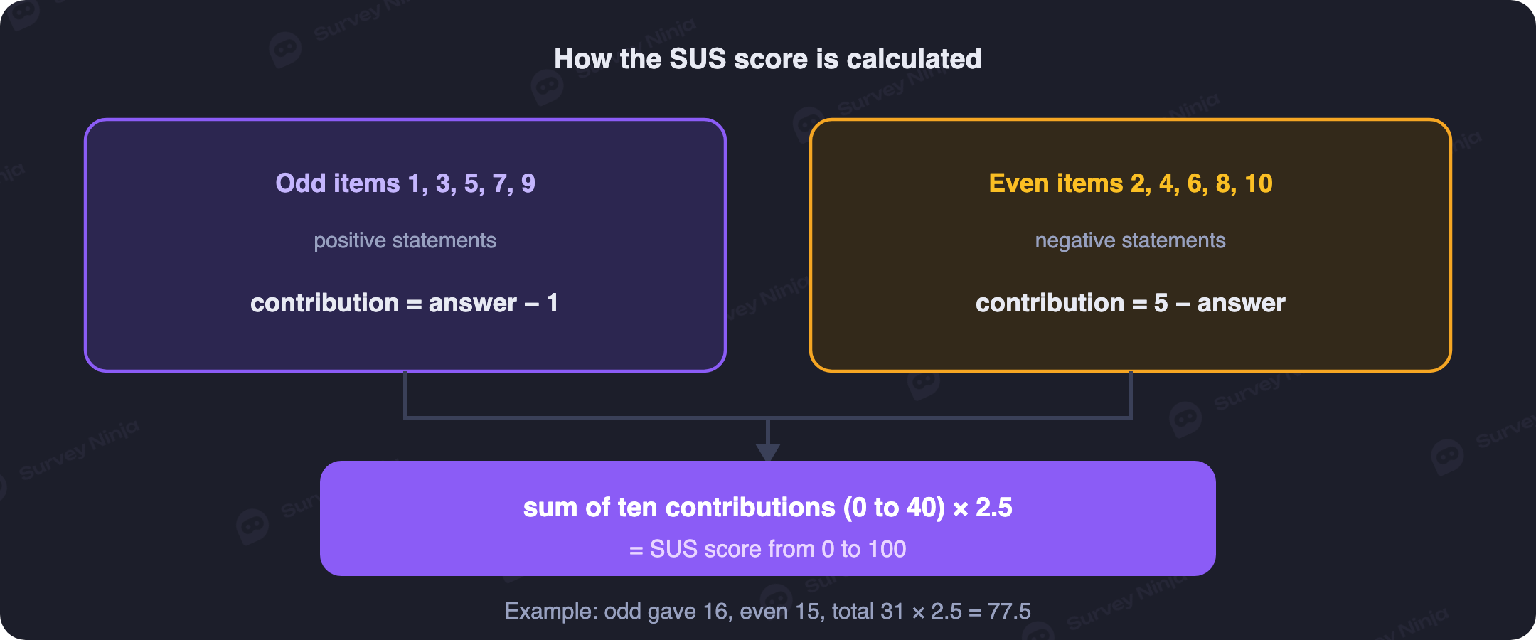
Each contribution lands between 0 and 4, so ten of them max out at 40, and the 2.5 multiplier stretches that onto the familiar 0 to 100 scale. Here is a worked example. Say a respondent answered the odd items 4, 4, 5, 4, 4 and the even items 2, 1, 2, 2, 3. The odd contributions become 3, 3, 4, 3, 3, which sum to 16. The even contributions become 3, 4, 3, 3, 2, which sum to 15. That is 31 in total, and 31 multiplied by 2.5 gives a SUS score of 77.5.
The score is worked out for each respondent separately, and the study result is the average across everyone. Doing this by hand gets tedious even at ten responses, so it is far easier to collect the answers in a survey tool and let the analytics compute the score, the percentile and the grade for the whole sample at once.
What the score means: why 68 is average
The single biggest mistake people make when reading SUS is treating the score as a percentage or a school grade. A SUS of 68 is not a failing mark, and it is not "68% usable." In a meta-analysis by Jeff Sauro drawing on more than 500 studies, the average SUS score came out at 68. So 68 sits dead center of the market, at the 50th percentile: half the products out there are more usable than yours, half are less.
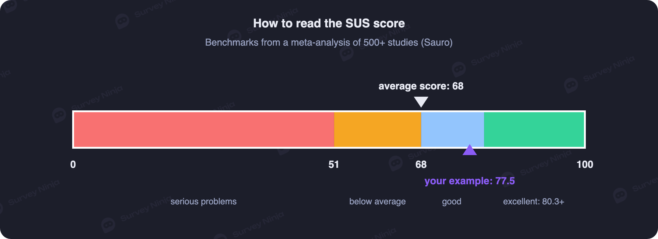
To turn the raw number into something readable, researchers map it onto a curved grading scale. Above 80.3 is an A, roughly the top 10% of products: users are happy and inclined to recommend. The range from 68 to 80.3 is a solid B. Scores from 51 to 68 flag noticeable usability problems, and anything below 51 means usability needs to become priority number one. Our example of 77.5 lands in the B band: more usable than average, but short of excellent.
If letter grades feel too abstract to share with stakeholders, there is a companion scale of plain adjectives. Research pairing SUS scores with a single "overall, how would you rate this product?" question found that a score in the low 50s reads as "OK," the low 70s as "good," and the mid-80s as "excellent," with anything under about 51 landing in "poor" territory. It is a rough translation, not a substitute for the percentile, but it is a fast way to say what a number means to a room that does not live in usability metrics.
Benchmarks are one reference point, but there is a second, more honest one: yourself. Measuring before and after a redesign shows whether the changes helped or hurt, and it is in that before-and-after comparison that SUS is at its most useful. A single absolute number is interesting; a trend across releases is genuinely actionable.
How many respondents you need
One of the nicer properties of SUS is that it tolerates small samples. Convergence studies suggest that around 12 participants already give an estimate stable enough to act on, and as the sample grows the confidence interval simply tightens. For comparing two versions of a product or tracking movement over time, that is usually plenty. If you want to pin the precision down more rigorously, our guide to choosing a sample size goes deeper into confidence intervals.
Common mistakes when measuring SUS
Most botched SUS measurements fail in the same handful of ways:
- Changing the wording or the scale. Rephrased items, a seven-point scale instead of five, dropped questions. After any of these you can no longer compare your result to the 68 benchmark, because you have measured something of your own.
- Reading the score as a percentage. A SUS of 70 is not "70 out of a possible 100," it is a position relative to other products. Without the percentile behind it, the number misleads.
- Expecting SUS to diagnose. The questionnaire tells you how usable a product is, but says nothing about what specifically is wrong. That is why it is worth adding one open-ended question ("what felt the most awkward?") to the ten items. Without it, a low score leaves you guessing at causes.
- Surveying the wrong people. SUS is filled in after real interaction with the product. Answers from people who only saw a screenshot or a landing page have nothing to do with usability.
- Wording every item positively. Sometimes the alternation gets stripped out "for simplicity," but that also removes the protection against thoughtless answers, and comparability with it.
SUS, UMUX and NPS: which to use
SUS measures usability, and that is what sets it apart from the metrics next to it. NPS asks about willingness to recommend, which is an attitude toward the product as a whole: a product can be clumsy but beloved, or slick but forgettable. UMUX and its short form UMUX-Lite tackle the same job as SUS but with four questions or two, handy when a questionnaire is already overloaded. For a pinpoint read on a single action there is the SEQ, one question asked right after a task, and for effort in service scenarios teams reach for the Customer Effort Score.
A practical combination looks like this: SUS once a quarter or after major releases as a general usability thermometer, short in-the-moment metrics where they fit, and always an open question to explain the causes. If you are wiring these measurements into a broader research process, a UX research question generator can help you draft the surrounding questions quickly.
How to run a SUS survey in SurveyNinja
Building a SUS survey in SurveyNinja takes only a few minutes: create a form with the ten statements on a five-point scale, add an open question about what felt awkward, and either send the link to users or embed the survey in the product. Answers export to Excel or CSV, and the built-in analytics roll every respondent up into an average, so you can read the score, the percentile and the letter grade for the whole sample.
You can start for free: the SurveyNinja plan comes with no limit on responses, which is more than enough for a first measurement, and there are ready-made templates to build from. The smart move is to create a SUS survey before your next redesign, so that once it ships you already have a baseline to compare against.
Frequently asked questions
Does a SUS of 68 mean 68% usability?
No. A SUS score is not a percentage, it is a position on a scale calibrated against hundreds of studies. 68 is the market average, the 50th percentile: exactly the middle. A SUS of 80, meanwhile, already corresponds to roughly the top 10% of products, even though "in percent" the gap looks modest.
Can I change the wording of the questions?
You can and should swap "system" for "website" or "app," as long as you do it the same way in every item. But rephrasing the statements, removing the alternation of positive and negative items, or shortening the list is not allowed: the benchmarks were calculated for the canonical scale, and after such edits any comparison to them loses its meaning.
Is SUS suitable for websites and online stores?
Yes. The questionnaire was built for "systems" in the broad sense and has been applied for decades to websites, apps, intranets and even offline devices. The one condition is that respondents must actually use the product before filling it in, rather than judging from a description.
How is SUS different from NPS?
SUS measures how usable the interaction is; NPS measures willingness to recommend. These are different axes: a product with mediocre usability can still post a high NPS thanks to price or uniqueness, and the other way around. For the full picture you use the metrics together rather than choosing one.
How often should I measure SUS?
A sensible rhythm is once a quarter or after each major release and redesign. More often adds little, since perceived usability shifts slowly and extra questionnaires tire users out. The key is to keep the method identical from wave to wave so the trend stays honest.
What should I do if the score is low?
SUS on its own will not tell you what to fix. Look at the answers to the open question, break the scores down by individual item (a poor result on the "unnecessarily complex" item, for instance, points to a cluttered interface), and round out the picture with usability testing. The score is a thermometer, not an X-ray.
Updated: Aug 26, 2026 Published: Aug 4, 2026