


Survey Gamification: What Works and What Wrecks Your Data
Useful  Mike Taylor Updated: Aug 26, 2026 Reading time ≈ 29 min
Most survey gamification makes completion rates go up and data quality go down, then presents the first number and hides the second. The version that actually works has nothing to do with points or badges: it lowers how much effort answering feels like, which is a different project entirely.
The word "gamification" gets used for two things that share nothing but a marketing label. One is redesigning the interaction so a question feels lighter to answer: a tap instead of typing, a face instead of a number, an honest sense of how much is left. The other is bolting a reward system onto an existing form: points, badges, a leaderboard, a prize draw. Vendors sell the second because it is easier to build as a plugin. Researchers who have compared the two, wave against wave, keep finding that the first improves data and the second degrades it. This guide treats them as what they are: unrelated projects that happen to share a name, plus a third family, changing the question format itself, that sits in between and has to be judged case by case.
The word means two unrelated things
Ask five people what "gamify this survey" means and you will get answers describing two different projects. Some mean interaction design: a progress bar, a tappable smiley scale, an image grid instead of a dropdown list, one question per screen instead of a long form. Some mean incentive design: points for answering, a badge for finishing, a leaderboard for the most responses, an entry into a prize draw. These sit at opposite ends of a risk spectrum, and the confusion between them is not academic. A stakeholder who asks to "gamify the customer survey" is usually picturing the second, the fun one with prizes, when the intervention that would actually raise their completion rate without wrecking their data is the first, the boring one with better UI.
The distinction matters because the two projects have opposite cost profiles. Interaction redesign costs a designer's afternoon and rarely damages the data it collects; done well, it improves it, because a clearer question gets a more careful answer. Reward design costs a budget line and a legal check on sweepstakes rules in your market, and it changes the composition and behavior of your respondent pool in ways that are hard to see until you go looking for them. Treating both under one heading is how a team ends up approving a prize draw on the strength of a pitch that was really about progress bars.
Completion rate is not the goal, usable answers are
Every gamification pitch leads with completion rate, because it is the easiest number to move and the easiest one to put in a slide. It is also the wrong target. The goal of a survey is answers you can act on, and completion rate says nothing about whether the answers you got are any good.
Here is the comparison that should end most of these debates on its own. A gamified customer survey that finishes at 60 percent, where half the respondents gave the identical rating across every item in a satisfaction grid, is worse than a plain version of the same survey that finishes at 35 percent with clean, varied answers. You have fewer rows in the second case, but you can trust every one of them, and when you have to defend a number to a client or a board, that trade wins every time. A completion rate is a funnel metric. It tells you how many people reached the end. It tells you nothing about whether they were thinking on the way there.
The failure is quiet because a gamified survey does not announce that its data is compromised. It still returns a dashboard, a completion percentage, an average score, everything a plain survey returns. Nobody gets an error message when half the responses in a matrix question are noise generated by a desire to reach a prize screen rather than an opinion about the product. The number just sits there looking legitimate, and it gets reported as if it were representative of your actual customers, employees or users. Catching this before it happens, not after a decision gets made on bad data, is most of what this article is about.
Three families of mechanics, and only one is close to free
Splitting survey gamification into three families makes the trade-offs legible instead of hidden inside one vague word.
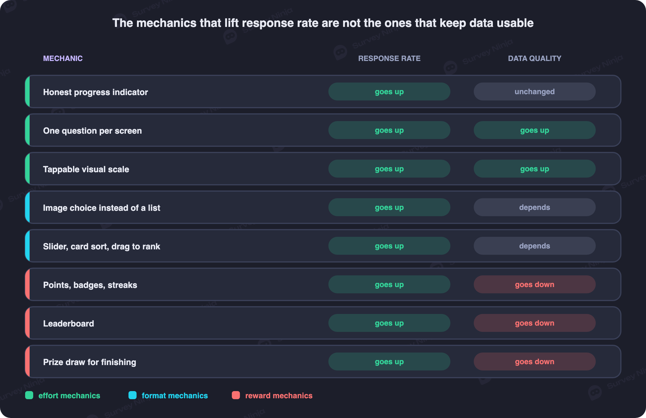
Effort mechanics are almost always safe, because they do not change what is being measured, only how much friction stands between the respondent and the answer. Honest progress feedback, one question per screen instead of a scrolling wall, conversational wording instead of a form-field label, visual and tappable scales instead of a text list of radio buttons, an image choice question instead of asking someone to read four product names, a small acknowledgment right after each answer, and showing how much is left rather than a proud count of how much is done. None of these change the meaning of a question. They change how much it costs to answer it, and lowering that cost is the entire reason gamification is worth discussing at all.
Format mechanics change the question type itself: card sorting instead of a ranked list, a slider instead of a numeric field, drag to rank instead of typing numbers into boxes, picking an image instead of reading a label, a short scenario or trade-off instead of an abstract importance rating. These are useful exactly when the format matches how people naturally think about the thing you are asking. Card sorting mirrors how people already group concepts in their heads, so it often produces cleaner categories than asking someone to rank a list they have never compared item by item. A trade-off scenario, "would you rather," gets closer to a real decision than asking someone to rate five features on separate five-point scales when in practice they can only have three. But format mechanics can also introduce bias that a plain question would not: a slider anchored at the left visually suggests the left value is the default, and an image choice question where one photo is simply better lit will out-perform its rivals regardless of what it depicts. Use a format because the question fits it, never because it looks more interesting on a mockup.
Reward mechanics are the family that causes the damage this article spends the next section on. They are worth naming here because they are the version most people mean by "gamification" and the version that gets pitched first, which is backwards from how much attention each family deserves.
| Family | Effect on response rate | Effect on data quality | Examples |
|---|---|---|---|
| Effort mechanics | Up, reliably | Flat or slightly up | Progress feedback, one question per screen, tappable scales, micro-acknowledgment |
| Format mechanics | Depends on fit | Up if the format fits the question, down if it does not | Card sorting, sliders, drag to rank, image choice, trade-off scenarios |
| Reward mechanics | Up, sharply | Down, often sharply | Points, badges, leaderboards, prize draws, streaks |
Effort mechanics are covered in more detail throughout how to create an online survey, and the single-question format that anchors the whole family is also the backbone of a good micro-survey. Question type choice, including where an image choice or a scale beats a plain list, is covered in types of surveys and question types.
Reward mechanics: why points and prizes corrupt the data
Reward mechanics fail through two separate mechanisms, and both are worth naming precisely because each is fixable in a different way and neither is fixed by making the reward bigger.
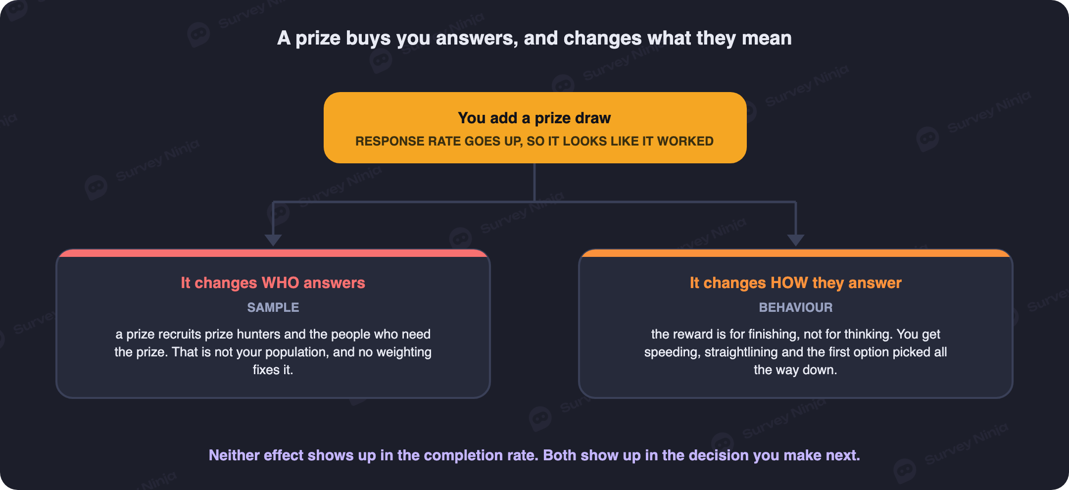
The first mechanism changes who answers. A prize recruits people who want the prize, and people who want a prize are not, in general, your customer population. A $50 gift card draw pulls in professional survey takers, people who enter every sweepstake they see, and people for whom $50 matters enough to spend fifteen minutes on a survey they otherwise would have ignored. None of that describes the busy enterprise buyer or the long-tenure employee whose honest opinion was the actual reason you ran the survey. This is response bias introduced at the recruitment stage, before a single question is answered, and no amount of clever question design fixes a sample that was never the right sample.
The second mechanism changes how people answer. Once a reward is attached to finishing, the respondent's implicit goal switches from "give an accurate answer" to "reach the end screen." That switch shows up as speeding, where someone finishes a twelve-minute questionnaire in three minutes; as straightlining, where every item in a matrix gets the same rating regardless of content; and as clicking the first non-neutral option down a long grid just to clear it. None of this is malicious. It is the predictable response to a contract that pays for completion and not for thought. Any reward tied to volume corrupts the thing you are measuring, because the incentive rewards exactly the behavior, rushing, that produces bad data.
Streaks and leaderboards deserve a specific word because they get borrowed from products where they genuinely work. A habit app rewarding a daily streak is optimizing for showing up, and showing up is the entire goal. A daily or weekly pulse survey that copies the streak mechanic is optimizing for the wrong thing, because showing up is not the goal, a thoughtful answer is, and a streak trains people to protect the streak by tapping through as fast as possible rather than pausing to think. A leaderboard causes a parallel problem in reverse: visible ranking pressures people toward the socially acceptable answer instead of the honest one. An internal survey that posts each team's average score turns a private opinion into a public statement about a colleague, and respondents quietly soften negative ratings to avoid being the reason a teammate's number looks bad. That is precisely the honest, uncomfortable signal the survey was trying to collect, deleted by the mechanic meant to encourage participation.
Progress indicators: the mechanic almost everyone uses, and almost everyone breaks
Progress indicators deserve their own section because they are the single most common gamification element in any survey tool, present by default in most builders, and treated as a UI checkbox rather than a design decision that affects dropout directly.
A progress bar makes an implicit promise: it says "this is how much is left," and people plan their remaining attention around that number. The first way to break the promise is a bar that jumps unpredictably. Skip logic that removes eight questions after a single answer can make a bar leap from 20 percent to 60 percent in one screen. That is not a neutral event; it reads as the survey lying, because the respondent had already budgeted attention based on the old number. A bar that behaves this way is worse than no bar at all, because a missing progress indicator sets no expectation to violate, while a jumpy one sets and breaks one on the same screen.
The second failure is a percentage that stalls. A long matrix rendered as a single "question" in the survey's internal counter can sit at 62 percent for ninety seconds while someone works through twenty grid rows. Nothing on screen tells them the number is about to move, so it looks frozen, and dropout spikes exactly at that stall. The fix is mechanical: break long grids into visually distinct steps so the counter advances with visible progress, or advance the bar per rendered row rather than per internal question object. This overlaps directly with how to reduce survey dropout, where stalled progress is one of the more fixable dropout causes because it is purely a display problem, not a length problem.
The harder case is a branching questionnaire where the true length genuinely is not known in advance, because different paths through the branching logic have different lengths. Do not fake a percentage here. A number implies precision you do not have, and a wrong number does more damage than an honest lack of one. Better options: a step counter with no denominator ("Section 2 of your feedback"), a soft estimate recalculated as the branch resolves ("about five more questions, based on your answers so far"), or a rough time estimate refreshed at each branch point rather than frozen at the start. An honest "getting close" beats a dishonest 74 percent every time, because respondents forgive vagueness far more readily than they forgive being misled by a number they trusted.
When gamification earns its place
Gamification, of the effort and format kind especially, is the right call in a specific set of situations, and recognizing them saves you from either over-applying it or dismissing it entirely.
Long questionnaires benefit the most, because effort mechanics redistribute attention across fifteen or twenty minutes in a way a plain form cannot; a visual scale and an honest progress indicator keep a long survey legible where a wall of identical text fields would not. Young audiences, students and younger consumer panels in particular, read a playful interface as normal rather than distracting, so a card-based or image-driven format costs nothing in credibility. Repeat panels are a strong case for format variety specifically, because the enemy of a panel that answers weekly or monthly is habituation: the same slider every time trains people to drag it to the same spot without reading the question, while rotating between a slider, a card sort and a simple scale on alternating waves keeps the panel actually looking at each question.
B2C and low-stakes topics, a favorite flavor, a preferred feature name, an event experience, are a good fit because a wrong or under-considered answer costs nothing, so the modest quality cost some format mechanics carry is easily worth the completion they buy. This covers most event surveys and on-site feedback collected by QR code, where the respondent is standing in line or leaving a venue and a fast, visual question is the only kind that gets answered at all. In-product asks are the last good case: a rating request inside a shopping or gaming app, delivered through a popup survey form or a lightweight triggered survey, sits inside an interface the respondent already expects to be a little playful, so a tap-based, visual question fits the surrounding product rather than sticking out. The general playbook for that context, including timing and how many questions the moment can carry, is covered in in-app feedback.
When to leave it alone
Professional and B2B respondents are the clearest case against gamification. They are answering under time pressure, task-focused, and a playful interface reads as a distraction from the one substantive question that actually matters to them, sometimes as a sign the survey was not built for a professional audience at all. Sensitive topics, health, harassment, compensation, anything with emotional weight, clash with a gamified tone in a way that dampens candor exactly where you need it most; nobody wants to rate their experience of a difficult event with a row of smiling emoji.
Anything with consequences for the respondent is a hard no. Performance reviews tied to survey results, medical intake, compliance questionnaires: when the answer changes what happens to the person answering, they optimize for how the answer will be read rather than for accuracy, and a playful, fast format nudges toward under-considered responses at precisely the moment that matters most. Employee surveys deserve their own mention because of the power dynamic underneath them: a leaderboard, a badge, or a reward tied to team participation invites the exact contamination described earlier, softened negative answers to protect a visible number, right where the honest and uncomfortable answer is the entire point of asking.
Finally, any study you plan to report as representative is not a place for reward mechanics. If the results will be presented as "X percent of our customers think Y," self-selection introduced by a prize invalidates that claim, because the population that answered is no longer the population you drew the sample from. This failure is silent: the survey still returns clean-looking results, a completion percentage, an average score, and nobody notices the sample quietly became prize hunters until the numbers stop matching what the account team hears in actual conversations. Anyone running work that leans on sampling theory should read probability sampling and size the sample properly with a sample size calculator rather than trying to buy volume with a prize.
How to tell a mechanic has damaged your data
These checks catch the damage before it reaches a report, and none of them require anything more than the raw response export.
- Median completion time versus a plausible floor. Estimate a floor from question count and type, roughly four seconds per simple closed item plus real reading and typing time for anything open-ended, then compare it against the actual median. A twelve-minute survey with a three-minute median is not a fast, engaged audience, it is a speeding cluster.
- Straightlining rate in grid questions. Calculate the share of respondents who gave the identical rating across every item in a matrix. A few percent is normal background noise; anything markedly higher on a gamified wave than on a plain one is the reward mechanic winning.
- Share who picked the first option every time. A simple careless-response marker: count respondents whose answer was the first listed option on every closed question. A rising share across waves tracks rising fatigue or a rushed, reward-chasing respondent pool.
- A gamified wave against a plain control. Run the identical questionnaire two ways at the same time, one with the gamified treatment and one without, and diff the two on completion time, straightlining rate and the depth of open-text answers, a comparison that also feeds directly into thematic analysis if the open text is where you expect the real signal to live.
Run these before rolling a mechanic out broadly, on a small test wave, not after a quarter of gamified data is already sitting in a dashboard someone has started quoting.
If you use incentives, do it the least harmful way
Sometimes an incentive is genuinely warranted, a long survey of a busy professional audience, a panel that needs a reason to keep coming back. If you decide to use one, the harm depends almost entirely on structure, not on size.
- Fixed and small, not a big prize draw. A modest, guaranteed amount recruits people willing to spend a few minutes for a small, certain reward. A large jackpot recruits people chasing a jackpot, which is a different population entirely.
- Given to everyone who finishes, not decided by lottery. A lottery keeps the "did I win" motivation alive through every question, which is exactly the motivation that produces speeding. A flat thank-you gesture for every completed response removes that motivation from the equation.
- Unrelated to the answers. Never structure an incentive around a target answer, "rate us 8 or higher to be entered." The incentive has to depend only on completing, never on which answer was given.
- Disclosed up front. Announcing the incentive before the first question lets people who do not want to be recorded or bothered opt out immediately, rather than pushing through to a reward they only learn about at the end.
- Never tied to a target number of responses. A quota, "we need 500 responses by Friday," turns into internal pressure to push the link harder, chase specific people, or accept a prize-hunting spike just to hit the number. The moment a response count becomes a deadline, someone starts optimizing for the count instead of the answers.
Accessibility and the device you didn't test on
Gamified mechanics are usually designed and tested on a fast laptop with a mouse, which is exactly the device profile least represented among many real respondent pools.
Drag mechanics fail on touch for some users long before they fail outright. Motor-impairment, screen-reader navigation and even ordinary hand tremor make a drag-to-rank interaction unreliable on a phone, and unlike a broken text field, a drag gesture that half-works does not throw an error, it silently returns a misordered rank that looks like a valid answer. Animations cost real time on slow connections. A point pop-up or a card transition that renders instantly on a demo laptop can add a full second or more per screen on an older Android device or a weak connection, and across twenty questions those seconds compound into dropout that never shows up as "the survey was too long," because on your dashboard it just shows up as abandonment with no explanation attached.
A mechanic that needs a mouse silently excludes people. Hover-reveal explanations, a slider with no numeric fallback, a click-drag card sort with no keyboard alternative: each of these quietly removes a segment of your audience from the survey without ever showing up as a support ticket or an error log. The rule that keeps a playful interaction actually inclusive rather than only inclusive on the device it was built on is simple: every mechanic needs a boring fallback, a tap target, a typed number, a plain radio button, or it is a form only part of your audience can complete, and the missing group does not register as "did not answer," it registers as a garbled or partial answer that looks like ordinary noise.
Three changes that lower effort and cost nothing
Before reaching for points or a prize draw, three effort mechanics deliver most of the completion gain that gamification promises, with none of the data risk, and none of them require a redesign.
- One question per screen instead of a long scrolling form. This is a configuration choice in most builders, not a development project, and it is consistently the single change with the strongest and most reliable effect on completion, because it turns an intimidating wall of fields into a series of small, finishable steps. It is covered in more depth in how to create an online survey.
- Conversational wording instead of form-field labels. "How did we do on this order?" reads as a question from a person; "Rate the following: order experience" reads as a form field. Rewriting a questionnaire this way is an editing pass, not a rebuild, and it lowers the sense of filling out paperwork without touching what is actually being measured. The wording checklist in feedback form questions covers the common traps, including phrasing that leans on a leading question without meaning to.
- An immediate micro-acknowledgment after each answer. A brief checkmark, a one-line "got it," nothing structural, just a small signal that the answer registered. It costs a template setting rather than a build, and it closes the small anxious gap between tapping an answer and the survey visibly moving on.
Try these first. They solve the actual problem behind most gamification requests, which is friction, not a lack of motivation, and none of them touch the reward layer that causes the trouble described above. SurveyNinja's one-question-per-screen layouts, image choice and slider question types, and logic jumps are built to support exactly this kind of effort-first design; see features for the full list, or start from a ready-made template and adjust the wording rather than building a questionnaire from a blank page.
Common mistakes
- Optimizing for completion rate instead of usable answers. A high completion rate on straightlined data is a worse outcome than a lower completion rate on clean data, not a better one.
- Treating reward mechanics as a bigger version of effort mechanics. They are a different project with a different risk profile, not the same idea turned up.
- Attaching a prize draw to a study you plan to report as representative. Self-selection from the prize invalidates the representativeness the whole study depends on.
- A progress bar that jumps after skip logic fires. A broken promise about remaining length is worse than making no promise at all.
- Faking a percentage on a branching survey with unknown length. A wrong number does more damage to trust than an honest step counter with no denominator.
- Copying a leaderboard from a training tool into a feedback survey. Visible ranking pushes people toward the socially acceptable answer instead of the honest one.
- Choosing a format mechanic because it looks interesting on a mockup. A slider or drag-to-rank that doesn't match how the question is actually thought about adds bias without adding insight.
- Shipping a drag interaction with no keyboard or tap fallback. It does not fail loudly, it just quietly returns bad data from the users it excludes.
- Tying an incentive to a response quota or a deadline. The moment a count becomes a target, someone starts optimizing for the count.
Frequently asked questions
What is the difference between effort mechanics and reward mechanics?
Effort mechanics change how much a question costs to answer without changing what is being measured, such as a tappable scale or an honest progress bar. Reward mechanics attach an external payoff to finishing, such as points or a prize draw, which changes both who chooses to respond and how carefully they answer.
Why can a prize draw make survey data worse?
Through two mechanisms. It changes who answers, because a prize recruits people who want the prize rather than your actual customer or employee population. It changes how people answer, because once the goal becomes reaching the reward screen rather than giving a considered answer, speeding and straightlining rise.
Why is a jumpy progress bar worse than no progress bar?
A progress bar makes an implicit promise about how much is left, and respondents plan their attention around that number. When skip logic makes the bar leap unpredictably, it breaks a promise the respondent had already relied on, which reads as the survey misleading them. No bar sets no expectation to break in the first place.
How do you show progress on a branching survey where the length isn't fixed?
Do not display a precise percentage you cannot back up. Use a step counter without a denominator, a soft estimate recalculated as the respondent's path resolves, or a time estimate refreshed at branch points. An honest, vague signal is trusted more than a specific number that turns out to be wrong.
How can you tell if a gamification mechanic has damaged your survey data?
Compare median completion time against a plausible floor for the question count, check the straightlining rate in any grid questions, measure the share of respondents who picked the first option on every item, and where possible run the same questionnaire as a gamified wave against a plain control to diff the two directly.
Is it ever safe to offer an incentive for completing a survey?
Yes, with structure that limits the harm: keep it fixed and modest rather than a large prize, give it to everyone who finishes rather than by lottery, keep it unrelated to which answers were given, disclose it before the first question, and never tie it to a target number of responses.
When should gamification be avoided entirely?
With professional and B2B respondents, on sensitive topics, on anything where the answer has consequences for the person answering, on employee surveys where a visible reward or ranking can suppress honest criticism, and on any study you intend to report as representative of a defined population.
What is the cheapest way to make a survey easier to answer without adding game mechanics?
Three changes cost nothing structurally: one question per screen instead of a long form, conversational wording instead of form-field labels, and a small acknowledgment after each answer. All three lower perceived effort, which is the actual problem gamification is usually trying to solve, without touching the reward layer that causes data problems.
Updated: Aug 26, 2026 Published: Aug 24, 2026