


QR Code Surveys That Actually Get Scanned
Useful  Mike Taylor Updated: Aug 26, 2026 Reading time ≈ 23 min
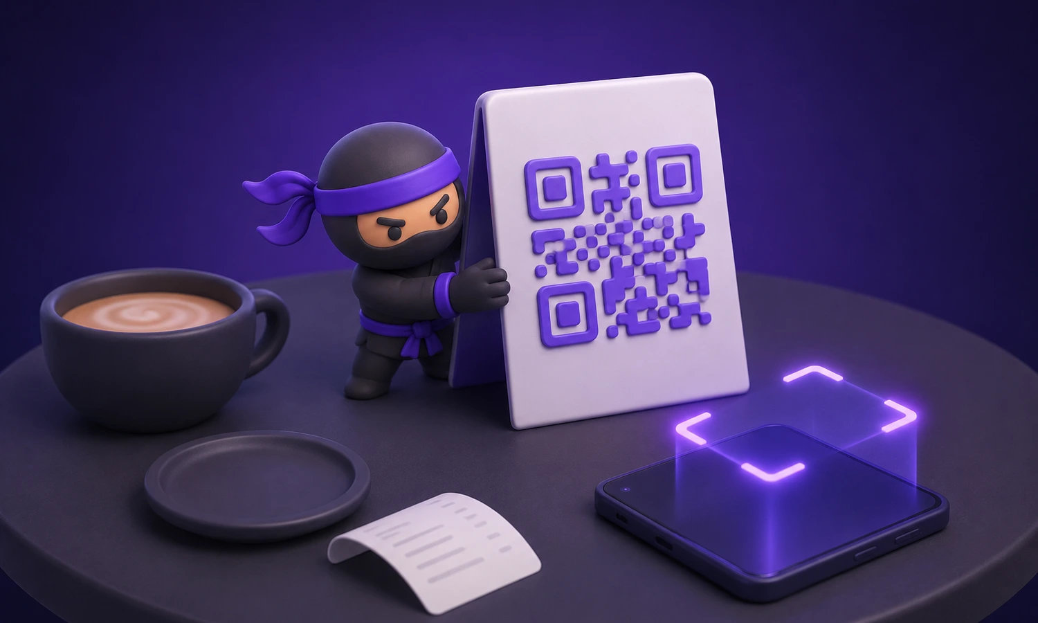
A QR code survey turns a physical place into a feedback channel: a customer points a phone at a printed square and lands on your questions with no app, no typing and nobody standing over them. The idea is trivial. Getting it scanned is not, and that part is physical rather than digital.
An online store watches everything: which pages were opened, which product was abandoned, how long someone hovered. A cafe, a clinic, a gym or a shop sees the queue and the till roll. The customer who waited eleven minutes for a table and decided never to come back leaves no trace.
Since roughly 2017 the stock camera app on both mobile platforms reads a code with no scanner app, which reduced the whole interaction to point and tap. That is what makes a QR code a feedback channel rather than a novelty on a menu. Question craft in general is covered in how to create an online survey; this guide is about paper, walls and the two seconds before someone lifts a phone.
The three ways to hear from a customer in your building
The first is asking out loud, and the answer is almost always "fine", because refusing to complain to someone's face is a reflex. The person collecting the feedback is also the person being judged, so staff ask the tables that went well and skip the rest. The second is paper, which needs a pen, a box and somebody to type hundreds of sheets into a spreadsheet.
The third is the row of coloured buttons by the exit, one bit of information with no reason attached: a red face says a customer was unhappy and leaves you guessing whether it was the price, the queue or the toilet. A printed code replaces that tap of undirected emotion with a structured answer carrying context, minutes after the experience.
What the code is, and what it is not
QR stands for Quick Response, a matrix barcode designed in Japan in the mid nineties for tracking parts on a production line. The three large squares in the corners let a camera find the code and work out its orientation, which is why a scan works upside down and off centre.
Capacity runs to thousands of characters, and that is a trap: more data means more modules, and more modules at the same printed size means smaller squares and a harder scan, so you want the shortest URL you can get and no other payload. The code carries no intelligence. It is a printed link, and what decides whether this works is the physical condition of the print and the page that opens.
Static and dynamic codes
A static code has the destination baked into the pattern, so changing where it goes means a new pattern and a reprint. A dynamic code encodes a short redirect you control: the pattern never changes, the destination does.
That decides three things. Survival, because the month after launch you will want to rotate the questions, and with five hundred table tents printed a static code makes that a budget conversation. Measurement, because the redirect is the only place a scan gets recorded, and without it you cannot tell a code nobody scanned from a survey nobody finished. And repair, since a broken survey URL becomes one edit instead of a print run.
Two cautions. The redirect domain must be one you will still control in three years, because a lapsed short link service turns every printed asset into a dead end. And a branded short domain beats a generic shortener, since phones preview the destination and an unfamiliar shortener is what a cautious customer has been taught to refuse.
Where the code goes
Placement decides more than anything else here. A spot performs when three things line up: the person has dead time, the experience has just happened, and the code sits within comfortable reach of their eyes without them changing posture. Miss any of the three and the code becomes wallpaper.
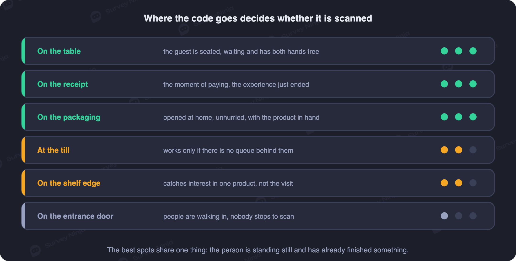
The table tent is the strongest placement in hospitality and it is not close: a guest waiting for food or for the bill has real dead time, the phone is already in hand, and the card sits at a fixed distance and can be angled toward them. The equivalent in a clinic or a gym is the waiting area, where dead time is abundant and slightly resented, which is the mood in which people answer questions.
The receipt or bill folder is second, landing as the transaction closes and surviving the trip home, though thermal print fades and a fold through the middle kills the code. The checkout counter works for the same reason a queue does. The shelf edge label is a specialist: nobody scans a shelf strip to discuss the shop in general, but a code under one product asks a specific question at the moment of choosing, so expect low volume and precise answers.
Packaging and the delivery box run the other way, scanned at home by someone who has used the thing, which costs you recall of the visit and buys an opinion about the product. The door or window looks perfect in theory and disappoints, because a person on the way out is walking with their hands full. The staff badge is the highest trust placement available and also the most biased, since staff choose when to point at it: use it for service recovery, not for measurement. And use two or three spots per venue, not eight: a place papered with codes reads as clutter, and you lose the ability to tell which placement earned the scan.
The physical rules that decide whether it scans
Most programmes fail here, silently. A code that does not scan produces no error and no complaint: the customer shrugs, puts the phone away, and your dashboard shows what looks like indifference.
Size follows distance, at roughly ten to one. Readable distance is about ten times the width of the code, so divide the real scan distance by ten and add a margin for bad light. A table tent read from 30 cm needs 2.5 to 3 cm of code; a shop window read from three metres of pavement needs about 30 cm, and shrinking that to a polite 10 cm is why nobody scans it. Below 2 cm, do not bother.
| Where the code lives | Real scan distance | Minimum printed side |
|---|---|---|
| Receipt, bill folder, table tent | 20 to 40 cm | 2.5 to 3 cm |
| Counter sticker, shelf edge label | 40 to 70 cm | 5 to 7 cm |
| Wall poster, fitting room door | 1 to 1.5 m | 10 to 15 cm |
| Shop window read from the pavement | 2.5 to 3.5 m | 25 to 35 cm |
| Banner, van livery, roadside board | 8 to 10 m | 80 cm to 1 m |
The module is the real unit, and the quiet zone is part of the code. No phone reliably reads modules under about 0.4 mm, or 0.6 mm on thermal paper, the practical reason to keep the URL short. The blank margin around the pattern, four modules wide on every side, is not decoration: cropping it causes more scan failures than any other design decision.
Dark on light, on a flat matte surface. Inverted codes are rejected by many scanners, and so are low contrast pairs that look sophisticated in a brand deck: dark blue on black, pastel on white. Gloss lamination under spotlights makes a hotspot that blanks part of the pattern, and a curve on a cup or a column bends the grid, so keep the modules near black on near white and give the brand colour the frame.
Height and angle are the boring part that decides everything. Put standing codes between 140 and 160 cm from the floor, and angle a table tent toward the guest instead of laying it flat, where it catches the ceiling and forces a lean. In a dim bar print bigger than the table says, since low light makes a camera hunt for focus and people give up in about three seconds.
Use error correction level M by default, or H when a logo sits in the middle. Then test: print the real asset, put it in the real spot, and scan from the actual distance with the oldest phone you own, at an angle, with the lights up and at your dimmest setting.
What to write next to the code
A bare code gets ignored. A customer decides in about half a second whether pointing a camera at your wall is worth it, and needs three answers in that time: what happens if I scan, what it costs me, and who is asking.
Name the outcome, not the mechanism. "Scan for our customer satisfaction survey" describes your internal process; "Tell us what went wrong today" describes something a customer might want. Skip the promise of thirty seconds, which everyone has read and nobody believes. A count of questions is verifiable and therefore credible, so "3 questions" or "4 taps, no typing" sets an expectation you can keep.
Say who is asking. A bare sticker in a public place is the shape of the tampering stories people have read, so put your logo and venue name on the asset and print the readable short address underneath. If you offer an incentive, be exact: "prizes" is noise, "10% off your next coffee" is a transaction, and whatever you promise has to be redeemable without an argument at the counter.
- Something we got wrong today? Tell the manager in 3 questions. Names the recipient and gives permission to complain.
- Rate your table service. 4 taps, no typing. Scoped to one thing, with the effort in a unit people can check.
- We changed the opening hours because of this code. What next? Proof that the last round of answers did something.
Leave out "your opinion is important to us", invisible through overuse, and keep a public review request off the same card: private information and a public rating are different jobs.
Put the location in the URL
One survey, many codes: each printed asset gets the same destination with different parameters attached, something like ?loc=store-14&spot=table-tent&table=7, and the survey stores those values in hidden fields with every answer. That is the difference between "customers say service is slow" and "service is slow at branch 14 on weekday evenings, and nowhere else".
Encode the branch, the placement type so you learn which spot earns its print run, and the table or room where routing matters, because a complaint carrying a table number can be fixed before the guest leaves. Time of day comes from the timestamp. Keep parameters short, since every character adds modules, and never put personal data in a URL. For a network, generate the codes in one batch from a spreadsheet mapping each code to its asset, and keep that spreadsheet.
Design the survey for someone who is standing up
The respondent is not at a desk. They are standing with a bag in one hand, or seated with a coat half on, or holding up a queue. That sets the budget: three to five closed questions, one screen where possible, and at most one optional open question at the end.
Make the first question the one you care about most and answerable with a single tap: a satisfaction score, a row of faces or a customer effort score question, with CSAT vs NPS covering the choice between rating a visit and rating a relationship. That first tap is a commitment: people who answer one question usually finish, and people who meet a text box do not.
Give every question prepared options so the survey can be finished with a thumb, following the Likert scale guide. An eleven point NPS row is the exception, since it does not fit a narrow screen without shrinking cells below thumb size. Then branch: a low score opens a short list of likely causes, which beats a blank box, followed by an optional comment and a route to a human, while a high score asks what to keep. That is ordinary branching logic.
Everything else is subtraction: no matrix grids, no drop downs with twenty options, no mandatory text, no captcha, no login, and no question whose answer the URL already carries. The ways a form loses people are in how to reduce survey dropout, the wording checklist in feedback form questions, and the options versus free text trade off in open vs closed questions. Rotate the content monthly, but keep one or two tracking questions identical forever so trends stay comparable.
Rolling it out
Build and publish the survey first, so you have a real URL. Wrap it in a dynamic short link, generate one code per placement with its own parameters, and design the asset around the code rather than dropping one onto an existing poster. Print a proof and scan it in the venue, from the real distance, on the oldest phone you own.
Then deploy with a map, so someone can say which code is where without walking the floor. Brief the staff the same day, because a server who says "there is a code on the card if you have a minute" multiplies scans, and a server who has never seen the card removes it as clutter. Two things belong in that briefing: mention the code to everyone rather than picking the tables that went well, and keep raw scores out of individual bonuses, or you will measure your team's judgment about whom to ask. That is response bias, and once it is in the data you cannot remove it.
Measure scans and completions separately
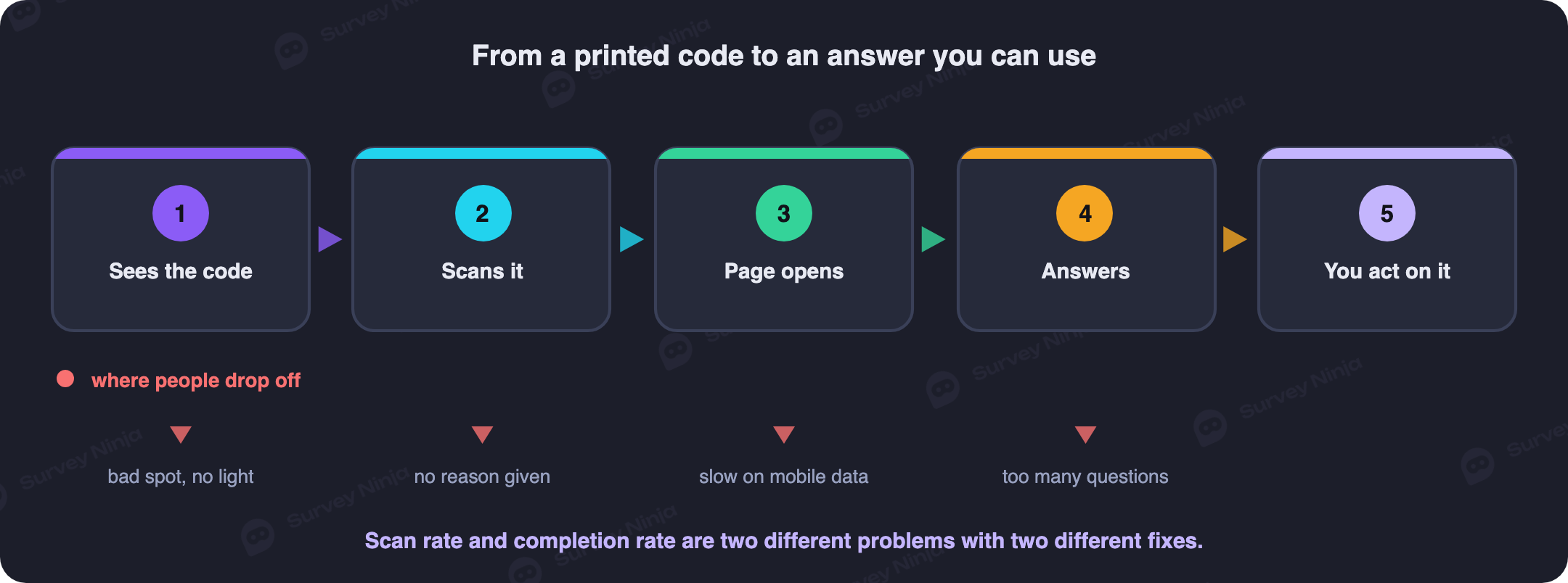
One number cannot tell you what is broken, so split the funnel into three. Scans per asset come from the dynamic link and measure the physical layer: placement, size, contrast, copy. Start rate, the share of scans producing a first answer, measures the handover: page speed, language, whether the survey looks long. Completion rate measures the survey itself; definitions are in the note on response rate.
Diagnosis is then almost mechanical. Few scans means wrong place, too small, or copy that gives nobody a reason. Many scans and few starts means the page was slow on a weak signal or looked like work. Many starts and few completions means it is too long, has a mandatory field, or contains one question people refuse, which you find by seeing where responses stop. That is also when to check for survey fatigue among regulars who have seen the same card for months.
For comparing locations, normalise: a flagship store always wins on raw counts, so compare responses per hundred customers instead. And people who scan a voluntary code are not a random sample, skewing toward strong feelings and toward customers comfortable with a phone, so read each location against its own previous month and check sample size before concluding anything from eleven responses.
What to do with the answers
Offline feedback has one advantage no online channel can match: the customer may still be in the building. A low score carrying a branch and a table number should reach the manager on duty within minutes, with an expectation to act before the guest leaves. Recovery inside the visit turns a complaint into a returning customer instead of a public review.
Weekly, read each location on the same questions over the same period and look at the gaps between locations rather than absolute levels. Monthly, group the open text into themes with counts attached, using thematic analysis, so the most vividly worded complaint does not outrank the most common one. Then separate what a location controls, such as queue length and cleanliness, from what head office controls, such as pricing and opening hours, because sending the second to a store manager as a performance issue makes the programme cynical.
Finally, close the loop where customers can see it. A small card beside the code saying what changed because of the last round is the cheapest thing on this page and reliably the most effective, since it turns a suggestion box into evidence that someone reads it. The same message works by mail, compared in email surveys, and the screen based equivalent is in in-app feedback.
Loose ends that quietly kill a rollout
Connectivity. Basements, thick walls and shopping centres produce the case where the code scans, the page hangs and the customer leaves. Offer guest wifi where the code lives, print the network name on the same card, and keep the landing screen light.
Overreach. Do not call a survey anonymous while it carries a table number, a timestamp and a shift, because that identifies a party at a table; the standard is in the note on anonymous surveys. And keep a second route open for people who will not scan.
Common mistakes
- A static code on a print run. The first time you want to change the questions, the whole run becomes waste.
- Printing too small for the distance. A 4 cm code on a shop window is decoration, not a channel.
- Cropping the quiet zone. The blank margin is part of the code, and removing it is the most common silent failure.
- A bare code with no copy. With no stated outcome and no stated length, there is no reason to lift a phone.
- One code for the whole network. Without a location parameter you learn that something is wrong somewhere.
- Counting only responses. Without a scan count you cannot tell an unseen code from an abandoned survey.
- Collecting and changing nothing. The second round is always smaller when the first went nowhere.
Getting one live this week
The build is short: write three or four closed questions, publish, wrap the link, generate one code per placement, print a proof, and put cards on the tables.
SurveyNinja covers the survey half: QR generation from the published link, hidden fields for the location and placement parameters, logic that sends low and high scores down different paths, and filtered reports for comparing branch against branch. Response volume is uncapped even on the free plan, which matters when a chain across thirty venues cannot know whether the first month brings two hundred answers or four thousand; see the pricing page. Start from a ready made template, or borrow from customer satisfaction survey questions and types of surveys and question types. Then build the survey, print one card, and put it on one table.
Frequently asked questions
What is a QR code survey?
A survey reached by scanning a printed code with a phone camera. The code holds nothing but a link, so the customer lands on your questions with no typing and nothing to install. It exists to solve the input problem of offline feedback, where the alternative is a paper form.
Where should a QR code go in a shop or a restaurant?
Where the customer has dead time, has just had the experience, and can reach the code with their eyes without moving. The table tent is the strongest placement in hospitality, followed by the bill folder and the checkout counter. Shelf edges suit product specific questions, and the exit door performs worse than it looks.
How big does a QR code need to be?
About one tenth of the distance it will be scanned from, plus a margin. That means 2.5 to 3 cm on a table tent read from 30 cm, 5 to 7 cm on a shelf label, and 25 to 35 cm on a shop window read from the pavement. Never go below 2 cm, and leave a quiet zone four modules wide.
Should I use a static or a dynamic QR code?
Dynamic, for anything printed in quantity. A static code has the destination fixed in the pattern, so changing the survey means reprinting everything. A dynamic code points at a redirect you control, so you can rotate questions without touching the print, and the redirect is the only place a scan gets counted.
What should I write next to the code?
The outcome, the length and the identity of whoever is asking. Name what the answer will change rather than describing the survey, state a countable length such as three questions instead of the worn out promise of thirty seconds, and add your logo and a readable short address underneath so the code does not look like a tampered sticker.
How many questions should a QR code survey have?
Three to five closed questions, plus at most one optional open comment. The respondent is standing up or about to leave, so the first question has to be answerable with a single tap and nothing should be mandatory except the opening rating. Branch on the score so a low answer asks what went wrong and a high answer asks what to keep.
How do I compare feedback between locations?
Give every printed asset the same survey with different URL parameters for the branch, the placement type and where relevant the table or room, and store those in hidden fields with each response. Then normalise by traffic, comparing responses per hundred customers rather than raw counts, and read each location against its own previous period.
What scan rate should I expect?
Less than everyone hopes, and the trend matters more than the number. Only a small fraction of visitors ever scan a voluntary code, and that fraction depends almost entirely on placement, printed size and the copy beside it. Track scans, starts and completions separately so a weak result tells you which layer to fix.
Updated: Aug 26, 2026 Published: Aug 14, 2026