


Email Surveys That People Actually Answer
Useful  Mike Taylor Updated: Aug 26, 2026 Reading time ≈ 23 min
Email is the only survey channel where you know exactly who you invited, and the only one where a single tap inside the message can start the survey. Used well, it brings back honest feedback from real customers. Used badly, it is one more unread newsletter with a link nobody presses.
An email survey is not a survey link pasted into a campaign. The format has its own mechanics: a first question that lives inside the message body, a landing page that picks up where the click left off, a subject line doing the work an invitation screen does elsewhere, and a delivery layer that can quietly swallow the whole send. If you need the underlying craft of question design first, that ground is covered in how to create an online survey and in our guide to what a questionnaire is. Here we assume the questions are sound and the problem is getting them answered.
The jobs email surveys are good at
Email suits questions aimed at people you already know, asked a little after something happened. That is a narrower brief than "customer feedback", and it explains why some email surveys work and others land flat. To hear from people who have never bought anything, or from visitors mid-session, you want a widget or an in-app prompt instead. Within its own territory, five jobs come up again and again.
- Loyalty and satisfaction after a purchase. A relationship question like NPS works by email precisely because it is not tied to one screen in the product, and CSAT works too if it goes out close to the event; the difference is unpacked in CSAT vs NPS.
- After a support interaction. A closed ticket is a natural trigger, and this is where customer effort score earns its place: how hard was it to get this sorted out.
- Onboarding check-ins. A survey a week or two in catches the people who signed up, got stuck and said nothing. They are still reachable by email at that point, which they will not be in a month.
- Churn and win-back. When somebody cancels, email is the only channel left, because they are no longer in the product for a prompt to find them. Keep it to why they left and what would bring them back; an AI churn survey generator gives you a draft to edit.
- Feedback on the newsletter itself. A rating row at the foot of a regular send tells you which issues landed, and over a few months that becomes a content signal rather than an opinion.
What these share is a known recipient, a recent event and a question that fits in a sentence. When an email survey fails, one of those three is usually missing.
The response funnel, and where people actually disappear
The common mistake is treating an email survey as a single conversion. It is a chain of five steps, and every one of them leaks. The chain matters because the fix for a disappointing result depends entirely on which step is bleeding, and the step teams blame is rarely the guilty one.
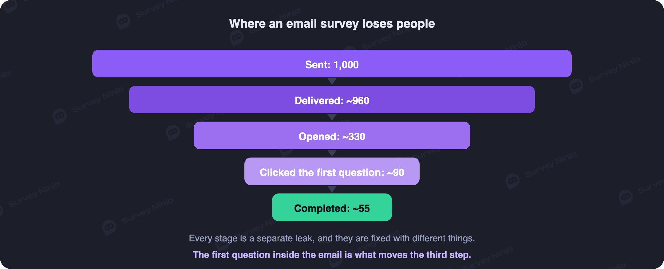
Sent to delivered is a deliverability question, and it is invisible unless you look. A healthy list loses a low single-digit percentage to bounces and filtering; the worst version is mail that is accepted and then filed into spam, which looks like perfect delivery and produces silence.
Delivered to opened is where the subject line lives. For a permissioned list writing to recent customers, open rates commonly sit in the twenties to forties as a percentage, and triggered messages beat broadcast sends because the recipient is half expecting something. Treat those figures as a shape rather than a target, since open tracking is unreliable on platforms that pre-fetch images.
Opened to first click is what most of this article is about. In a plain "take our survey" email with a button, only a small share of openers click. With the first question embedded in the message, that share tends to be several times higher, because the ask changes from a commitment into a tap.
First click to completion is the step you control best. A short, visibly finite survey keeps most of the people who clicked; a long or repetitive one loses them fast, as dissected in how to reduce survey dropout.
Multiply it through and the arithmetic is sobering. A campaign to a decent list often ends with completed responses in the low single digits of everyone sent, and anything near double figures is a strong result rather than a normal one. That is not failure: two hundred responses from a five thousand contact list is a usable dataset. The point of the funnel is knowing which stage to work on, because if opens are healthy and clicks are terrible, rewriting the subject line is wasted effort. Track response rate and completion rate separately, since they diagnose different problems.
The one-click first question
Here is the technique that moves email survey numbers more than anything else: put the first question inside the email, and make answering it one click.
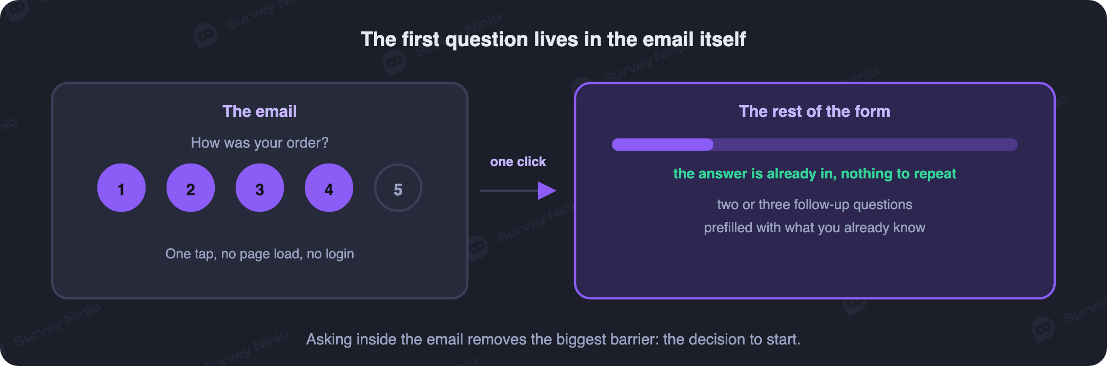
Mechanically it is simpler than it sounds. Email clients block scripts, so nothing interactive can run inside a message. What you can do is render the answer options as a row of linked cells, buttons or images, each with its own URL carrying the chosen value as a parameter. A row of numbers from 0 to 10, five faces, a thumbs up and thumbs down: all of them are links wearing a costume. The recipient sees a question; your survey platform sees a click with an answer attached.
Why this lifts response so sharply is half psychology and half friction. A survey link asks for an unknown amount of time, while a rating row asks for one tap on a number. The person has not agreed to take a survey, they have expressed an opinion, which is a far smaller decision. And once they have clicked they are inside the process rather than outside it, so the second question feels like continuing instead of starting.
Two constraints come with building one. Images are blocked by default in some clients, so an image-only rating row can arrive as an empty box, which makes table cells with background colours and real text the safer construction. And placement decides the rest: keep the options on one line with tap targets of at least 44 pixels, and put the block high in the message, because a rating row under four paragraphs of preamble is a rating row nobody sees.
What opens after that click
The click carries the answer into your survey and opens the rest of the form. Done properly, three things are true on that landing page. The first answer is already recorded, so nobody re-answers the question they just answered in the email. The page opens on the second question rather than a welcome screen, because a welcome screen after a click is a door that has already been opened. And the remainder is visibly short, with a progress indicator.
This is where branching earns its keep. Somebody who tapped a 9 and somebody who tapped a 3 should not see the same follow-up, and branching logic lets you ask the detractor what went wrong and the promoter what to keep doing. Three to five questions after the click is a sensible ceiling, finishing with one open question, since that is where the reason behind the rating actually lives; the balance between counting and explaining is set out in open vs closed questions. Decide too whether a partial response counts, because somebody who taps the rating and then closes the tab has still told you something, and that is the most common outcome by volume.
Subject lines and preheaders
The subject line is the whole invitation, compressed, and there are only a few reliable ways to make one worth opening. Name the thing the survey is about, since "How was your delivery?" beats "We value your feedback" every time. State the size of the ask honestly, because "one question" works in a subject line and is only allowed if it is true. Reference the specific event, so the recipient knows this is about their order last Tuesday rather than a generic campaign. And keep it short enough to survive a phone, which means aiming at roughly 40 characters and accepting that anything past 60 may be cut.
The preheader is the preview text beside the subject in the inbox, and it is the most wasted asset in email. Left alone it fills with whatever comes first in your HTML, often "View this message in your browser". Set it deliberately and use it to finish the thought: the subject asks the question, the preheader says how long it takes and what you will do with the answer. Avoid leading with a prize draw, which raises opens and lowers data quality because it changes who answers and why.
Timing and frequency
Feedback decays. Ask too early and the experience is not finished; ask too late and the person is reconstructing a memory rather than reporting one. The right delay depends on which touchpoint you are asking about.
| Trigger | Send the survey | Why |
|---|---|---|
| Support ticket closed | Within a few hours | The interaction is vivid and the agent is still identifiable |
| Order delivered | One to three days after arrival | Long enough to open the box, short enough to remember the process |
| Onboarding started | Seven to fourteen days in | Enough usage to have an opinion, early enough to save the account |
| Subscription cancelled | Immediately, or within a day | The reason is at its clearest and the address still works |
| Relationship NPS | Quarterly or twice a year | You are tracking a trend, so the interval has to stay constant |
Frequency is where goodwill gets spent. A rule that holds up well is one relationship survey per person per quarter, plus event-triggered surveys capped so nobody gets more than one every few weeks however many events they generate. Set that cap in your sending rules rather than your intentions, because the customer who orders weekly is the one you will accidentally survey to death. Suppress anyone who answered recently or has ignored two invitations in a row, since a third will not change their mind but will push them toward the unsubscribe link. This is the operational face of survey fatigue.
Mobile rendering, because that is where it will be opened
Most email is read on a phone, and for consumer audiences the majority is comfortable. That single fact decides the layout. A single column is not a preference but the only thing that survives, since multi-column designs collapse unpredictably across clients. Body text at 16 pixels or larger stays readable without pinching. A 0 to 10 row has to fit a screen around 320 pixels wide in the worst case, which usually means splitting it across two lines rather than shrinking cells past thumb size.
The survey that opens after the click carries the same obligation. Wide matrix questions are close to unusable on a phone and should be split into single questions, long dropdown lists are worse on mobile than on desktop, and every scale needs labelled endpoints, since a bare row of numbers on a small screen gives no clue which end is good. Test the whole path on a real handset in the client your audience actually uses, because desktop preview panes are consistently more flattering than reality.
Deliverability basics so the survey is not filtered out
A survey that lands in spam has a response rate of zero, and this failure mode produces the most confused post-mortems. You do not need to become a specialist, but a few things are worth checking before every send.
- Authenticate the sending domain. SPF, DKIM and DMARC are table stakes, and major mailbox providers have tightened requirements for bulk senders. Without them your mail is suspicious by default.
- Send from a real, monitored address. A no-reply sender depresses engagement and invites filtering, and people do reply to survey invitations with things worth reading.
- Clean the list first. Remove hard bounces and long-dormant addresses, because a high bounce rate on one campaign damages every campaign after it.
- Keep the message light. One tracking pixel, a reasonable image-to-text ratio, no attachments. Heavy HTML and link shorteners both attract filters.
- Include a working unsubscribe link. It is a legal requirement in most markets and far cheaper than a spam complaint.
Warm up gradually if the domain is new, and split large sends so a problem surfaces on the first batch instead of the whole list. If part of your audience has not heard from you in a year, treat contacting them as a reactivation campaign with its own risks.
Personalisation and hidden fields
Personalisation in an email survey is not "Hi {{first_name}}". It is the discipline of not asking people things you already know. If your system holds the order number, the plan, the region, the tenure and the support agent, none of those belong in the questionnaire. Every question removed this way raises completion and improves accuracy at once, because your records beat a customer's recollection of when they signed up.
The mechanism is hidden fields. You append parameters to the survey URL in the email, your platform stores them alongside the response, and they never appear on screen. A link carrying plan, signup month and account ID turns an anonymous rating into a response you can slice by tier and cohort without a single profiling question. That is what makes real segmentation possible on a three-question survey, and it is the difference between "our score is 34" and "our score is 34 because annual sits at 51 and monthly at 12".
Two cautions. Passing an account ID means the survey is not anonymous, and calling it anonymous anyway destroys trust permanently; our note on anonymous surveys explains what the label requires. And keep personal data out of URL parameters, since survey links get forwarded, logged and pasted into chat: pass an internal identifier that means nothing outside your systems rather than an email address in plain sight. Under GDPR and similar regimes you also need a lawful basis for the contact, so say on the first screen what you store, who reads it and for how long.
Reminders that help rather than annoy
A single reminder typically adds a meaningful share of your final responses, often something like a quarter to a third more than the first send produced alone. A second adds much less. A third adds almost nothing and costs you unsubscribes, which is a bad trade for a handful of rows.
Send it three to five days after the original, only to people who did not respond, and never to people who did. That last part sounds obvious and is the most common technical failure in survey programmes, because suppression lists get built from opens rather than from responses. Change the subject line instead of resending the identical message, since the first one demonstrably did not work on this group. Keep it shorter, lead with the rating row again so the one-click path is still there, and say plainly that this is the last time you will ask. Then honour that.
Reading the results and doing something with them
Start by separating the score from the story. The rating row gives you a number that is easy to trend, and the open answers explain why it moved; report them together or the number becomes a dashboard ornament. Cut the results by the hidden fields you passed, since the interesting finding is nearly always in a segment rather than the total, and code the open responses into themes with counts attached so the loudest comment does not outrank the most common one. Our guide to thematic analysis covers that without drowning in text.
Then be honest about who answered. Email surveys over-represent people with strong feelings in both directions and under-represent the mildly content, a form of response bias you cannot remove and should not ignore. It matters most when comparing periods, because a shift in your score can come from a change in who responded rather than in what they think. Keep the wording and the trigger stable while tracking a trend, and change one thing at a time when you experiment.
Finally, close the loop. Reply individually where a response deserves it, especially the low ratings, and when a fix ships, tell the people who asked for it. A short "you said, we did" note costs one email and is the strongest thing you can do for your next survey's response rate, because people answer surveys from companies that visibly listened last time.
Common mistakes
- A button that says "Take our survey" and nothing else. No question in the email means no one-click path, and the response rate shows it.
- Asking what you already know. Name, plan, order number and signup date belong in hidden fields, not in questions.
- Sending to the whole database. A survey about delivery sent to people who never ordered produces confident answers from the wrong audience.
- Reminding people who already answered. The fastest way to make a good respondent unsubscribe.
- Promising two minutes and delivering nine. The number in the subject line is a contract, and breaking it costs you the next survey too.
- Ignoring deliverability until the results look bad. Check the delivered figure before rewriting anything else.
- Collecting and then going silent. Answers age quickly, and an audience that saw nothing happen last time answers less next time.
Building it without writing code
Most email platforms can produce a linked rating row from a plain HTML block, and most survey platforms can accept an answer from a URL parameter, so the two halves meet without development work. On the survey side you need five things: a first question that prefills from a link, hidden fields, branching after the rating, mobile rendering by default and reports you can filter by those hidden fields. A ready-made template removes most wording errors before you get to the sending part.
SurveyNinja handles the survey half: prefilled answers from links, hidden variables for data you already hold, logic that routes detractors and promoters differently, layouts that work on a phone without fixing, and filtered reports for comparing segments. The free plan has no cap on responses, which matters for email specifically, because a good send to a large list arrives in a few hours and a quota is the wrong thing to hit mid-campaign; details are on the pricing page. Build your survey, drop the first question into your next send and watch which stage of the funnel moves.
Frequently asked questions
What is an email survey?
A questionnaire sent to a known list of recipients, usually with the first question rendered inside the message itself so that one click records an answer and opens the rest of the form. Unlike a website or in-app survey, you know exactly who was invited, so you can personalise the message and follow up with the people who stayed quiet.
Can you really embed a question inside an email?
You can embed the appearance of one. Email clients block scripts, so nothing interactive runs inside a message, but each answer option can be a link with the chosen value in its URL. A row of numbers or faces built from table cells looks like a rating widget and behaves like a set of links.
What is a good response rate for an email survey?
It varies enormously by audience and trigger, so compare your own campaigns rather than chasing a benchmark. As a shape: a permissioned list of recent customers often opens in the twenties to forties as a percentage, and completed responses commonly land in the low single digits of everyone sent, with triggered messages doing better than broadcasts.
How soon after an event should the survey go out?
Within a few hours for a closed support ticket, one to three days after a delivery, seven to fourteen days into onboarding, and immediately after a cancellation. Relationship surveys like NPS run on a fixed cycle instead, quarterly or twice a year, because the interval has to stay constant to track a trend.
How often is too often to survey the same person?
A workable ceiling is one relationship survey per person per quarter, plus event-triggered surveys capped at roughly one every few weeks however many events that person generates. Suppress anyone who answered recently or ignored two invitations in a row, and enforce the cap in your sending rules rather than trusting the calendar.
How do you stop a survey email going to spam?
Authenticate the sending domain with SPF, DKIM and DMARC, send from a monitored address rather than a no-reply one, clean hard bounces and dormant contacts off the list first, keep the HTML light with a sensible image-to-text ratio, and include a working unsubscribe link.
Should you send a reminder?
One reminder, three to five days later, to non-respondents only. It usually adds a meaningful share of your total responses, while a second adds much less and a third mostly generates unsubscribes. Change the subject line rather than resending the same message, and say it is the last time you will ask.
Can an email survey be anonymous?
Only if you stop passing identifiers. The moment you attach an account ID or email address to the response, it is identifiable however you label it. For genuine anonymity, send a shared link with no per-recipient parameters and accept that you will not know who answered or be able to target reminders.
Updated: Aug 26, 2026 Published: Aug 10, 2026