


Customer Journey Mapping: Build a Map People Actually Use
Useful  Mike Taylor Sep 3, 2026 Reading time ≈ 27 min

A customer journey map is not the deliverable. The deliverable is a short list of moments where the experience breaks, each one with an owner and a number that shows whether the fix worked. Everything below exists to get you to that list.
Most teams that build a map skip straight to the diagram. Two hours in a conference room, sticky notes for every touchpoint anyone can remember, and a nicely arranged output that gets photographed, presented once, and then filed away. The diagram was never the point. What matters is whether it changes what the team does on Monday morning, and a map built entirely from memory rarely earns that.
What a customer journey map actually is, and what it is not
A customer journey map lays out the path a real customer takes toward a goal, stage by stage, alongside what they are doing, where they are doing it, and how the experience feels to them at each point. It exists to answer one question: where, specifically, does this stop working for the person going through it.
It gets confused with three things it is not, and each confusion wastes a different kind of effort.
It is not a funnel. A funnel is your process: the stages you designed, the order you expect people to move through them, the conversion rate at each step. A journey is the customer's experience of trying to reach their own goal, and your funnel is only one part of that. A signup funnel might read trial, activation, paid. The customer's actual path might read signup, hit a paywall nobody warned them about, open a support ticket, wait two days for a reply, and cancel before it arrives. Both are true at once. The two diverge exactly where the problems live, which is why mapping only the funnel hides the thing you built the map to find.
It is not a flowchart of your product. A flowchart shows what the software can do. A journey shows what a person actually did, and a large share of that happens off screen: reading a review before signing up, asking a colleague what they think, giving up for a week and coming back unprompted. None of that shows up in your product's screens. A map that only follows clicks inside the app will miss most of the friction that decides whether someone stays.
It is not a persona document. A persona describes who someone is: role, goals, frustrations, roughly fixed over time. A journey describes what happens to a person like that over a specific stretch of time, through a specific set of stages. Personas tell you who you are mapping. The map tells you what happens to them. Confuse the two and you get a well described character standing still.
What a journey map is actually for
A map earns its cost in three ways, and none of them is the picture.
First, it finds where the experience breaks: the step where effort spikes, satisfaction drops, or people quietly leave. A survey of overall satisfaction can tell you the average is mediocre. A map tells you which specific stage is dragging that average down, which is the difference between a metric and a to-do list.
Second, it forces a decision about what to fix first. Most organizations can name a dozen things wrong with the customer experience. Few can rank them, because ranking requires knowing how many people hit each problem and how badly it costs them, and that requires the map to actually carry evidence, not a hunch about where things feel rough.
Third, and this is the one people underestimate, it gives separate teams one shared picture instead of four private ones. Support has a theory about where customers struggle. Product has another. Marketing has a third, built from different evidence and rarely compared against the others. A journey map that people actually use becomes the one artifact every team argues from, instead of three teams arguing past each other in separate meetings.
The anatomy of a usable map
Strip a journey map down to its rows and you get six things, repeated once per stage: the stage itself, the customer's goal at that stage, their actions, the touchpoints where those actions happen, what they think and feel, and the friction in the way.
One split matters more than any of these labels: which rows you can observe, and which you can only get by asking. That split decides your entire research plan.
Actions and touchpoints are mostly observable. Page views, clicks, time between steps, which channel someone used to reach support: your analytics and product logs already hold most of this. You do not need to ask a customer which page they visited before they cancelled. You can look it up.
Goals, thoughts, feelings, and the reason behind the friction are not observable. Analytics can tell you that fifty people dropped off on the pricing page. It cannot tell you whether they left because the price was too high, because they wanted to compare it with a competitor first, or because they got distracted and meant to come back. That gap only closes by asking, and it is the most common reason a data-only map ends up wrong. Someone reads a drop-off as one story, when the real story, gathered from ten short interviews or a single exit question, turns out to be something else entirely.
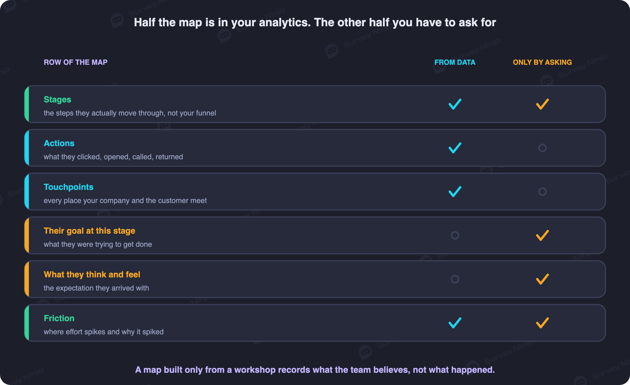
Treat the anatomy as a checklist while you build, row by row, stage by stage. If a row is a guess rather than a data point or a direct quote, mark it as a guess. An honest gap is useful. A guess dressed up as a finding is what gets a map quietly ignored the first time someone checks it against reality.
The feeling row deserves one more note, because teams often leave it as a face or a color and call it finished. Gathered on a consistent scale, such as the ones covered in our guide to Likert scales, that row turns a vague impression into a number you can compare month over month and stage over stage.
Stop copying the generic stage list
Awareness, consideration, purchase, onboarding, use, renewal. That six-stage template appears in almost every article on this topic. It fits a handful of businesses and misfits most of them. A subscription tool with a two-minute signup does not have a meaningful "consideration" stage separate from "purchase". A B2B product with a six-month procurement cycle has three or four stages of consideration that the generic template flattens into one word.
The stages that belong in your map are the ones your customers actually move through, not the ones a template assumes. Two ways to find them, and use both.
Pull your own usage data first. Look for natural breakpoints: a place where behavior changes shape, a spike in a specific action, a long gap before the next one, a switch from self-serve browsing to a phone call. Those breakpoints are usually your real stage boundaries, and they rarely line up neatly with words like "awareness" or "consideration".
Then talk to a handful of actual customers. Ask them, in their own words, to walk you through what happened from the moment they first heard of you to today. Listen for the language they use to describe the shift between one part of the story and the next. Customers name their own stages more precisely than any template does, because they are describing what happened to them rather than a category someone invented for a slide.
Five or six stages is a reasonable range for most maps. Fewer than that and real breaks hide inside one giant bucket. More than that and the map gets too granular to read at a glance, which defeats the point of having a shared picture at all.
One map per journey, not one per persona
The honest answer to "how many maps do we need" is neither one for the whole business nor one per persona. It is one per meaningfully different journey.
A brand new customer and a five year renewal both use your product, and a persona document might describe them as the same type of user. They do not walk the same path. The new customer's stages are about learning what the product does and deciding whether it is worth the switch. The renewing customer's stages are about whether the last year delivered what was promised, and whether switching to something else is now worth the hassle. Cramming both into one map produces a diagram wide enough to be useless to either audience, because half its rows apply to one group and half to the other.
The practical test: if two segments hit meaningfully different touchpoints, in a different order, driven by different goals, they need separate maps. If they hit the same touchpoints in the same order and only differ by which plan they are on, one map with a branch is enough. Working out which segments actually differ this way starts with the same groundwork covered in our piece on defining a target audience, applied to behavior rather than demographics.
The same logic holds outside the customer relationship too. An employee's first ninety days looks nothing like their fifth year, and a program built to measure one will misread the other. That is exactly the problem our guide to running an employee engagement survey walks through stage by stage.
Start with the one or two journeys that carry the most revenue or the most churn risk. A map for every conceivable segment is a project that never ships. Two good maps beat six mediocre ones. If you are starting from nothing, a persona generator gets you a first draft to argue with, which is faster than an empty page and safer than treating the draft as a finding.
Where the data actually comes from, touchpoint by touchpoint
Most journey mapping guides wave at this part with "conduct customer research" and move on. It is the part that decides whether your map is evidence or opinion, so it gets the most space here.
Every touchpoint on your map has a natural moment to ask a question, and the instrument has to match that moment. Ask too late and people forget the details. Ask through the wrong channel and you hear from whoever happens to check email that week, not the person who actually went through the touchpoint that day.
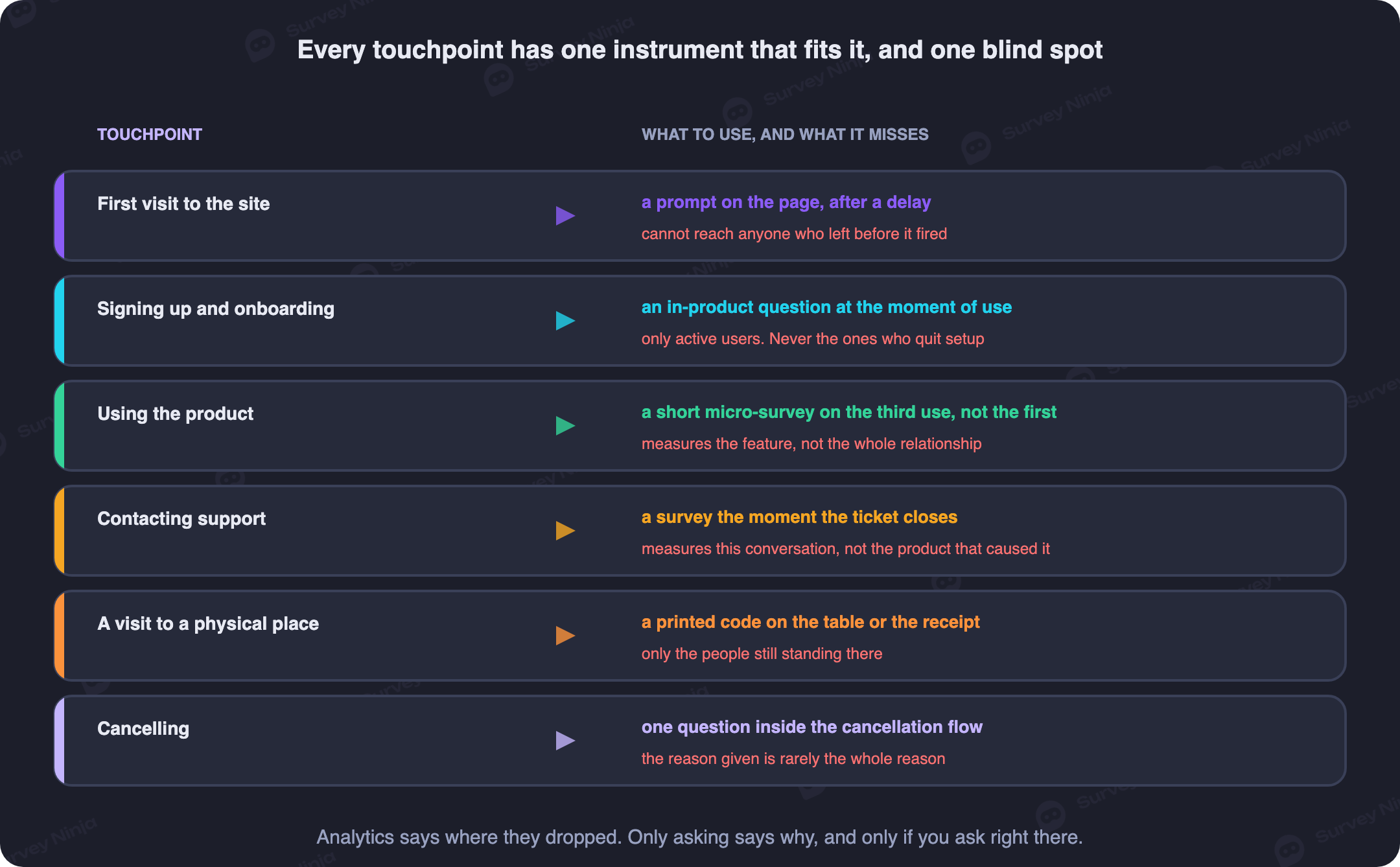
| Touchpoint | Instrument | What it tells you | What it cannot tell you |
|---|---|---|---|
| Inside the product, right after a task | In-app prompt | Reaction while the moment is fresh, tied to one exact screen | Why someone who never got that far left earlier, or what non-users think |
| A support ticket closes | Triggered survey on the resolution event | Whether the fix actually worked, from the person it happened to | Whether the same friction shows up for people who never contacted support |
| A store, branch, or event booth | QR code survey | An on-the-spot reaction to a physical place or a person | Anything about the people who did not scan, which is most of them |
| After a delivery or a purchase | Email survey | A reflective answer once the product has actually been used | The immediate reaction, since that moment has passed by the time it lands |
| Mid-browse on the site, before someone leaves | Website popup | Why someone is stuck on this exact page right now | Anyone who already left, or anyone running an ad blocker |
| A cancellation or downgrade flow | Exit question built into the flow, in the family of a churn survey | The reason someone gives for leaving, sometimes the real one | Whether the stated reason matches the one that actually drove the decision |
| Across the whole relationship, no single event | Recurring pulse survey | Whether the relationship is trending up or down over months | What happened at any one specific touchpoint |
Two design choices apply to every row in that table, not just one. Keep the question count small enough to survive the moment it interrupts, one or two questions at most for anything triggered mid-task; the mechanics of why longer forms lose people are in our piece on reducing survey dropout, and they apply here even though the moment is a journey touchpoint rather than a standalone survey. Pick the question type to match what you actually need too, a rating for tracking over time or an open text box for understanding why, a decision our guide to survey and question types covers in more depth than fits here.
Wording matters as much as placement. A prompt firing at the right moment with a vague question still returns nothing usable. The same rules that make a feedback form answerable apply to one question dropped into a cancellation flow: name the specific thing you are asking about, and do not write the answer into the question.
What people say and what they do are two different data sets
Analytics tells you where people dropped off. It does not tell you why. A survey tells you why people say they left. It does not tell you how many people that reason actually applies to. Neither one alone builds a map you can trust, and the two disagree just often enough to be worth checking against each other.
Start with the numbers, because they are cheap to pull and they tell you where to point the harder work. Session logs, funnel completion rates, time between steps: standard descriptive analysis of what you already collect surfaces the stage where the curve bends hardest, before you have asked a single customer anything.
Then go find out why, at that specific stage, not everywhere at once. A handful of open-ended answers from a survey at that touchpoint, or a dozen short interviews, supplies the reason behind the number. Code what comes back into a small set of recurring themes rather than treating every comment as its own finding, the way our note on thematic analysis lays out, so one vivid complaint does not outrank a duller reason ten other people gave.
The two data sets check each other. If the analytics say a stage is fine but every open comment about it is a complaint, the metric is measuring the wrong thing. If customers keep saying a step is confusing but completion there is high, the confusion is not costing you anyone yet, and it can wait.
Finding where the experience actually breaks
With stages, evidence, and a mix of numbers and quotes in hand, the map's job is to point at specific breaks, not to describe the whole journey evenly. Four patterns catch most of them.
Effort spikes. A stage where the customer has to do noticeably more work than the stage before or after it: more clicks, more waiting, more back and forth with a person. Effort is measurable in the same family as customer effort score, and a spike in that number at one stage, next to flat numbers everywhere else, is one of the cleanest signals a map can surface.
Goal versus process mismatches. The customer's goal at a stage and your internal process for that stage are supposed to serve the same outcome, and they quietly stop matching more often than teams expect. A customer trying to cancel wants a fast, honest answer about how to do it. A retention process built to slow that down and route them into a save offer serves a different goal entirely, and the mismatch shows up in the map as friction the team insists is a feature.
Handoffs between teams. This one deserves its own warning, because most breaks live here and almost no map draws it explicitly. Sales hands off to onboarding. Onboarding hands off to support. Support hands off to success. Each handoff means someone new picks up a customer they have never spoken to, working from whatever notes made it across, and the customer repeats context they already gave once. Draw every handoff on the map as its own marker, separate from the stage boundary it sits inside, and check each one specifically: what carries across, and what gets lost.
Satisfaction drops between adjacent stages. A score that falls from one stage to the next, even a small one, is worth more attention than a low absolute score that stays flat. A flat low score might just mean the whole relationship runs at that temperature. A drop means something specific happened between those two stages, and the map's job is to say what.
Turn the map into a dashboard, not a poster
A map that only exists as a diagram gets checked once and forgotten. A map with a number attached to every stage, tracked on a schedule, becomes something people actually open.
Different stages call for different metrics, and picking the wrong one for a stage wastes a good measurement habit. A single transactional moment, like a completed purchase or a resolved ticket, suits an effort or satisfaction question asked right there. A stage that spans weeks or months, like the middle stretch of a subscription, suits a relationship metric tracked periodically instead. Cramming a relationship question into a transactional moment gets an answer about the wrong thing, and the reverse wastes a good transactional moment on a question too broad to act on. The tradeoffs between the common options sit in our comparison of customer metrics, worth reading before you assign one to every row out of habit.
Track each stage's number over a consistent window, monthly is a reasonable default for most businesses, and put all of them on one page next to each other. That page is the dashboard the map was always meant to become. When the number for one stage moves, the map tells you what to go check. When it does not move despite a fix everyone believed would help, that gap deserves more attention than a success story would have gotten.
A map nobody owns is a map nobody trusts
Give the map an owner, a specific person, not a team. Ownership spread across a team turns into ownership by nobody within two quarters.
Set a review cadence and put it on a calendar, quarterly is reasonable for most maps, more often for a fast-changing product. At each review, check the stages against current behavior, refresh the numbers, and retire anything that has stopped being true. A touchpoint your product no longer has does not belong on a live map.
Here is the uncomfortable part. A map nobody has touched in a year is worse than no map at all, because people still quote it in meetings as if it describes the present. A new hire reads it as current fact. A decision gets justified by pointing at a stage that no longer exists in that shape. No map at least forces someone to ask a current question. A stale map answers a question nobody asked, with an answer that used to be true.
If a map has gone stale and nobody has the appetite to refresh it properly, the honest move is to say so out loud and retire it, not leave it hanging on a wall collecting false authority.
A first usable version in about two weeks
You do not need a research team or a quarter to get a working map. Two weeks, run in this order, gets you something usable.
Days one and two: pick one journey and pull what you already have. Choose the single journey that carries the most revenue or the most churn risk, not every journey at once. Pull whatever usage data, support tickets, and existing survey answers already sit in your systems for that journey. This is your first draft of the stages and the observable rows, built entirely from data you did not have to collect.
Days three through six: talk to real customers. Five to eight short conversations with people who actually went through the journey recently, not a focus group and not internal guesses about what customers think. Recruiting the right people for this, rather than whoever answers first, is exactly the problem our guide to finding survey respondents works through. Ask them to walk you through what happened, in order, in their own words. Fill in the rows you could not observe: goals, feelings, the reason behind the friction.
Days seven and eight: draw the actual map. Six stages at most, every row filled with either a data point, a direct quote, or a clearly marked guess. Mark every handoff separately. This draft is allowed to be ugly. It is not allowed to be dishonest about what is a finding and what is a guess.
Days nine and ten: put a live instrument on the two or three worst stages. Not every touchpoint, just the ones the first draft flagged as breaking. Match the instrument to the moment using the table above, start from a ready-made template instead of writing questions from scratch, and set it live. A free account with no response cap is enough to run all of them at once without worrying about hitting a quota mid research, and the pricing page lays out what changes once you outgrow it.
Days eleven through fourteen: review, cut what nobody will use, assign an owner. Bring the draft to the teams the map touches, cut any row nobody actually reads, and put a name and a review date on it before you call it done. A map without an owner does not survive its first quarter.
Common mistakes
- Building the whole map in a workshop, with no customer data. That produces a record of what the team believes, a useful thing to write down and a dangerous thing to act on as if it were evidence.
- Copying the generic six-stage template. Awareness through renewal fits a handful of businesses and misfits most of them, so derive your own stages from how customers actually move.
- One map for every persona. A new customer and a five year renewal do not walk the same path, and forcing them onto one diagram serves neither.
- Treating the map as a picture instead of a dashboard. Without a number tracked per stage, nobody can tell whether a fix worked.
- Skipping the handoffs. Most breaks live at the boundary between teams, and a map that only marks stages misses them entirely.
- Asking the wrong instrument at a touchpoint. A five-question email survey sent for a moment that needed one in-app tap gets ignored, and a single tap cannot carry a question that needed real explanation.
- Never revisiting it. A map from eighteen months ago gets quoted as current fact, worse than admitting nobody has looked at the customer's actual path recently.
- No owner. A map owned by "the team" gets updated by nobody, on no particular schedule, which in practice means never.
Frequently asked questions
What is a customer journey map?
A record of the stages a specific type of customer goes through to reach a goal, with their actions, the touchpoints involved, their thoughts and feelings at each stage, and the friction that gets in the way. Built from evidence rather than a single workshop, it exists to show exactly where the experience breaks, not to produce a diagram for a wall.
How is a customer journey map different from a sales funnel?
A funnel is your process: the stages you designed and the conversion rate between them. A journey is the customer's experience of pursuing their own goal, which your funnel only partly covers. The two diverge exactly where the real problems live, since a customer's actual path often includes steps your funnel never accounts for, like contacting support or reading a review.
How many stages should a customer journey map have?
Five or six is a reasonable range for most maps, derived from where your own usage data shows a real change in behavior rather than copied from a generic template. Awareness, consideration, purchase, onboarding, use, renewal fits some businesses and misfits most, so pull your own breakpoints instead of assuming that list applies to yours.
Do we need a separate map for every customer persona?
Not one per persona and not one for the whole business. Build one map per meaningfully different journey: if two segments hit different touchpoints in a different order for different reasons, they need separate maps. If they only differ by which plan they bought, one map with a branch is enough.
What data goes into a customer journey map, and how much of it comes from surveys?
Actions and touchpoints usually come from analytics and product logs you already have. Goals, feelings, and the reason behind friction can only come from asking, through an in-app prompt, a triggered survey, or a short interview matched to the specific moment. A map built only from analytics answers where people drop off but never why.
How do you find where a customer journey actually breaks?
Look for four patterns: a stage where effort spikes noticeably above the ones around it, a place where the customer's goal and your internal process disagree, a handoff between two teams, and a satisfaction score that drops between two adjacent stages. Handoffs are the most commonly missed, since most breaks live at the boundary between teams.
Which metric should track each stage of the journey?
It depends on whether the stage is a single transactional moment or a stretch of the relationship spanning weeks or months. A transactional moment suits an effort or satisfaction question asked right there; a longer stretch suits a relationship metric tracked periodically. Picking between the common options is covered in our comparison of customer metrics.
How often should a customer journey map be updated?
On a set cadence, quarterly for most businesses, with a named owner responsible for the review. A map nobody has touched in a year is worse than no map at all, because people keep quoting it in meetings as current fact long after the journey it describes has changed.
Published: Sep 3, 2026